T Residence at The Grand Hyatt Residences
Design and Words by IDr. Astrid Sangil and Ar. Chris Bello of PBELL + A. ID
Project location: Grand Hyatt Residences, Taguig City, Philippines
Floor Area: 300 square meters
Inspiration
As with all of our projects, our inspiration is our client. From our meetings, conversations and collaboration with our client, we get a peek into their personalities, their interests and behavior. These are important elements to consider especially when working on residential interiors as designing for clients like these goes beyond surface aesthetics.
The house should be an extension of who they are and should reflect not just the designer's sense of style but most importantly should show who the client is. The way a client speaks, their demeanor and even how they dressed up during our meetings are observed and considered when we do our designs. Most of the time personalities, needs, and preferences are revealed with subtle clues and it's up to the designers to interpret them the best we could into their homes.
Living Area
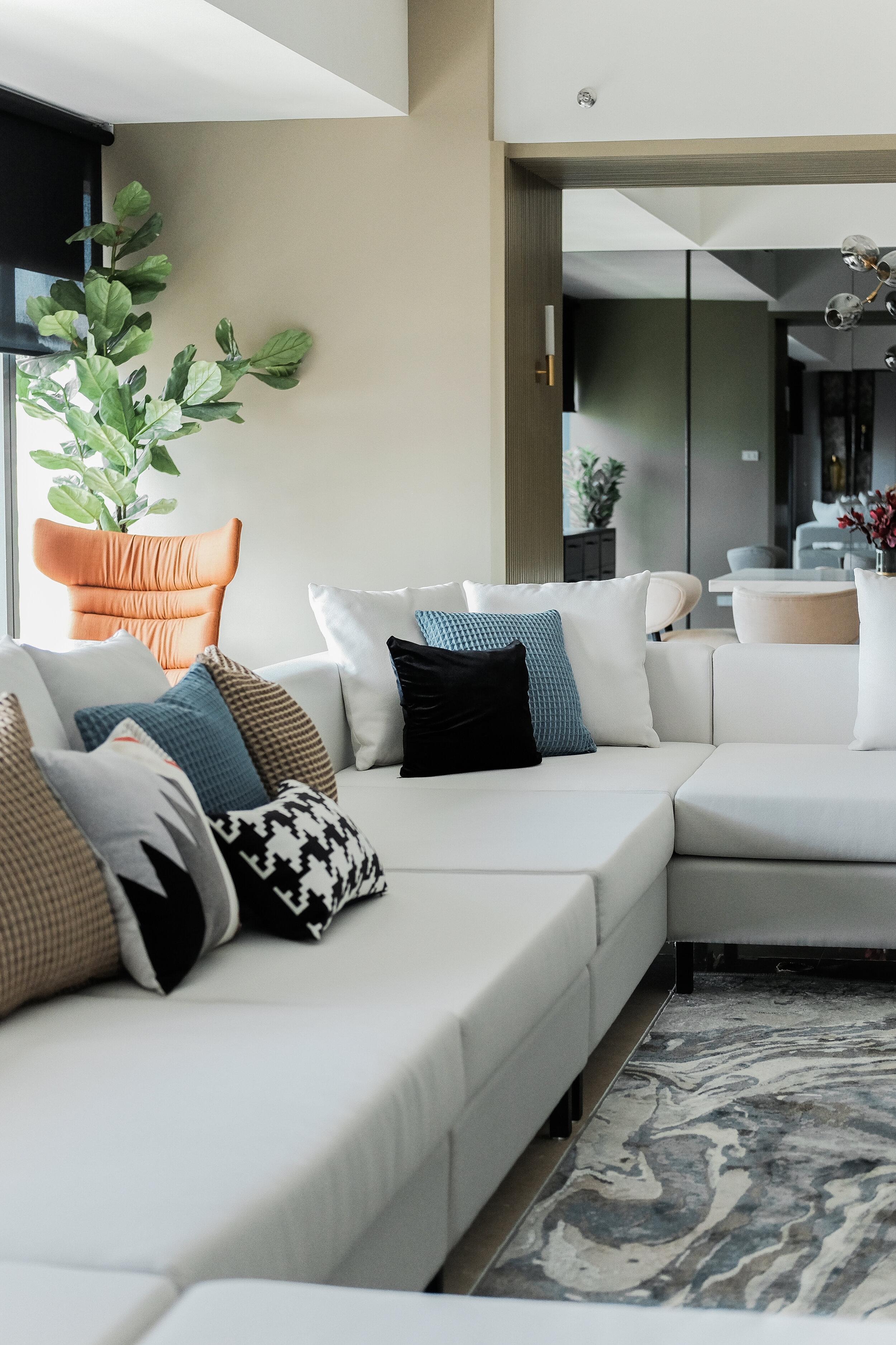
For a condo unit, this project has a spacious living area at 70sqm. Add to that the fact that there is no visible barrier going to the dining area (26sqm), it makes the space feel even larger. Instead of filling the area with numerous items, we decided to play with proportions and scale to somehow fill the room. A customized sofa that spans 5meters was used as a welcoming element when you enter the unit and also as a means of filling the enormous space available.
The client was very particular with not having a space that's too fussy so we made sure that the space would not be cluttered with too many things just to fill up the space. A rug with an eye-catching pattern and color was also used to draw the eye in and make the space feel more intimate. And in relation to intimate spaces, we also provided a sitting area by the window with a high back pair of chairs. Our client happily relayed to us that she likes sitting there for coffee or tea in the morning while also using the space to view the sunset.
The client was also an avid gamer and wanted to have a big tv at the living area so we made sure to seamlessly incorporate that with the shelving/storage unit that spans the width of the room.



Dining Area
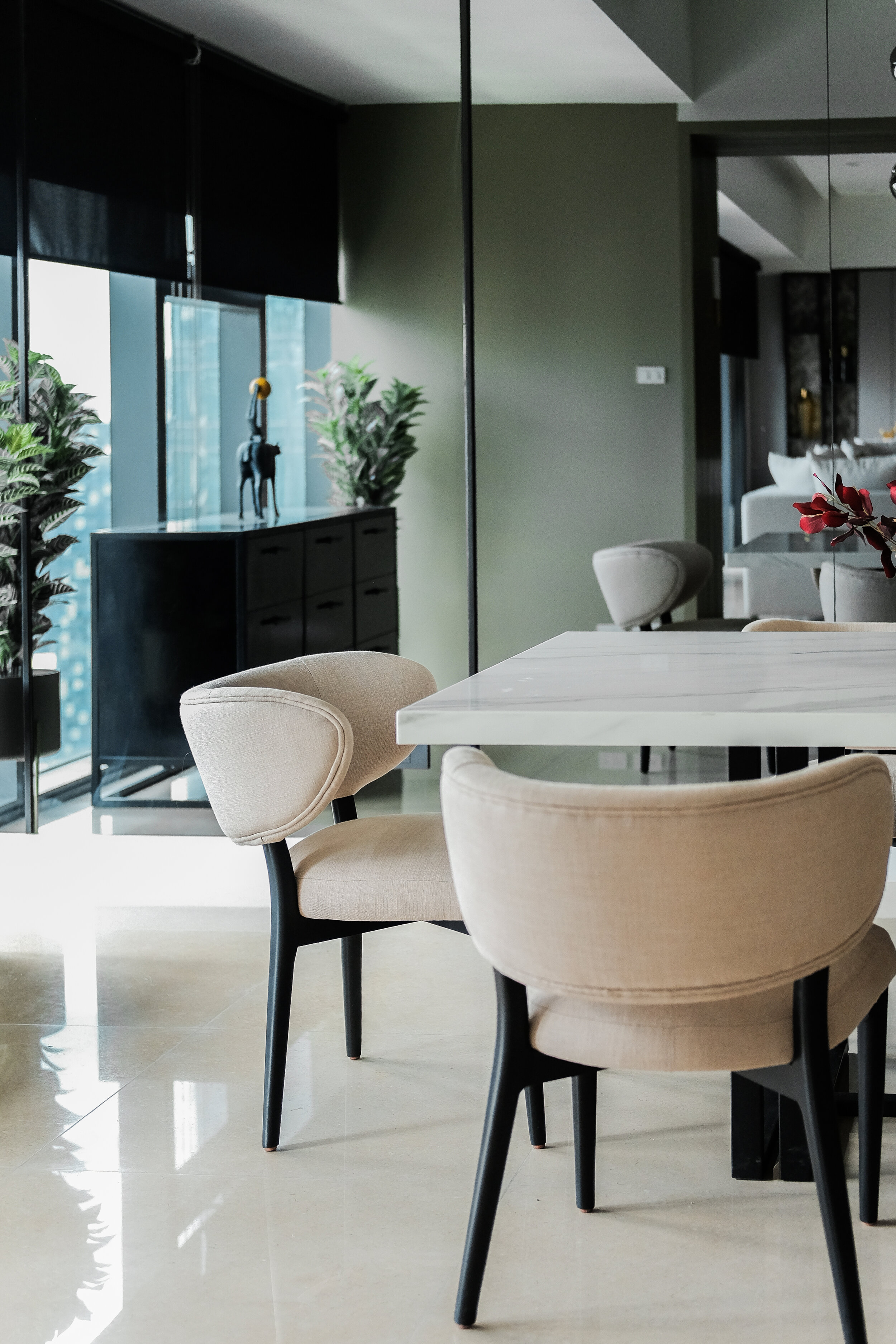
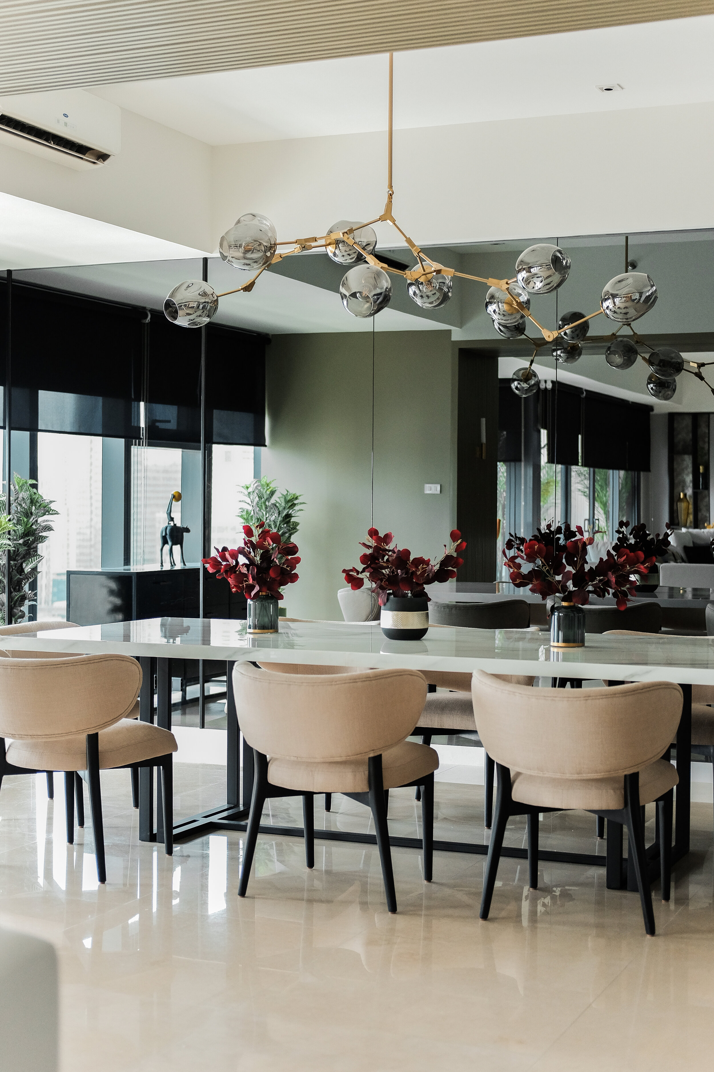
Even if the space was already quite big, we still decided to make use of mirrors to further exaggerate the spaciousness of the unit. To balance out this effect, we went with grey mirrors and warm lighting for a more intimate feel (as compared to regular mirrors).
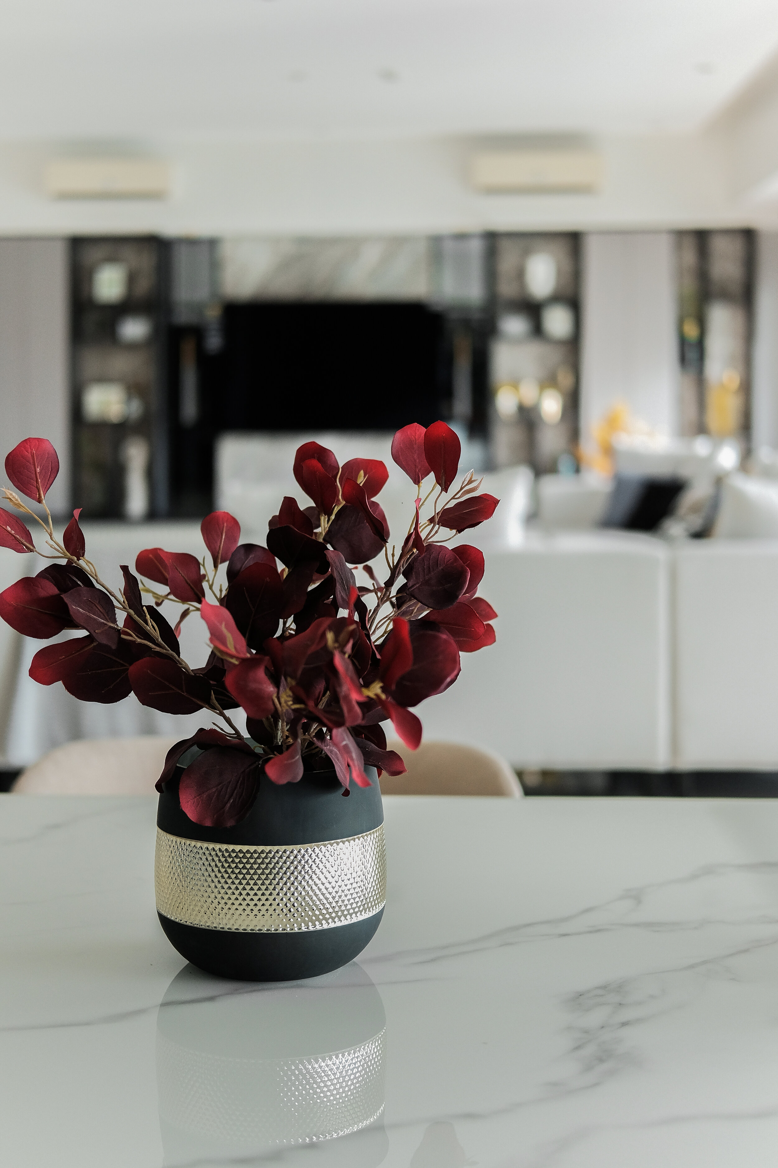
It was very challenging having to transport and install the 2.8meter-long marble stone top table but in the end it was all worth it as it provided an undeniable elegance to the space.
Master Bedroom
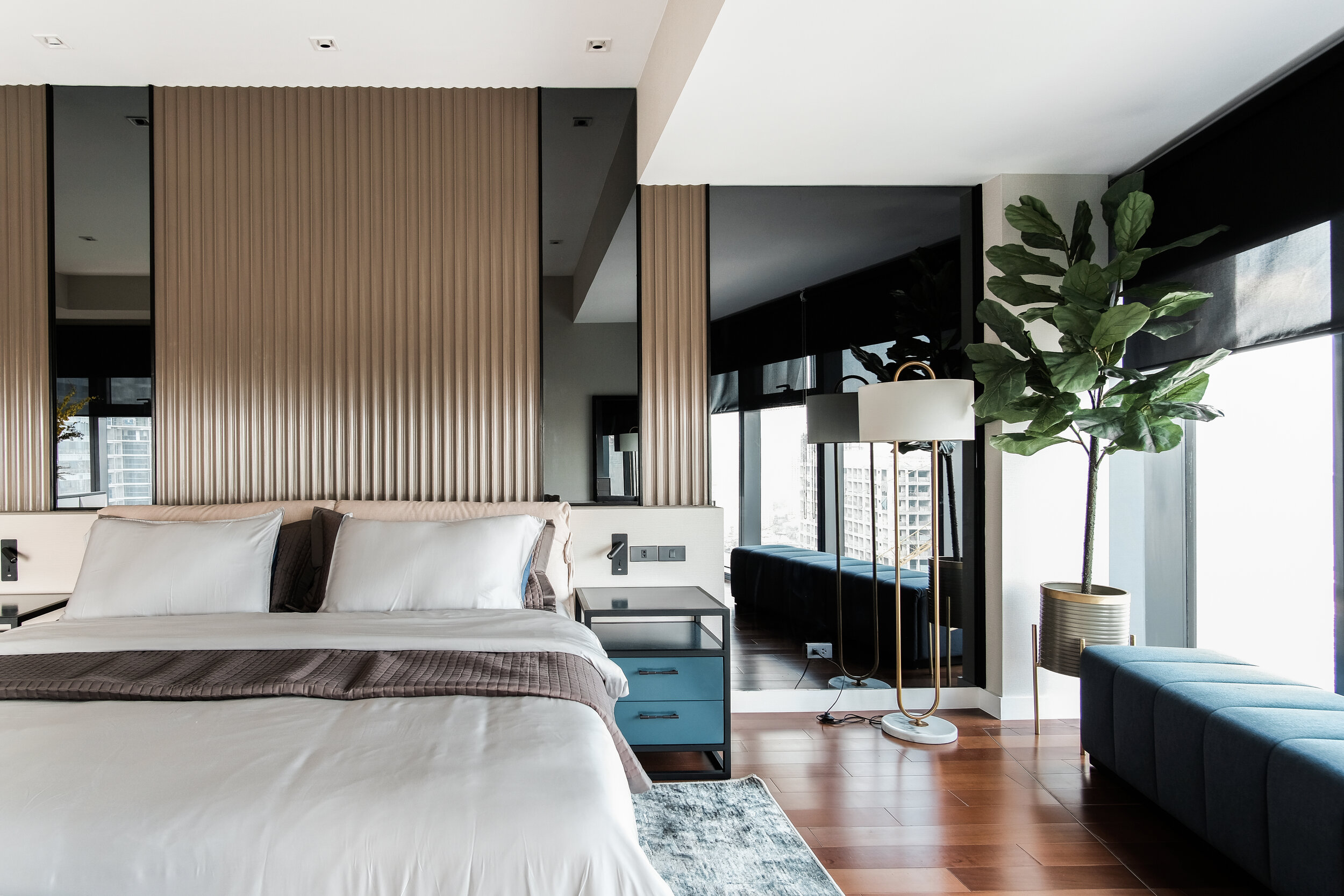
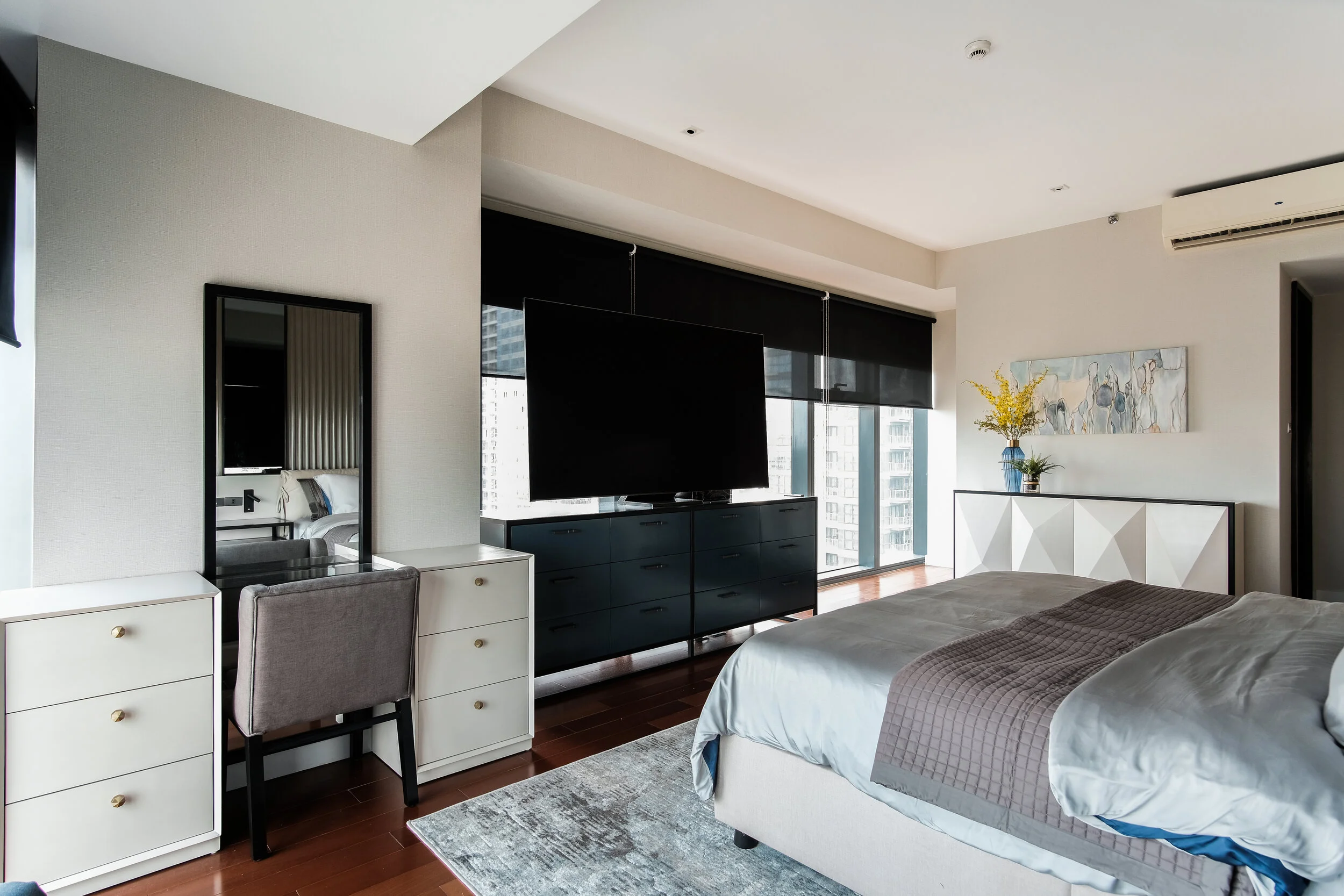
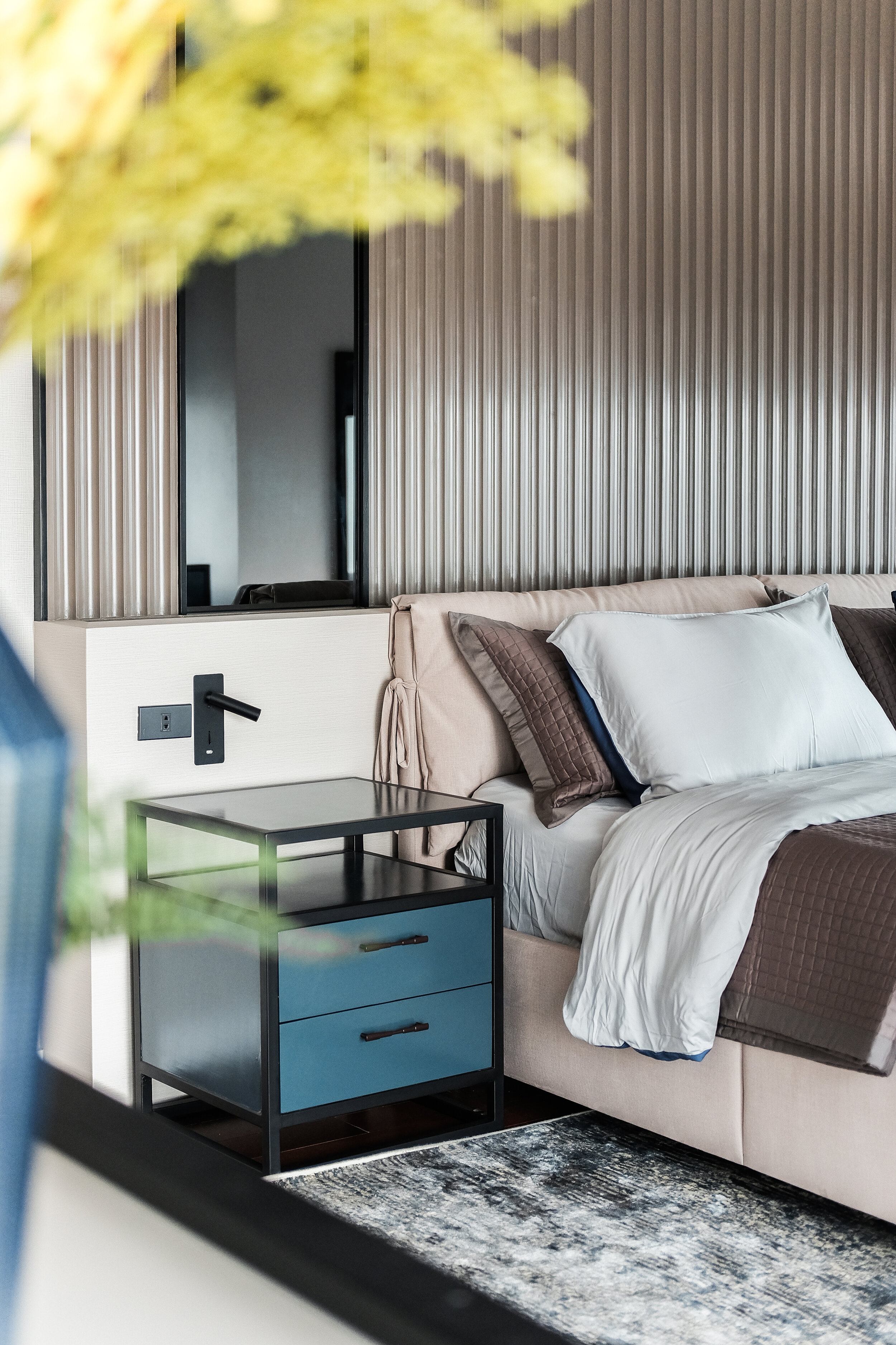
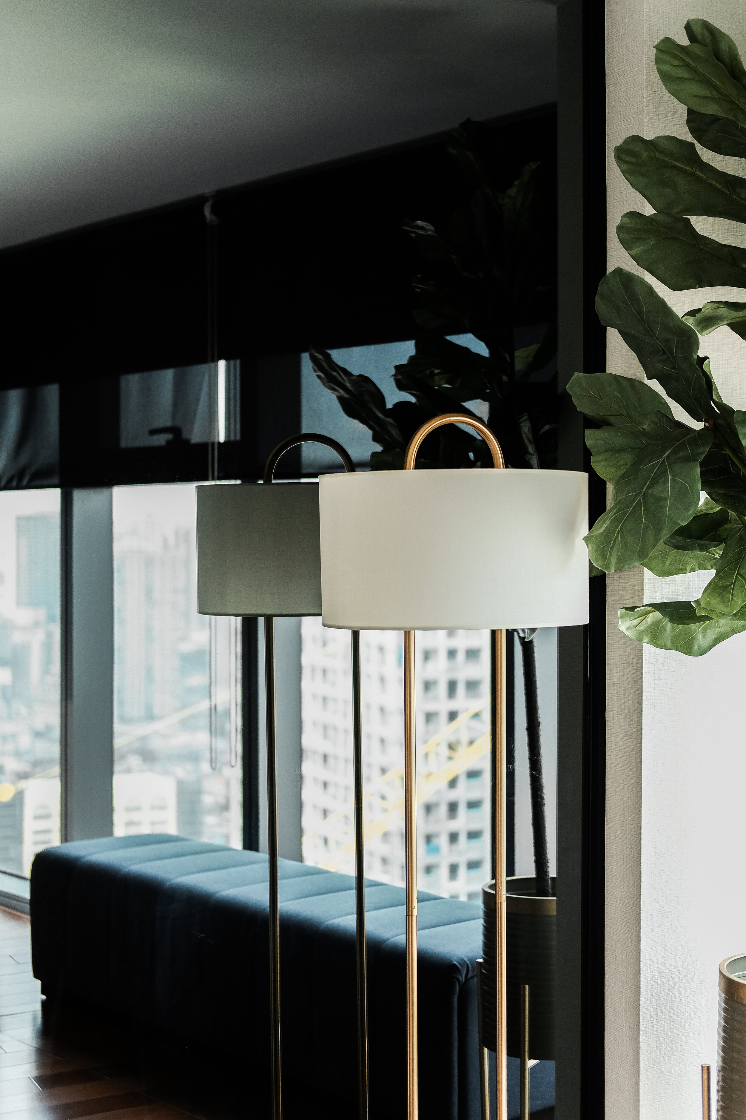
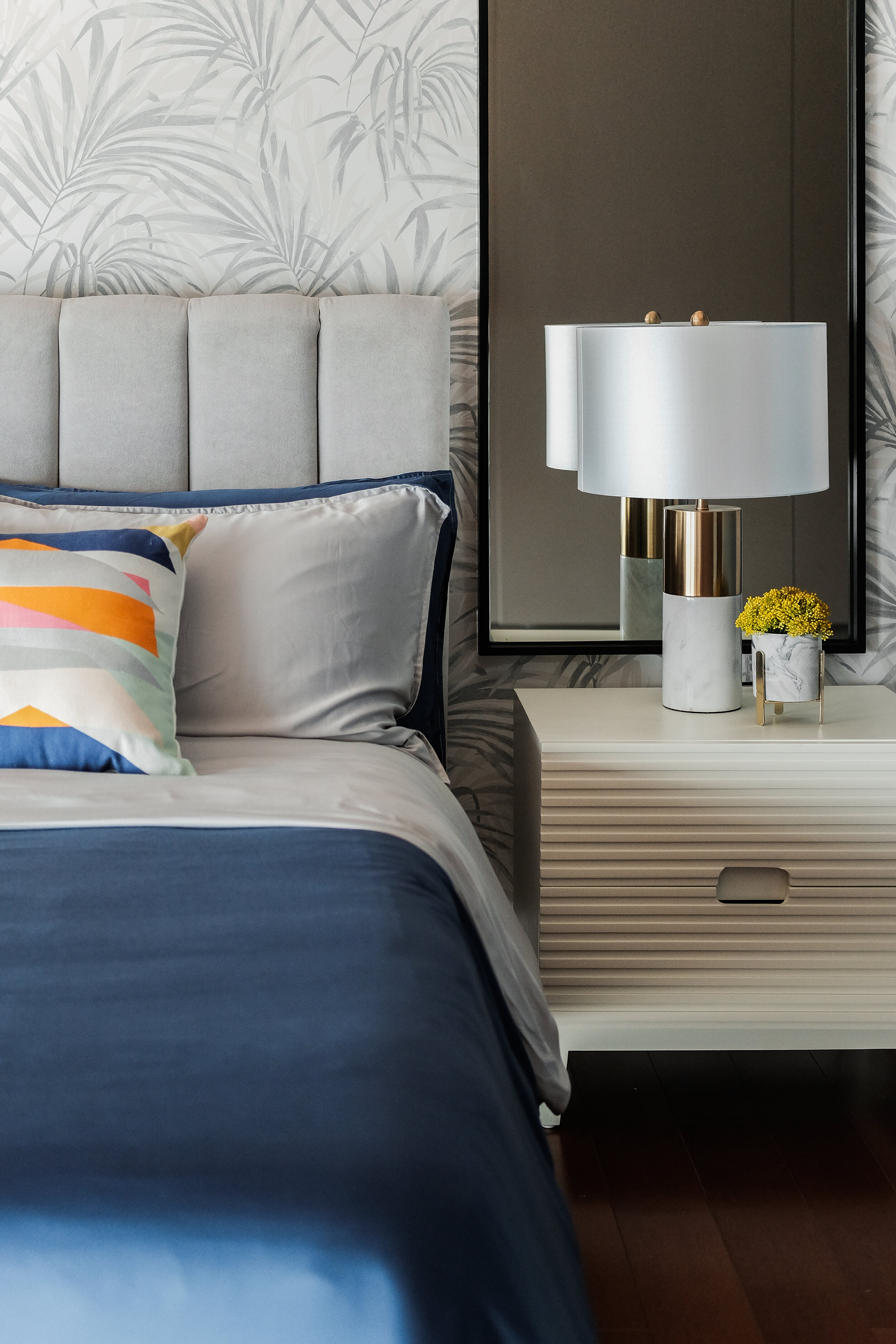
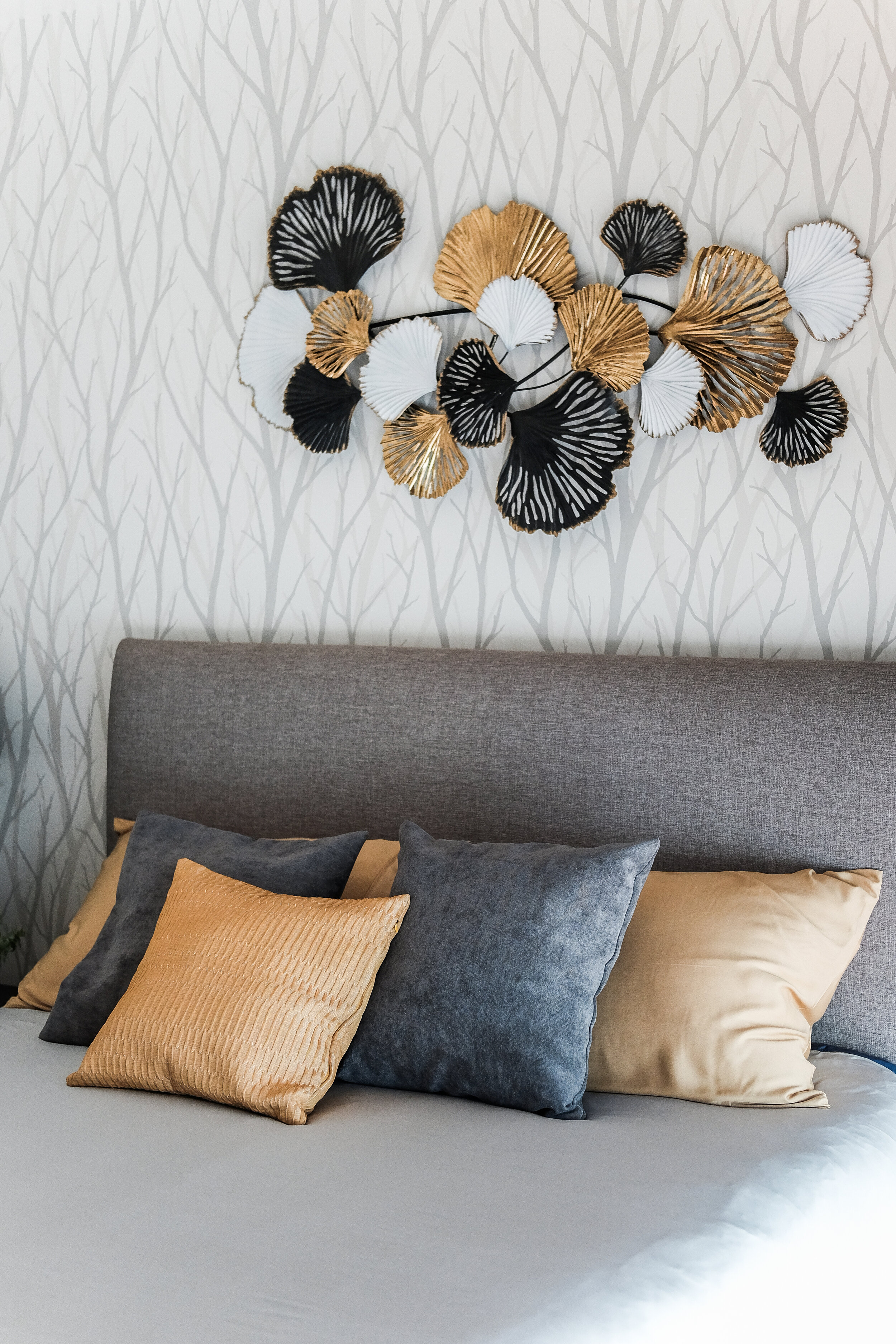
From the photos the clients initially provided (of rooms they saw online which they liked) we noticed that they were into browns and beiges and a mostly neutral scheme. We used that as a starting point and made the room interesting by adding textures through the CNC-cut accent panels, the reflectives surfaces of bronze mirrors and fabric combinations on customized furniture pieces. We also used accents of colors like blue and yellow which we feel goes well with a mostly brown/beige space as they balance out the very subdued nature of brown.


Master Bedroom T&B
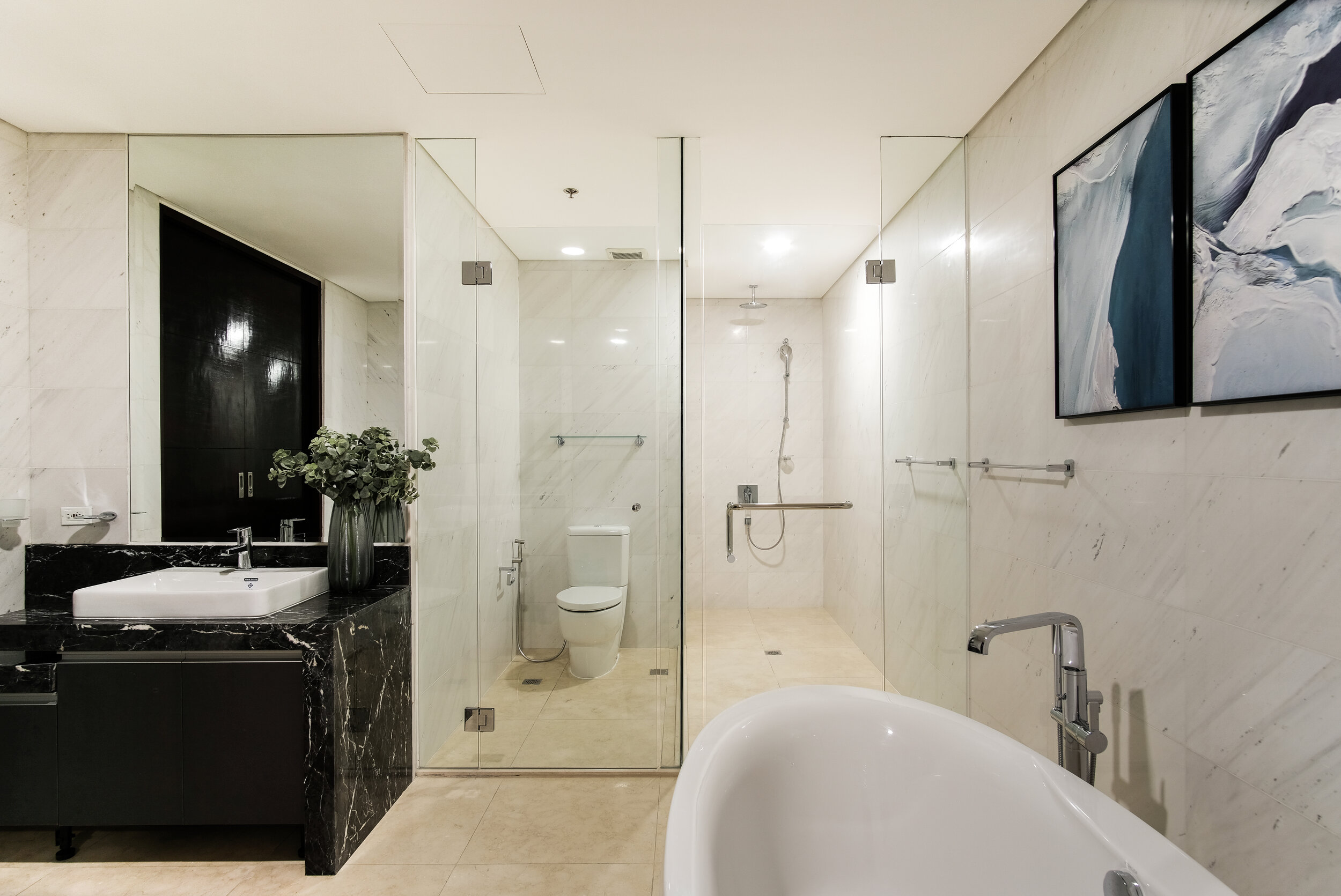
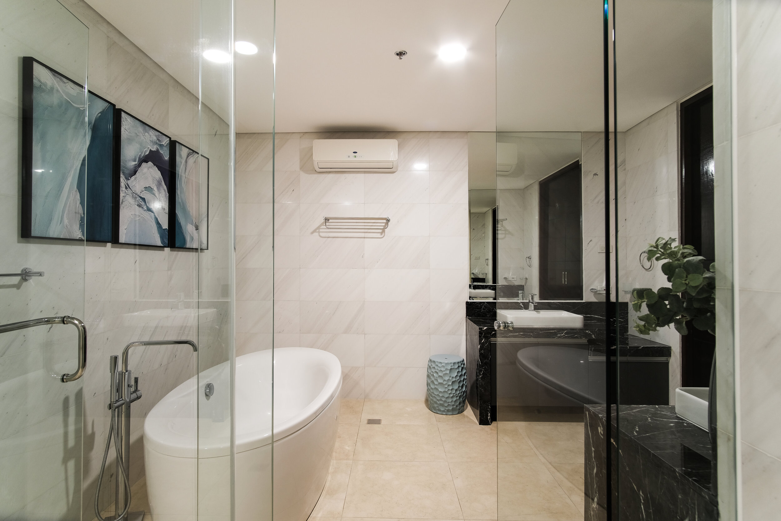
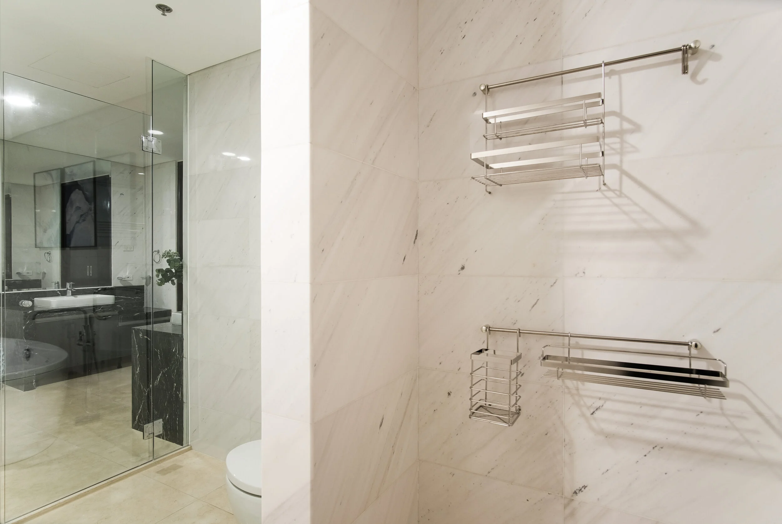
This area was mostly just furnished/accessorized as the client wanted to maintain the existing tiles and fixtures. We purchased an artwork that reminds of the movement of water and the remaining accessories were just subtle additions to ensure that they dont pose any unnecessary obstructions to the space.



Home Office
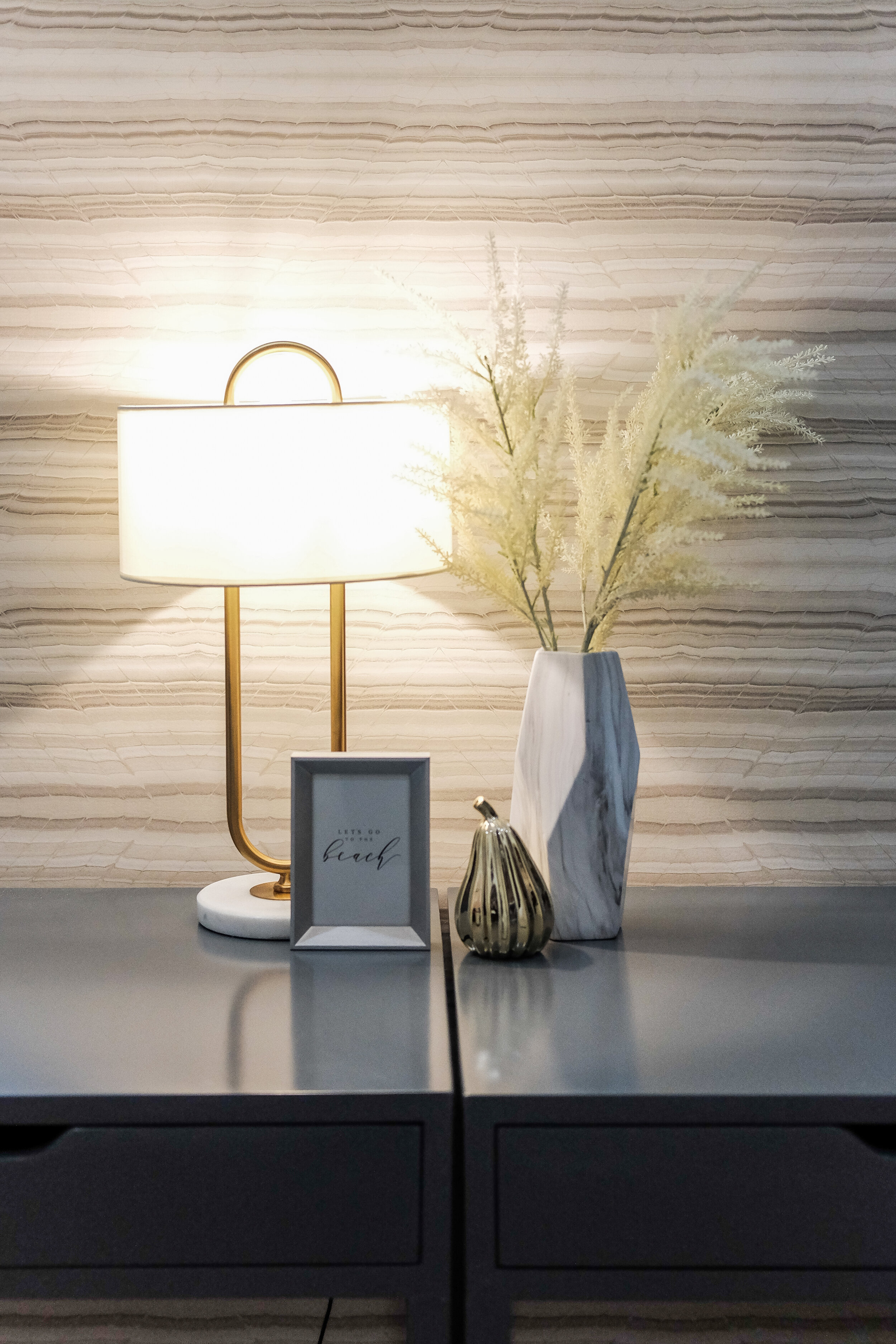
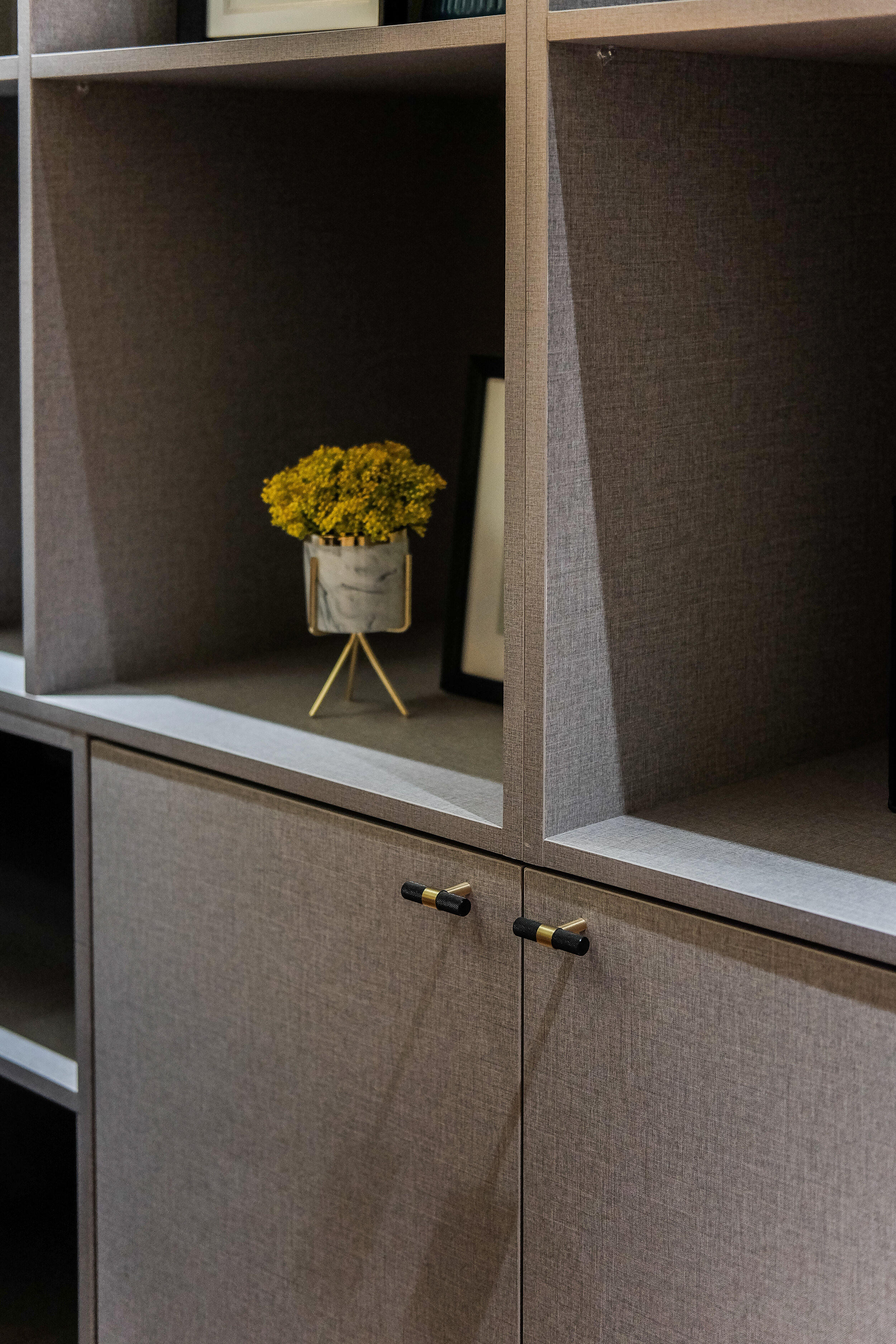
Storage is always important especially at a home office area so we made sure to maximize the available space for storage while also ensuring that it still a comfortable area to work in. We were given specific instructions from the start that the home office and other 2 bedrooms should be simple, not too costly and uncomplicated to do. The use of an accent wallpaper was a good solution as well as the provision of open shelving which can be used decoratively while being functional at the same time.
Bedrooms 1 and 2
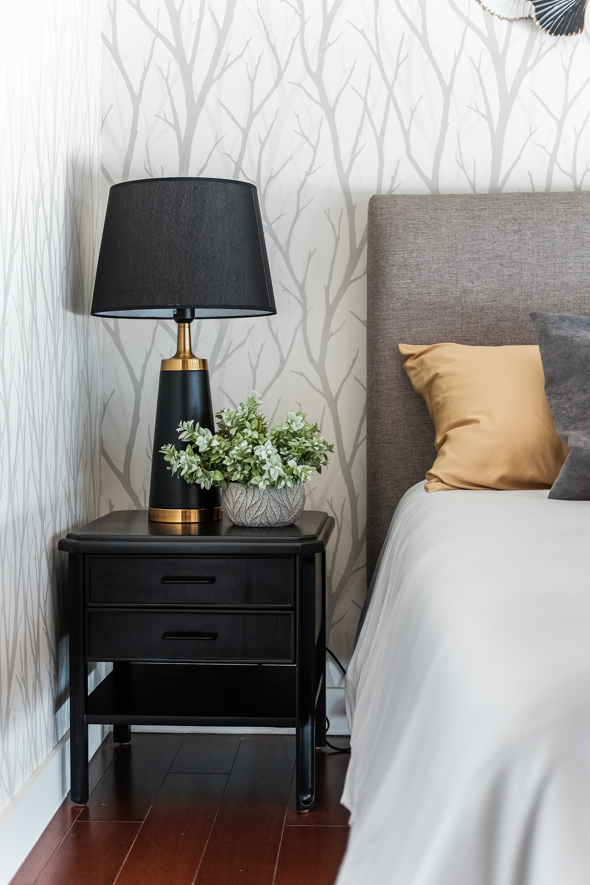
Both rooms had the same approach of making use of an interesting pattern on the accent wallpaper while the rest of the walls were painted. This is in line with the client's preference to be more sensible and practical with these areas while still achieving a nice aesthetic.
Most Memorable Experience
Working during a pandemic is quite memorable as there were numerous obstacles we had to overcome. The safety of our clients and our staff is our number 1 priority so even if there were extra measures we had to take to ensure this despite challenges we may face, they were all worth it.
It was extra challenging to conduct site visits sweating heavily and feeling light headed behind our PPE's while at the same time almost having a heart attack when one of your suppliers or workers would sneeze on site! haha! Since most condo construction areas have limited ventilation, we were all understandably nervous and were extremely cautious the entire process.
We thank also our clients for having extreme patience during construction phase. From all suppliers to all subcontractors who worked with us in this project we are extremely grateful for all your hard work. We're proud and happy to have gone through the experience together unscathed, thankfully.
Contact the Interior Designer and Architect
IDr. Astrid Sangil and Ar. Chris Bello of PBELL + A. ID
Email: designs@pbell-aid.com
Facebook: Pbell Architects + Astrid Interior Designs
Mobile: 09178947616 and 09985109543
Landline: 79331243
Website: www.pbell-aid.com
We have a project information form on the website for all interested clients.


