Kutis 2000 Facial and Skin Clinic
Design and Words by IDr. Victoria Pariña of Likha Studio
Project location: Quezon City, Philippines
Floor Area: 62 square meters
Inspiration
The clients wanted to revamp their clinic into an elegant and minimalist space imbued with refined luxe. At the same time, they wanted to create a warm and inviting healthcare space for their clients and potential partners.
Ten years ago, the husband and father of Dra. Nenita Manzano and Dr. Faus Manzano, respectively, built and designed the layout of the clinic himself. Since then, the family of doctors have not renovated their clinic.
We were inspired by how the design of their clinic started and wanted to leave a part of it to have a "personal touch" to the space. We decided to retain the layout and just refinish the existing cabinetries and to focus on changing some major finishes that would give a huge impact on the space.
Reception and Ground Floor Hallway
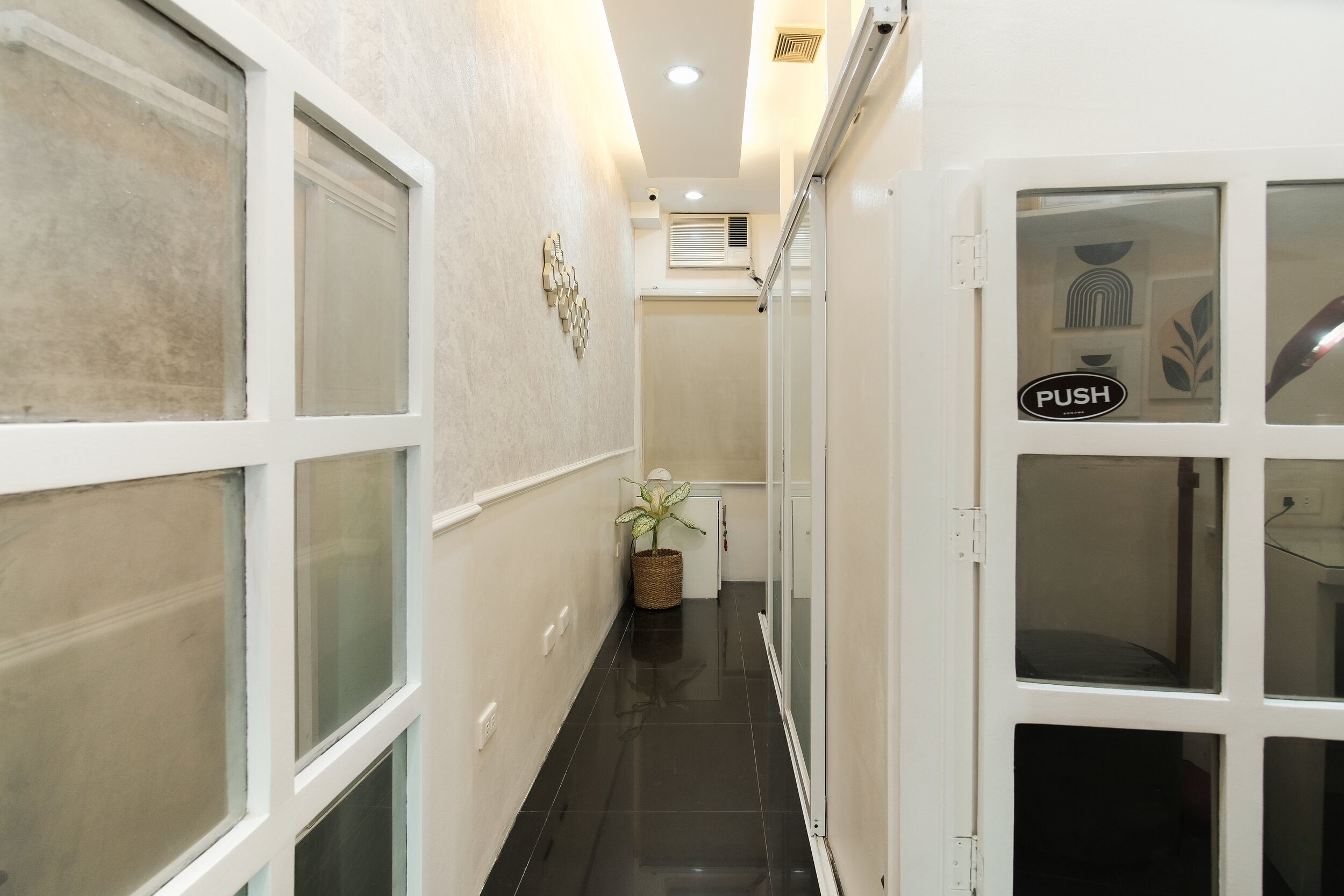
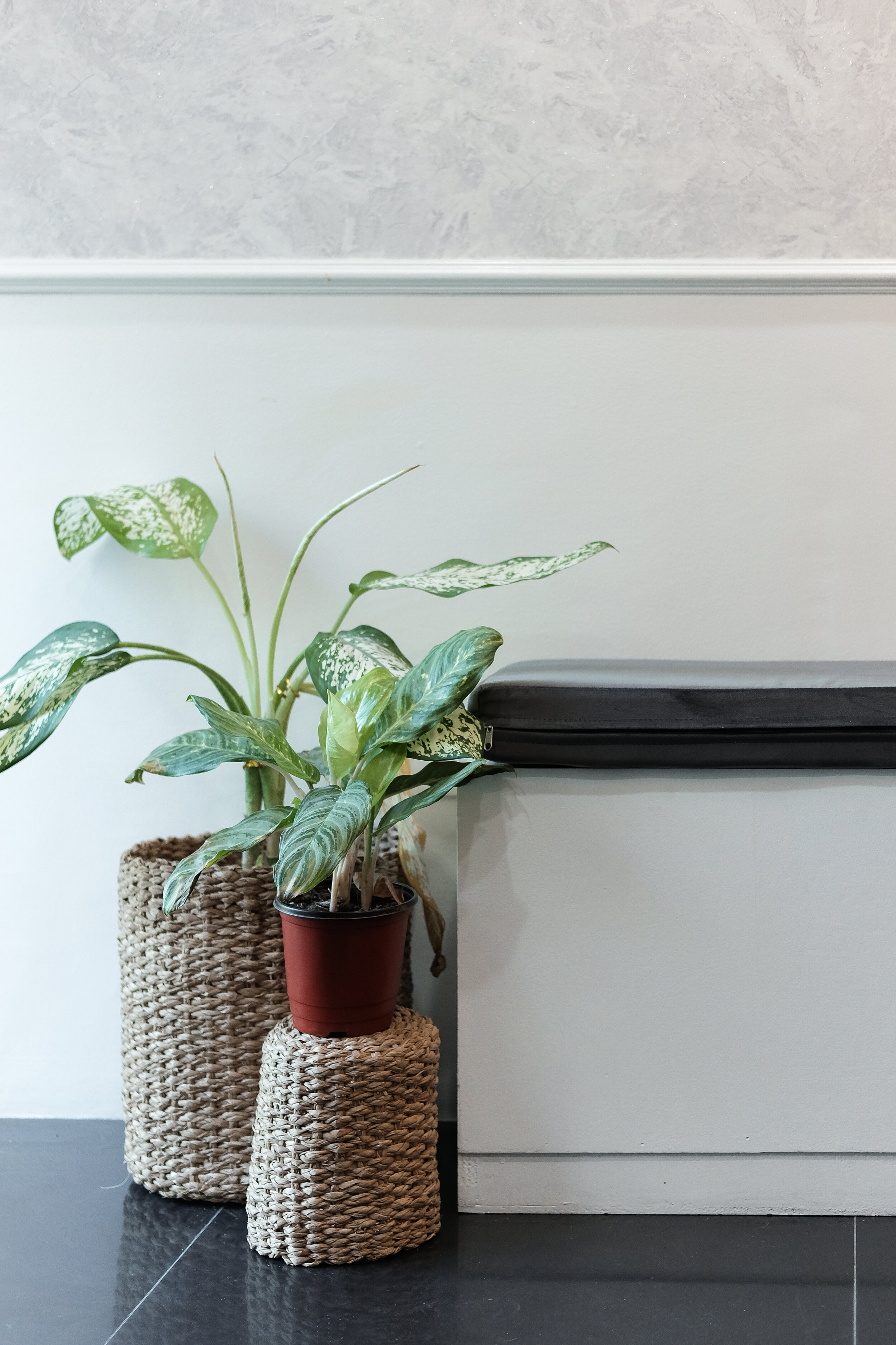
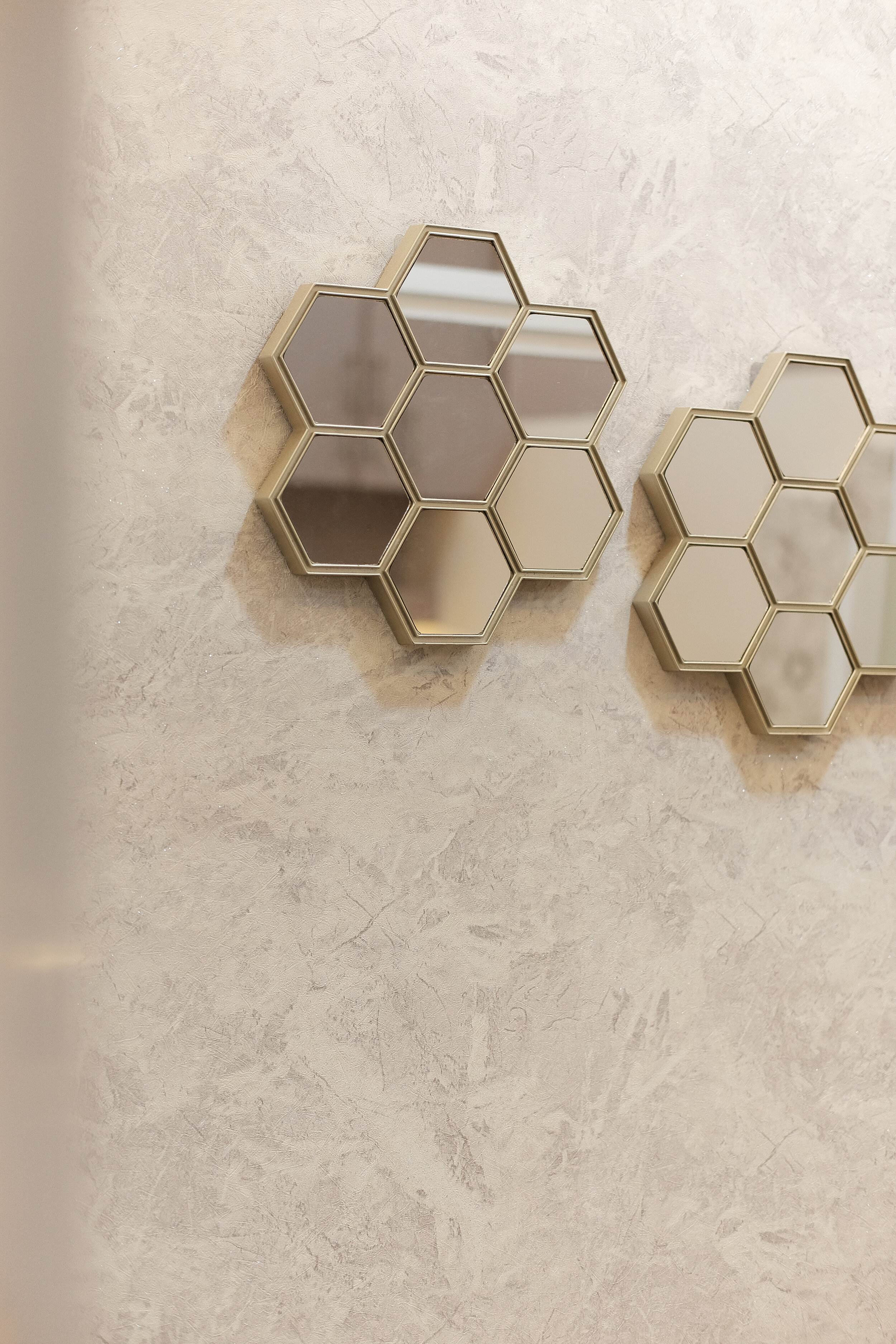
Since this is the first thing you will see upon entering, we wanted to bring all the elements of the space here. We wanted the clients to feel what to expect in the other areas once they step inside the clinic. From the reception and hallway, the neutral and clean palette alongside classic textures of marble, wood and brass accents are continued throughout the space creating an overarching elegant and luxurious space. We especially loved the marble wallpaper we installed in the hallway. It gives the clinic the subtle luxe impact that we were going for.

Treatment Rooms
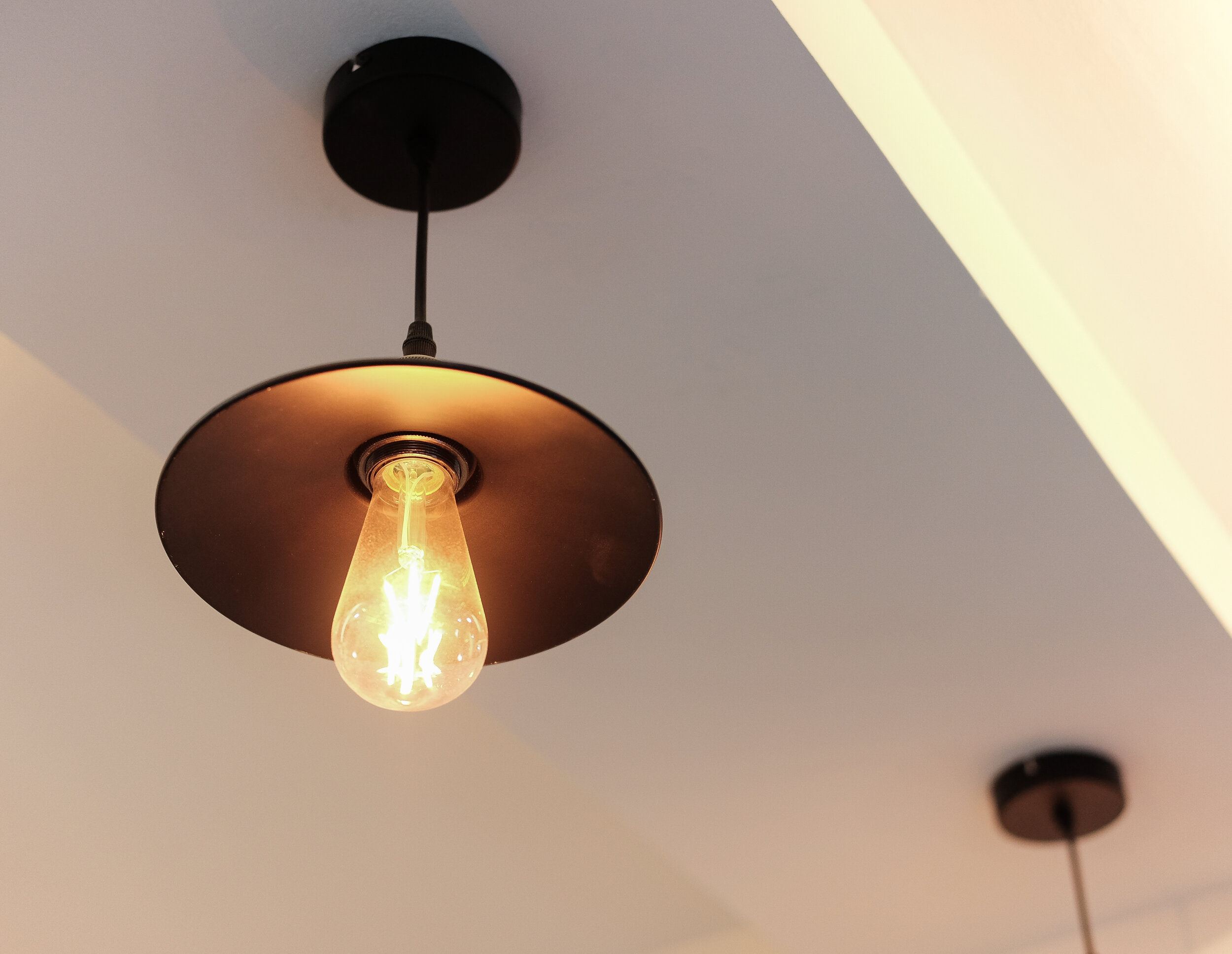
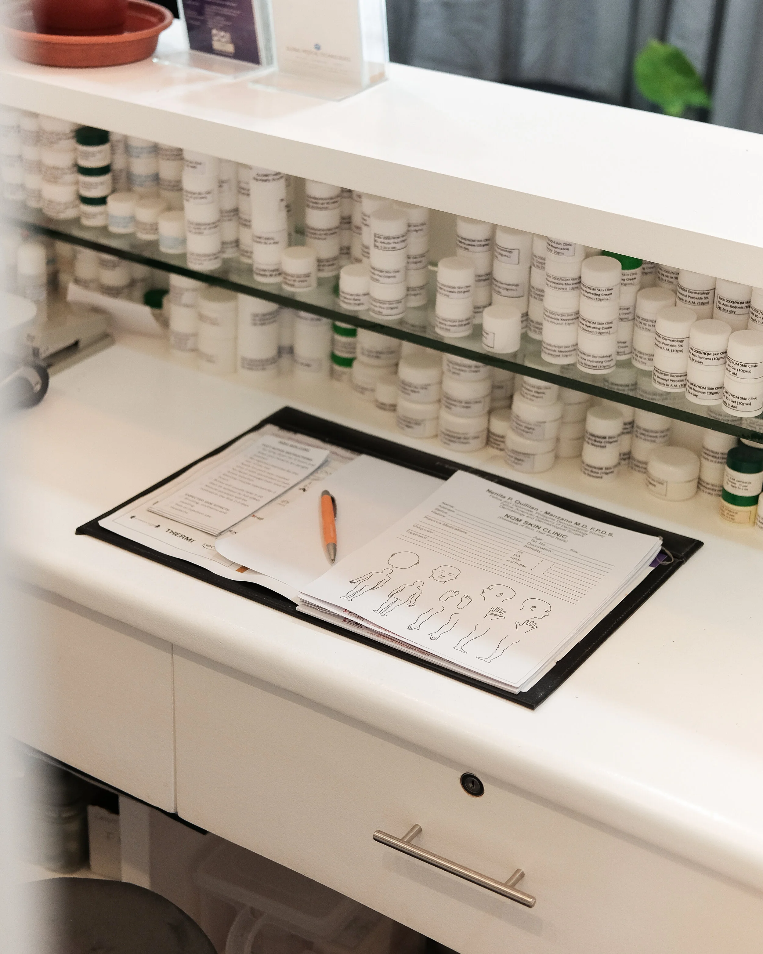
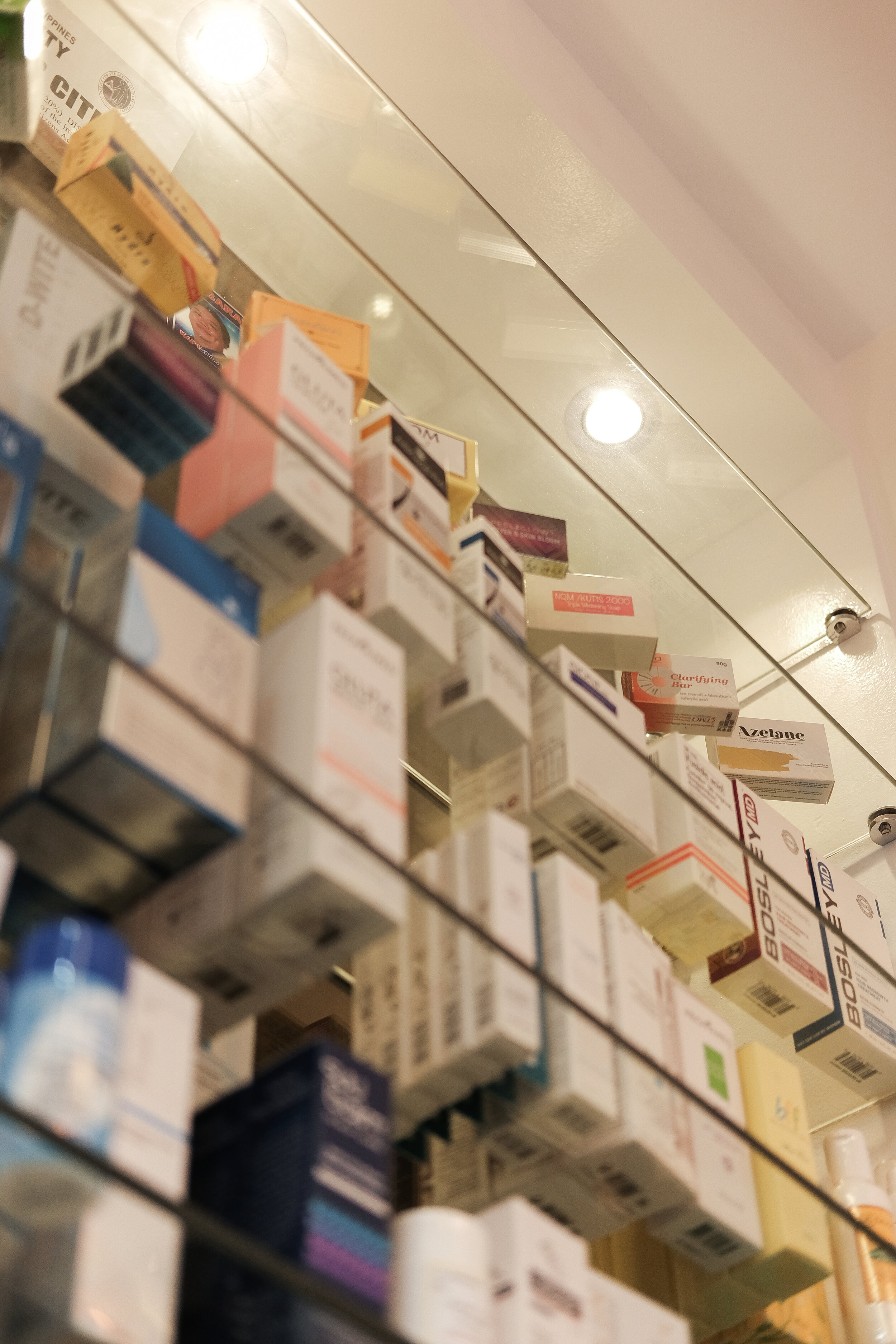
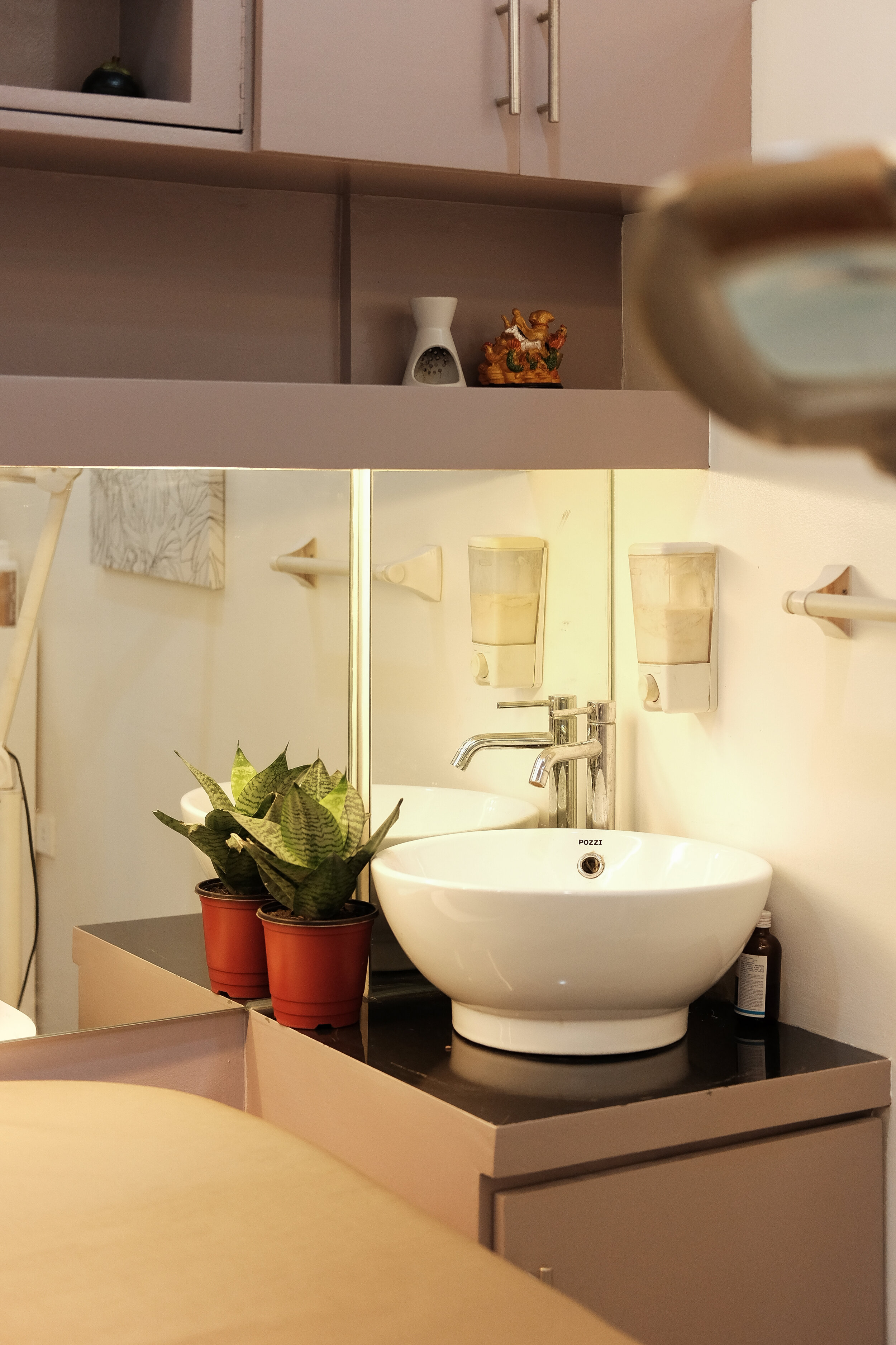
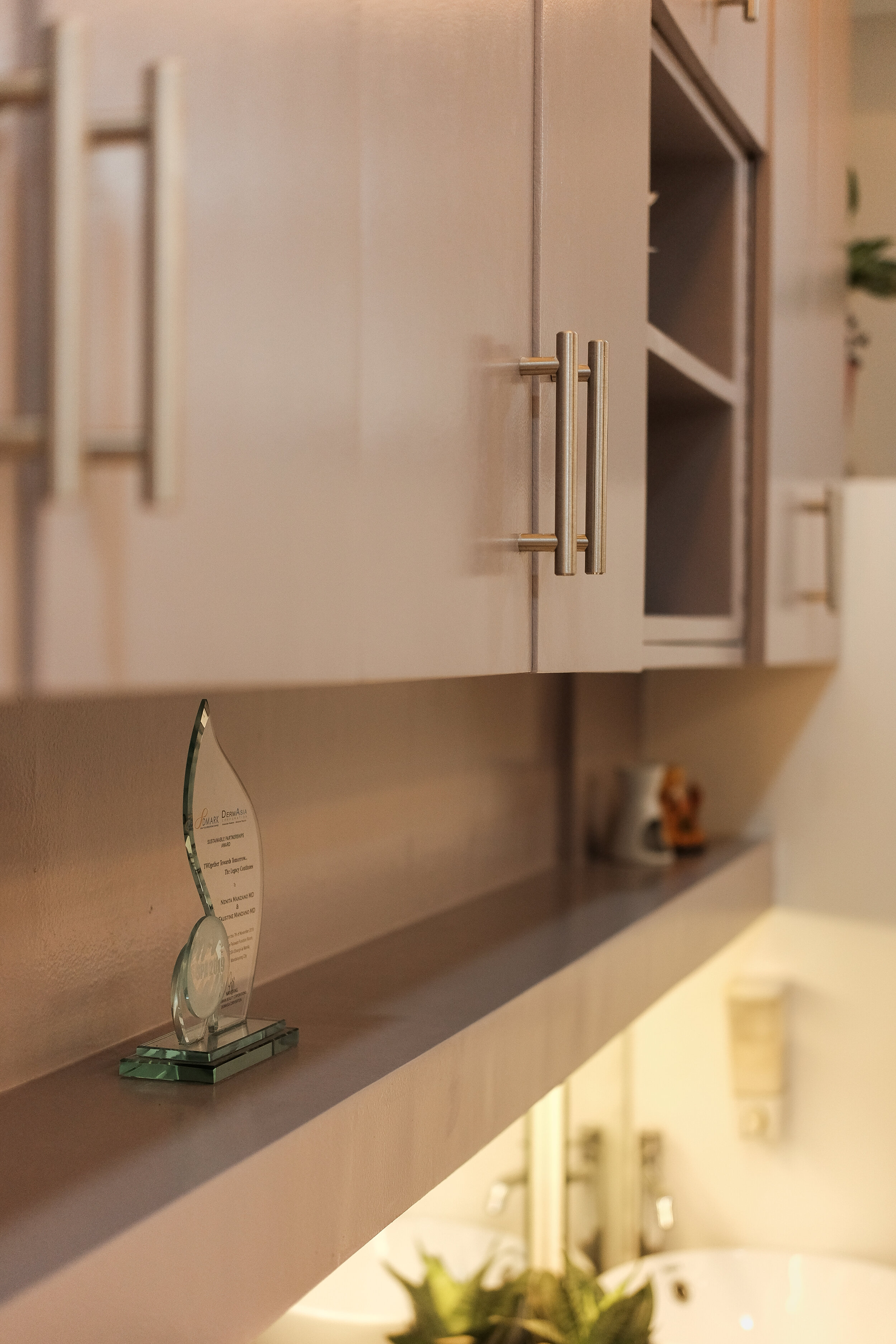
Given also the determined budget by the client, we retained the existing cabinetries and only added in a few extra storage. We decided to refinish them in a neutral taupe color to give it a fresh look and to be in line with the overall color scheme. We also played around with the lighting by mixing task and general lighting with ambient lighting as seen on the cove lights for the added warm ambiance effect.


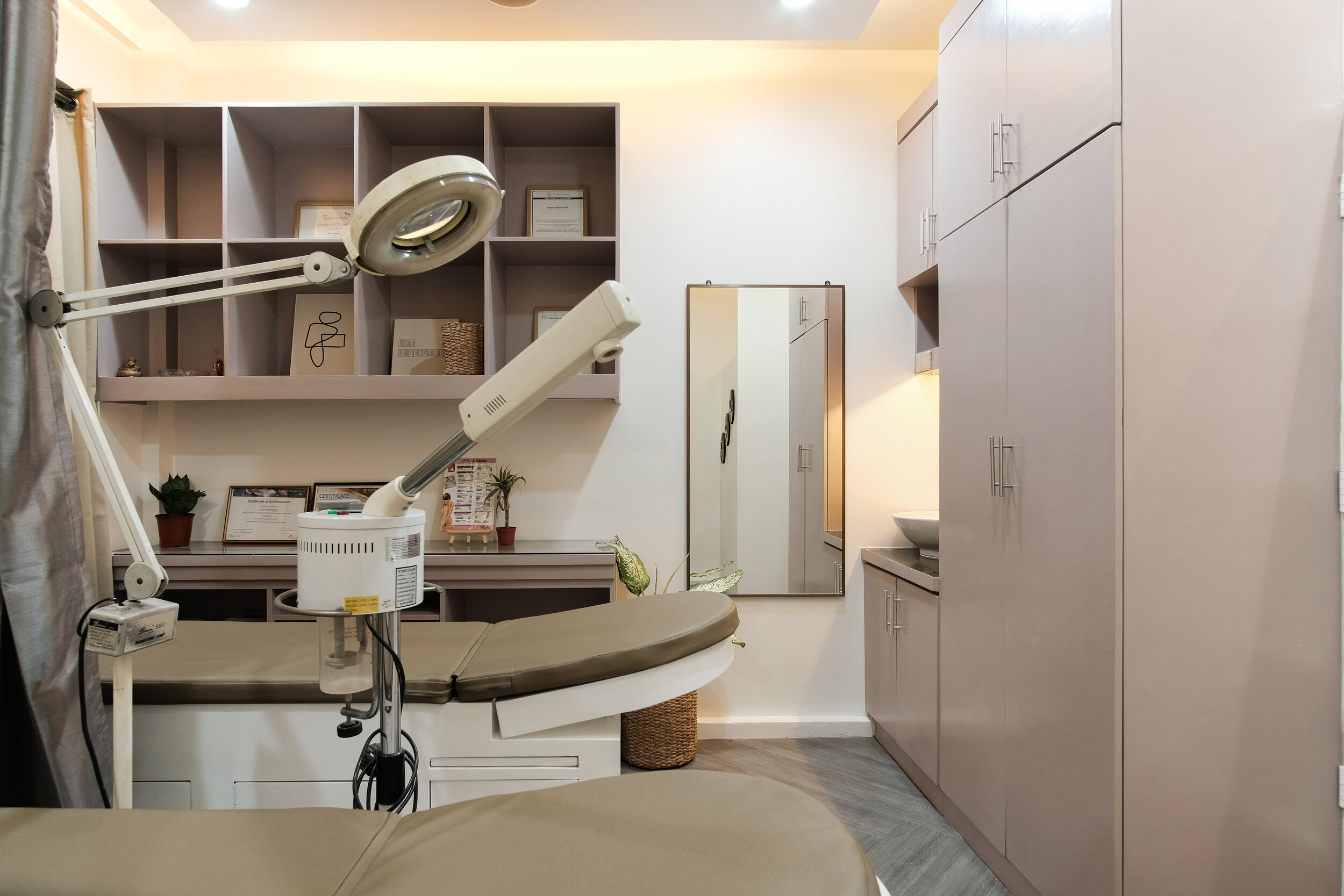
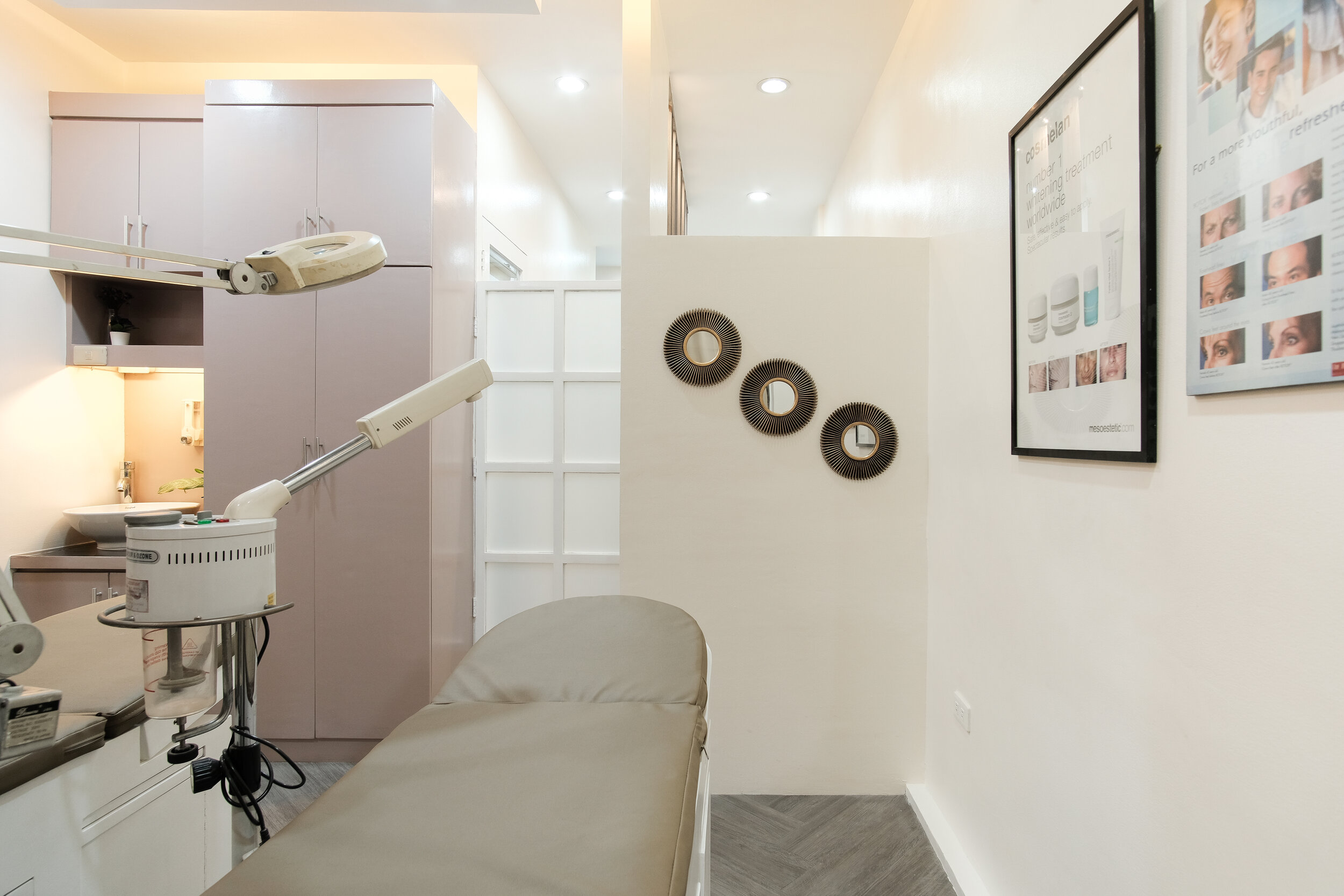

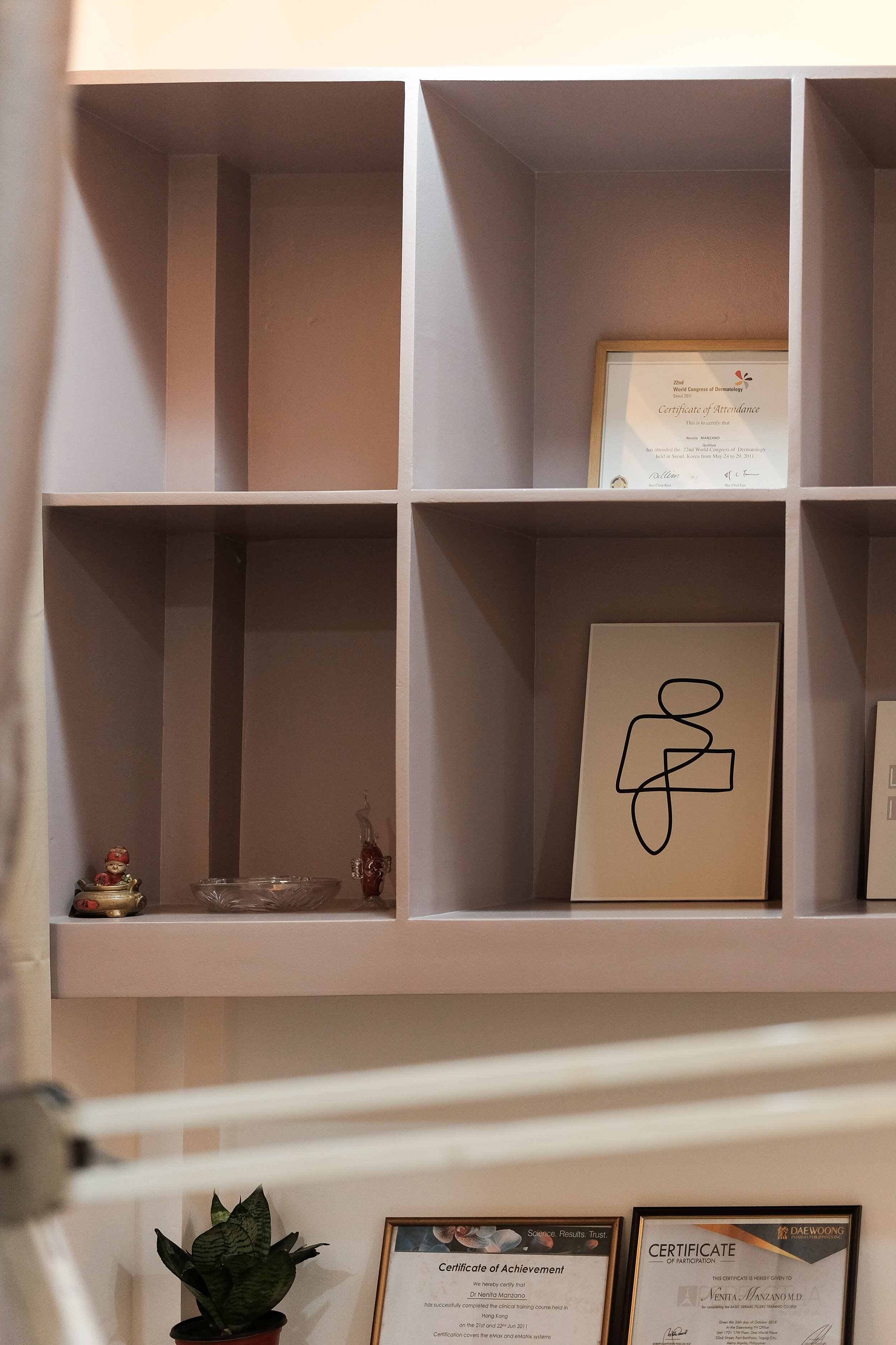
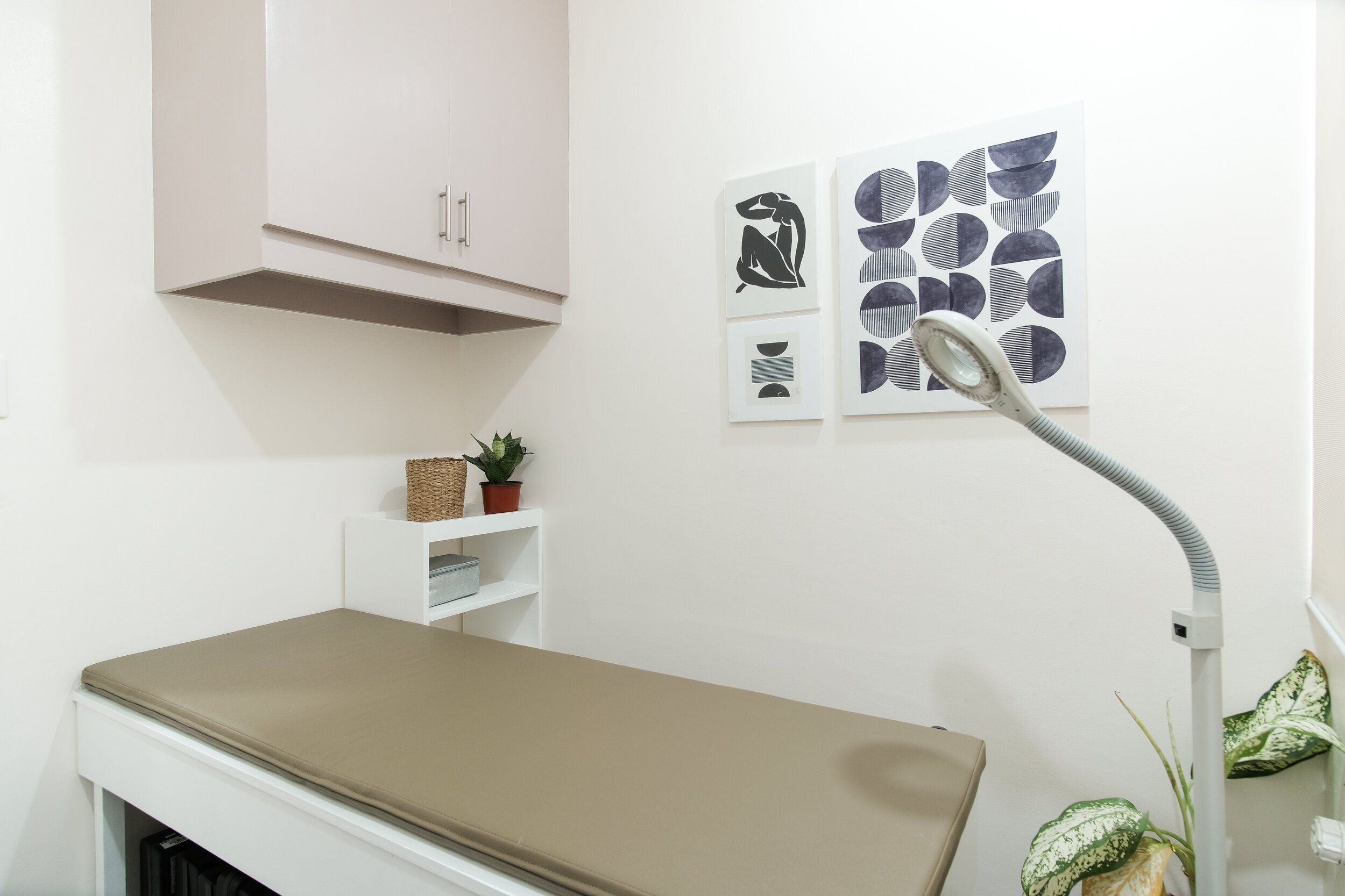


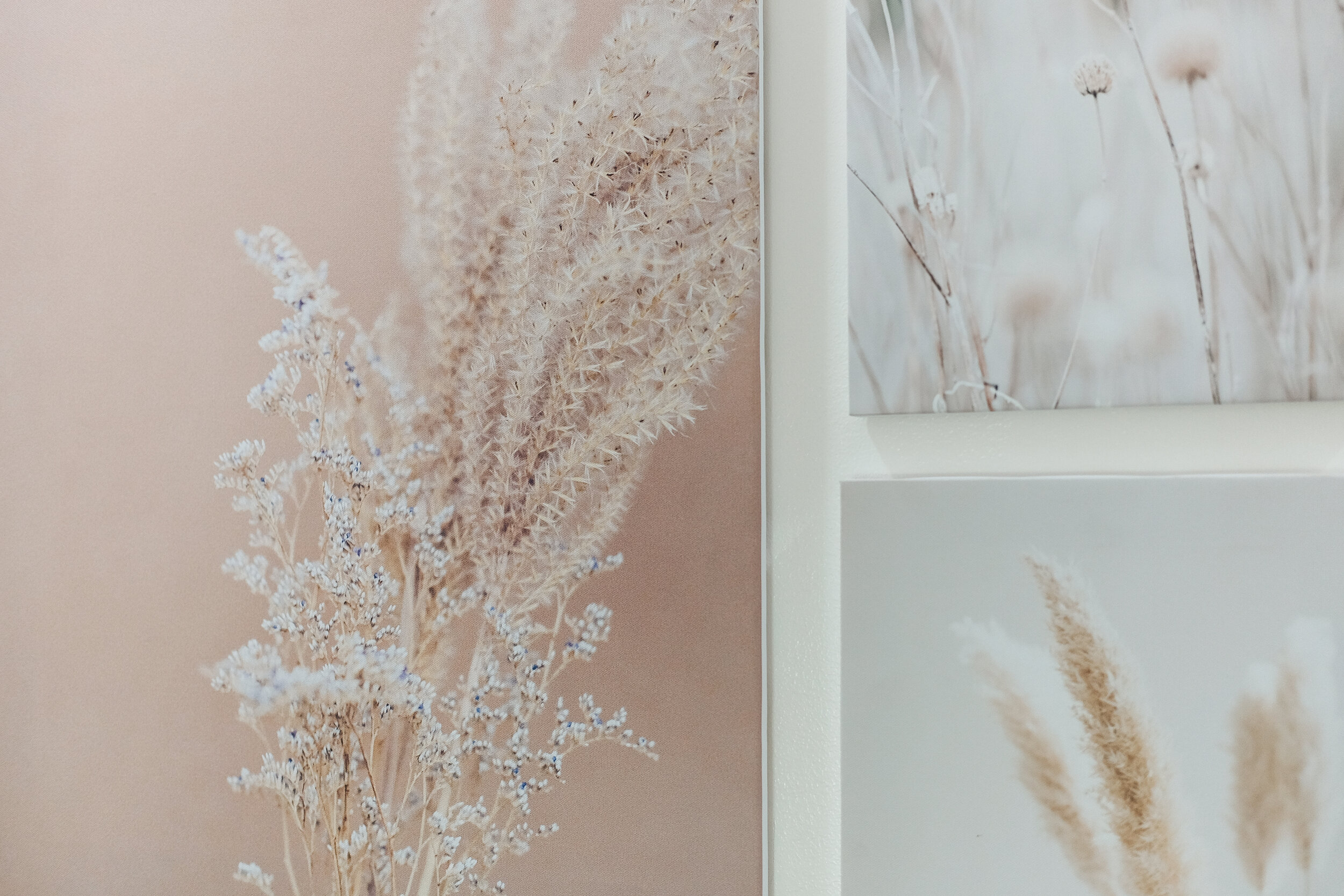
Staff Area
Before we transformed this area, the space looked so plain and dull. It wasn't even a staff area before, it was just a space for storage. Upon our initial site inspection, we noticed that there was no space for the employees to do their work and have their "own personal space". We suggested turning this area into a staff area/lounge to our client and they immediately agreed!
Since the space is tight and a bit narrow, we painted the walls and cabinetry in one color and added in a few moldings on the wall to give it a little character that's still cohesive with the overall look of the clinic. We just added in a glass sliding door with a frosted sticker so the staff can have their privacy without making the space look compact and dark.
Second Floor Hallway
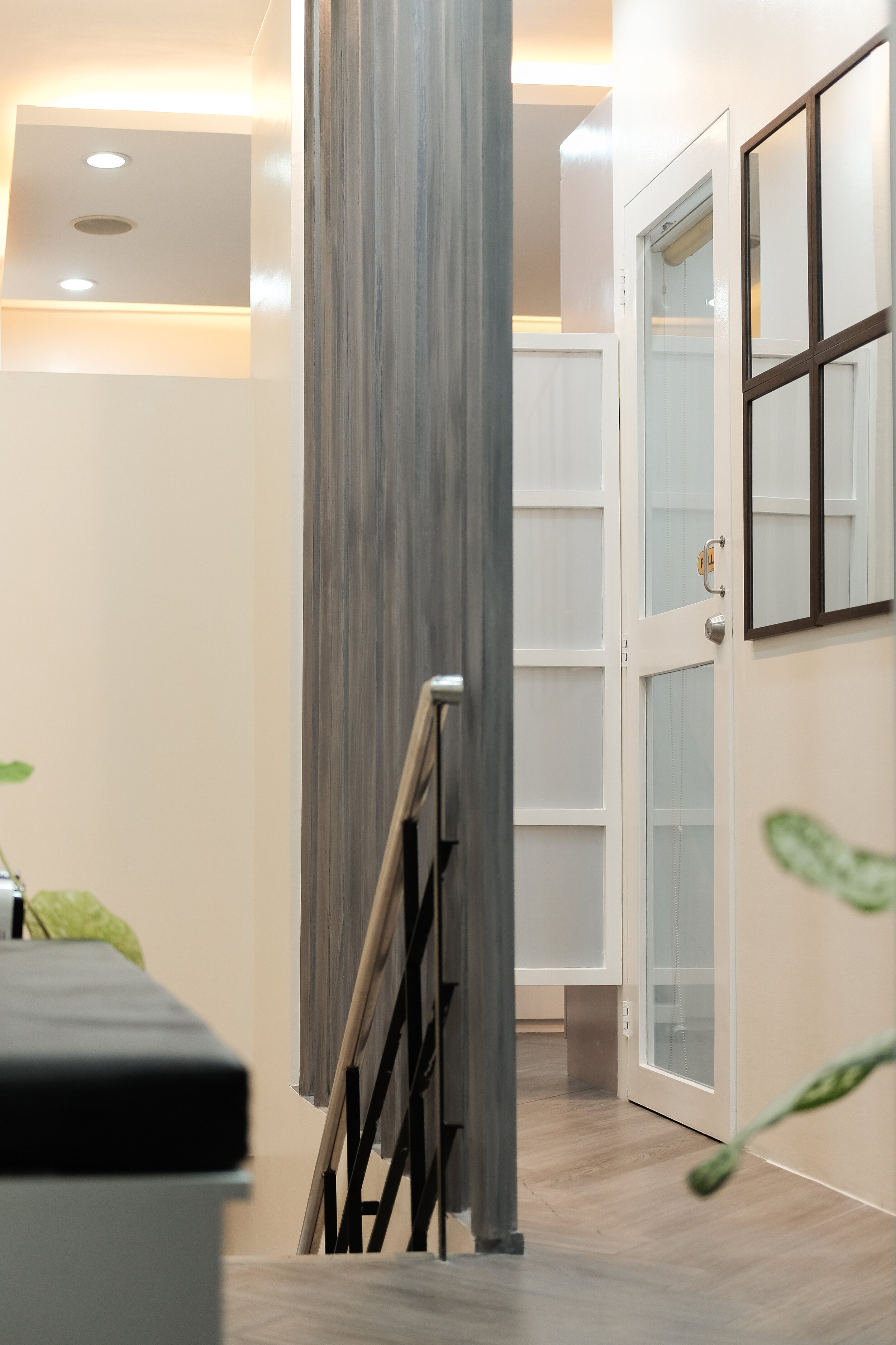
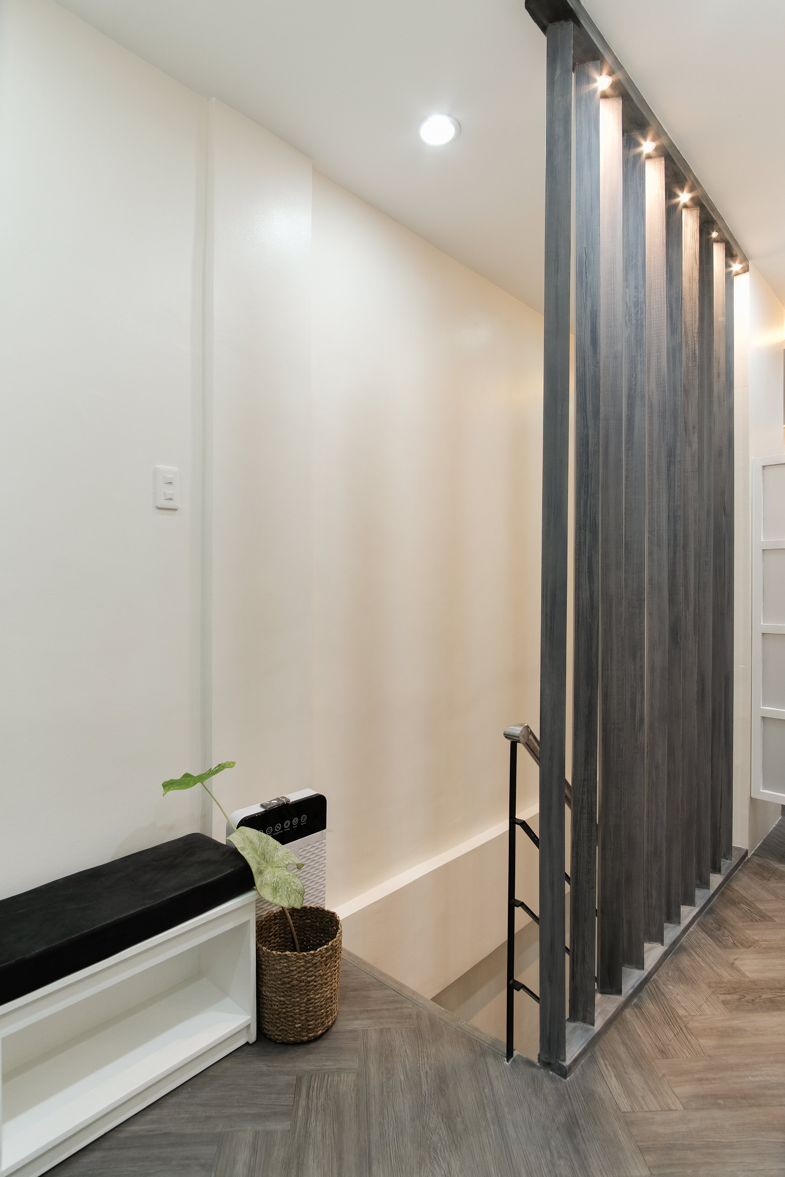
Before transforming the 2nd floor hallway, it had such an outdated look with pops of color orange on the walls and floor. We were thrilled when the clients told us that they wanted to change the flooring for this area.
Considering we wanted to keep the entire clinic's look clean and inviting and didn't want to do major work on the flooring, we decided to use vinyl wood tiles since it's light and easy to install and maintain. Since the walls on the 2nd floor hallway are plain and neutral, we installed the tiles in a herringbone pattern to give character and personality to the space. This was continued throughout the other areas of the 2nd floor. We love how it turned out and are happy to see the herringbone floor of our dreams come to life!
One of our client's wishes was also to change the 2nd floor stair railing into wood slats that run from the floor to the ceiling. We loved the idea but didn't want to give them a straight and forward layout. We installed them at an angle and added small pin lights in an alternating order to illuminate this architectural detail. Eventually, this came to be the highlight of the 2nd floor hallway.


Most Memorable Experience
Our most memorable experience would probably be the construction phase and the turnover of the project. Getting projects while in a pandemic is scary but a very big blessing that we're grateful for. We had challenges due to COVID lockdowns and restricted movements but in close collaboration with our clients, we wanted to define the style that most represents them and the feeling they want their clients to feel in the environments we create.
It was also very heartwarming and humbling to hear from them how much they love the outcome! Lucky for us, they were such an easy client to work with and they trusted us completely with the design and decisions. We also love seeing the outcome, how our vision was turned into a reality and how we can always look back at it through the photos from the shoot.
Contact the Interior Designer
IDr. IDr. Victoria Pariña of Likha Studio
Instagram: @likha_studio
Facebook: Likha Studio
Website: www.likhastudioph.com
Email: likhastudio.manila@gmail.com | likha.db.studio@gmail.com


