A Barbershop Fit for a Modern Contemporary Gent
Design and Words by IDr. Lesly Yiu
Project location: 48sqm, two storey space in the heart of the quirky collective of Cubao Expo | #3 General Romulo Ave, Cubao, Quezon City, 1109 Metro Manila
Inspiration
Design inspiration came from the client's request to create a space that is both appealing enough for the modern gent but also unintimidating for their counterparts. They wanted to create a barbershop that is also a communal space where different people can hang out in. We wanted to draw from the "kwentong barbero" concept but with a modern twist.
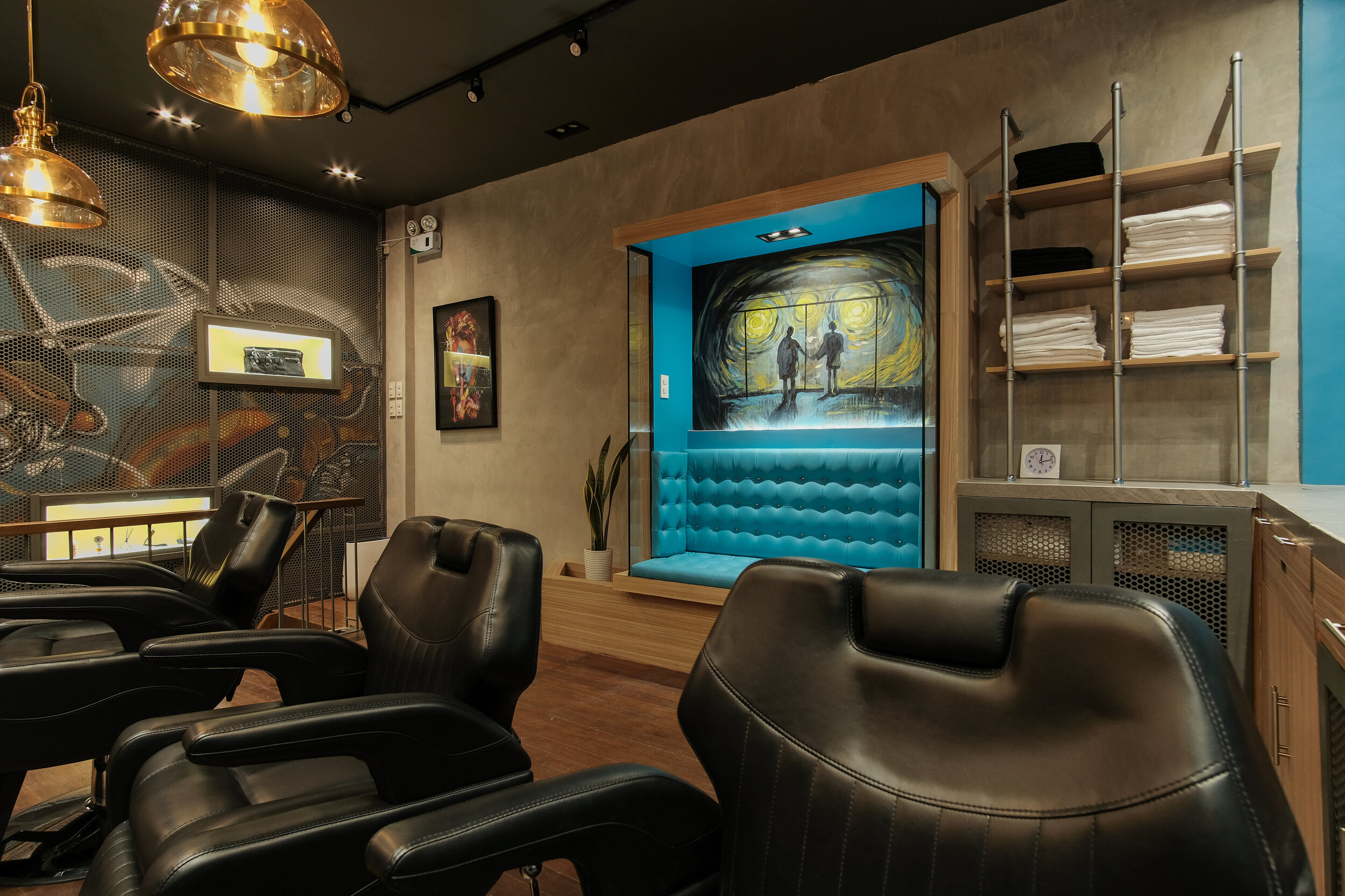
The design for this berbershop is a modern approach of incorporating contemporary art into interior design. It is a playful mix of clean lines and rough finishes, bold color accents and different textures. Everything in the space will give one something to be curious about.
Accent Wall
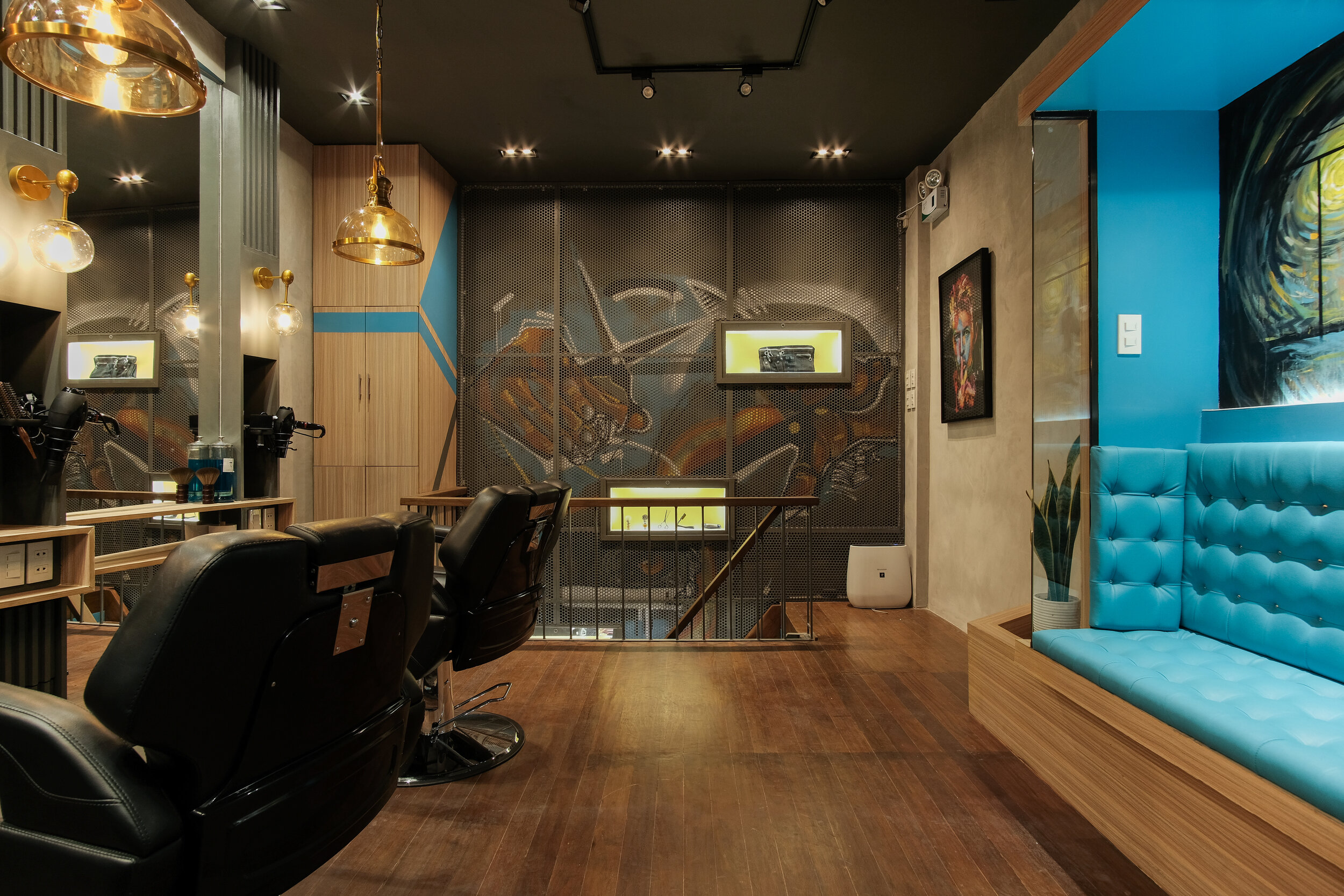
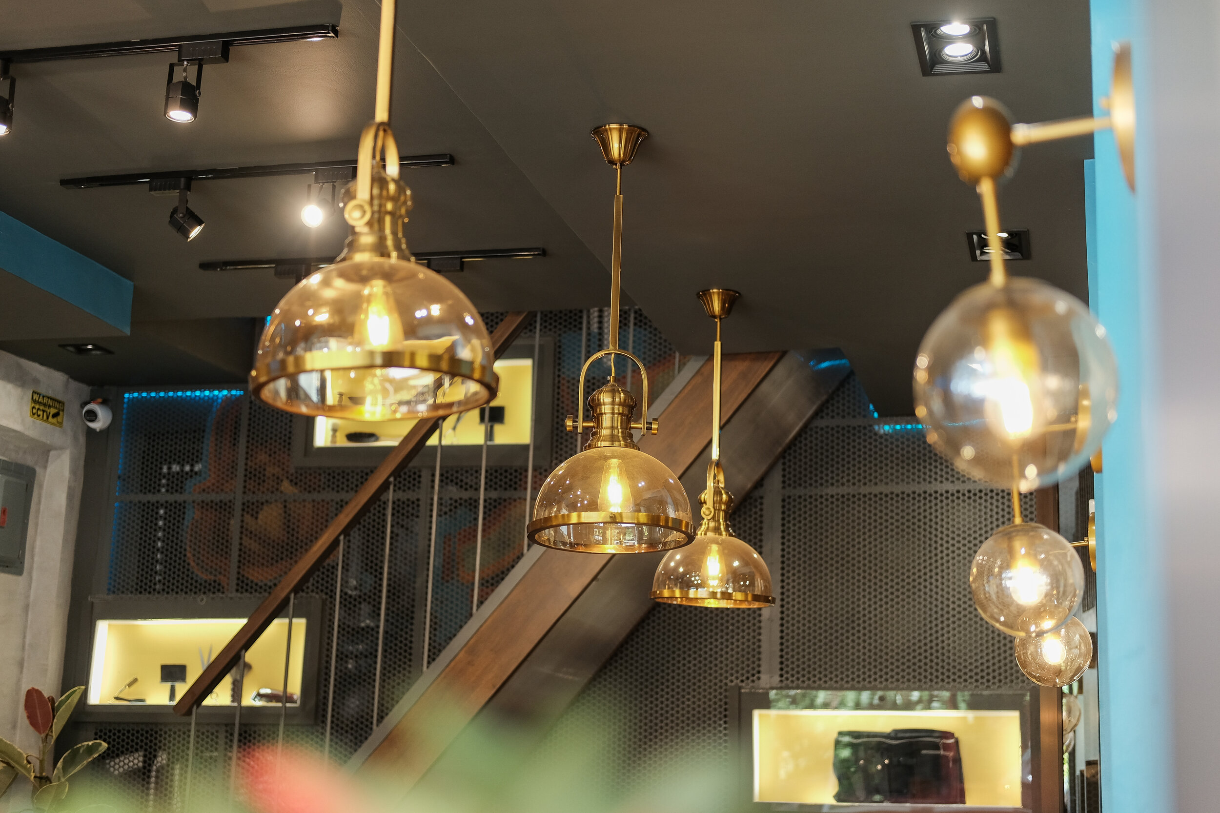
One of the design elements in this space is the accent wall. We collaborated with a local artist for the feature wall to make it unique and in line with Barbers Tale MNL brand. The wall was big enough that we also incorporated lightboxes that act like window displays when you go up to the 2nd floor. This draws the eye to the 2nd level of the space. This wall also transforms the mood of the whole space when the blue striplights around its perimeter are on. Once the general lighting is off, and only the accent lights are on, then it becomes a whole different space altogether. The perforated sheets also tone down the whole wall feature and ties everything into one whole art piece.


The Bifold Front Window
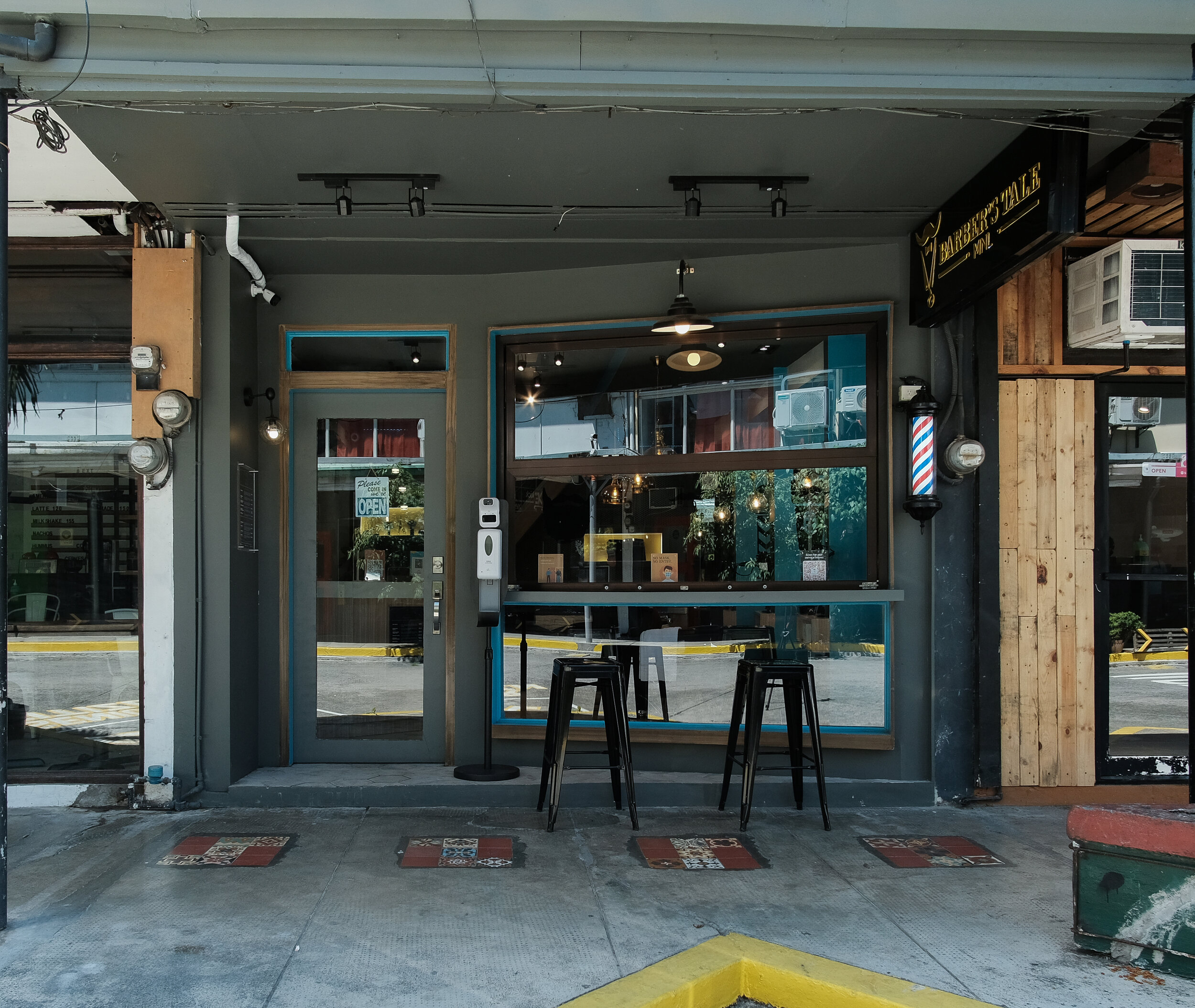
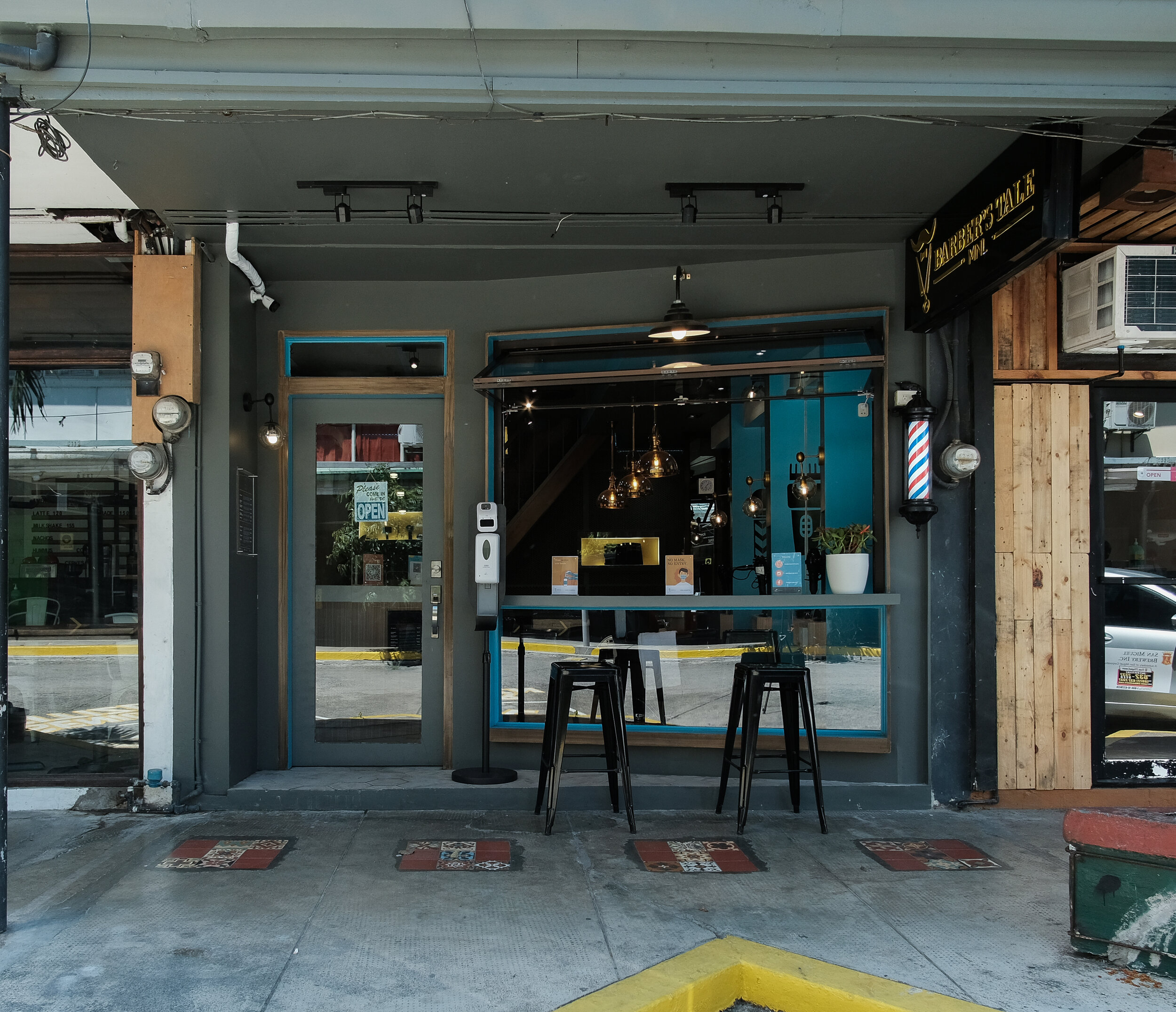
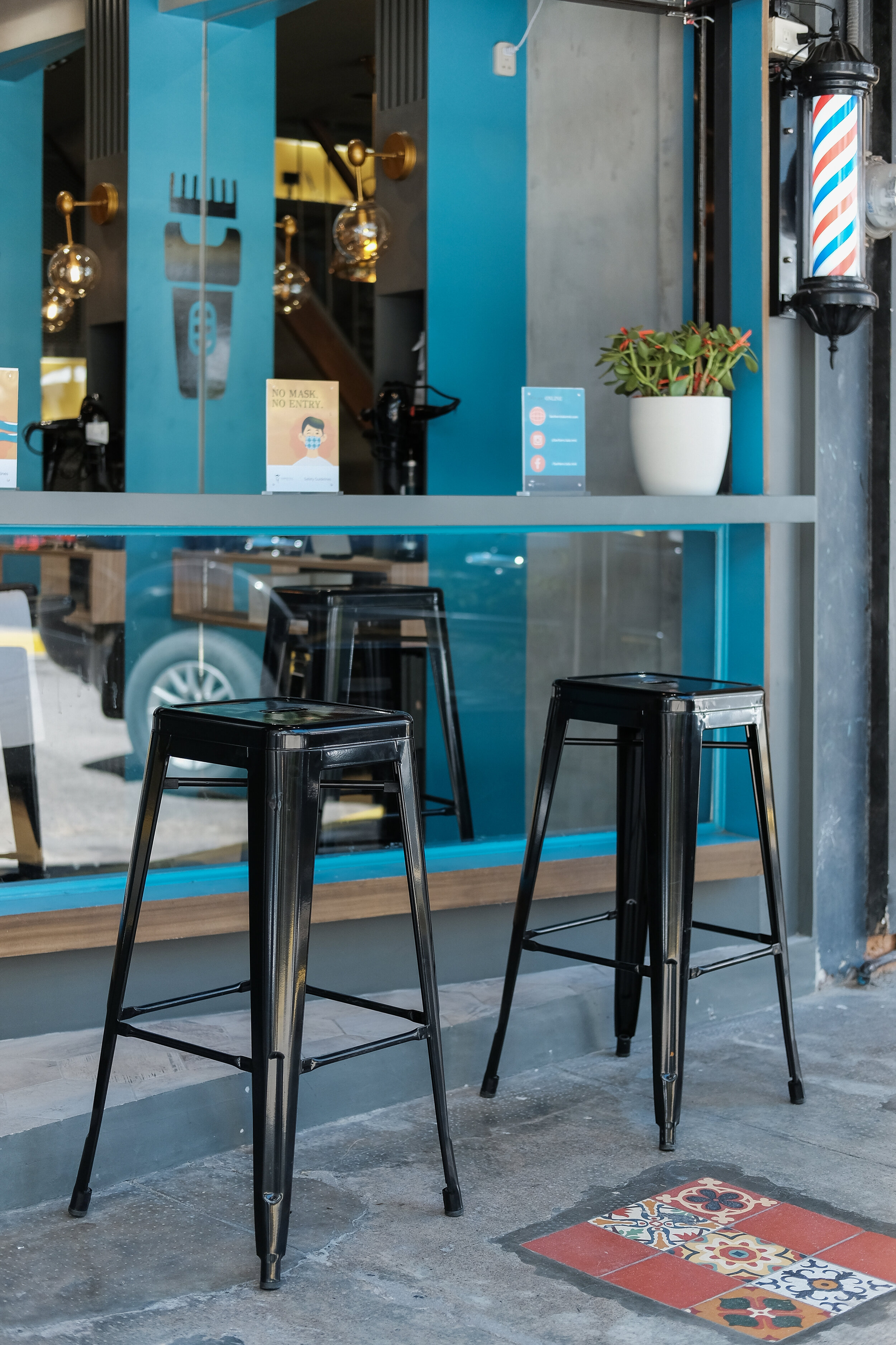
The Vertical bifold window gives the space a sense of adaptability. We wanted it to be adaptable to different scenarios given that we live in unpredictable times. We've also provided barstool seating inside and outside so that when the window is open it gives a sort of "kwentong barbero" type of feel, just people hanging out in the local barbershop listening to each other's stories. When the windows are closed, it becomes a photo op area where you can align your face to the decal stickers of different types of beards.

Floor Pattern Design
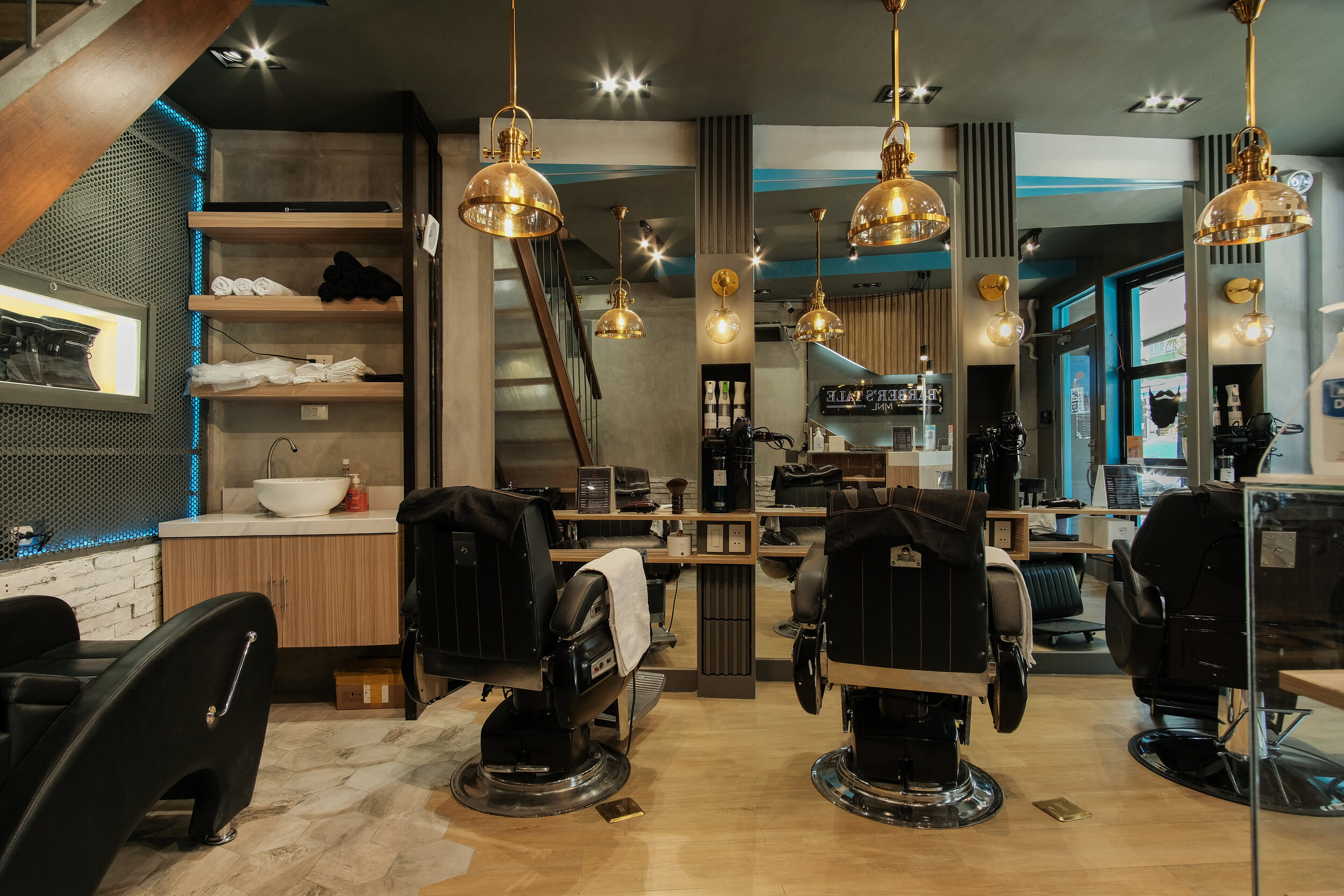
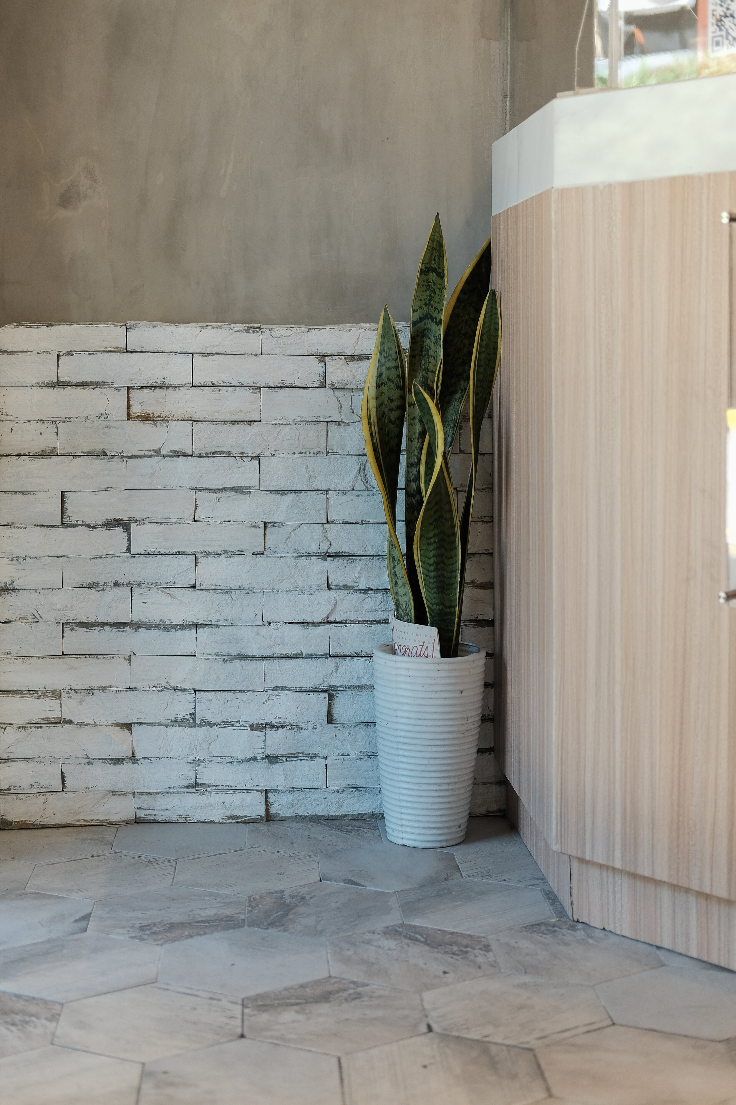
The new floor pattern was only applied to the ground floor since we wanted to keep the hardwood floors on the 2nd level. We used a combination of hexagonal tiles and wood tiles to give movement to the design once one enters the space.

The Optical Illusions
Another design element was the half decals by the full length mirrors of each station that also functions as an optical illusion and a play on the imagination. It is a simple way to make the space look bigger.

The 2nd Floor Waiting Area
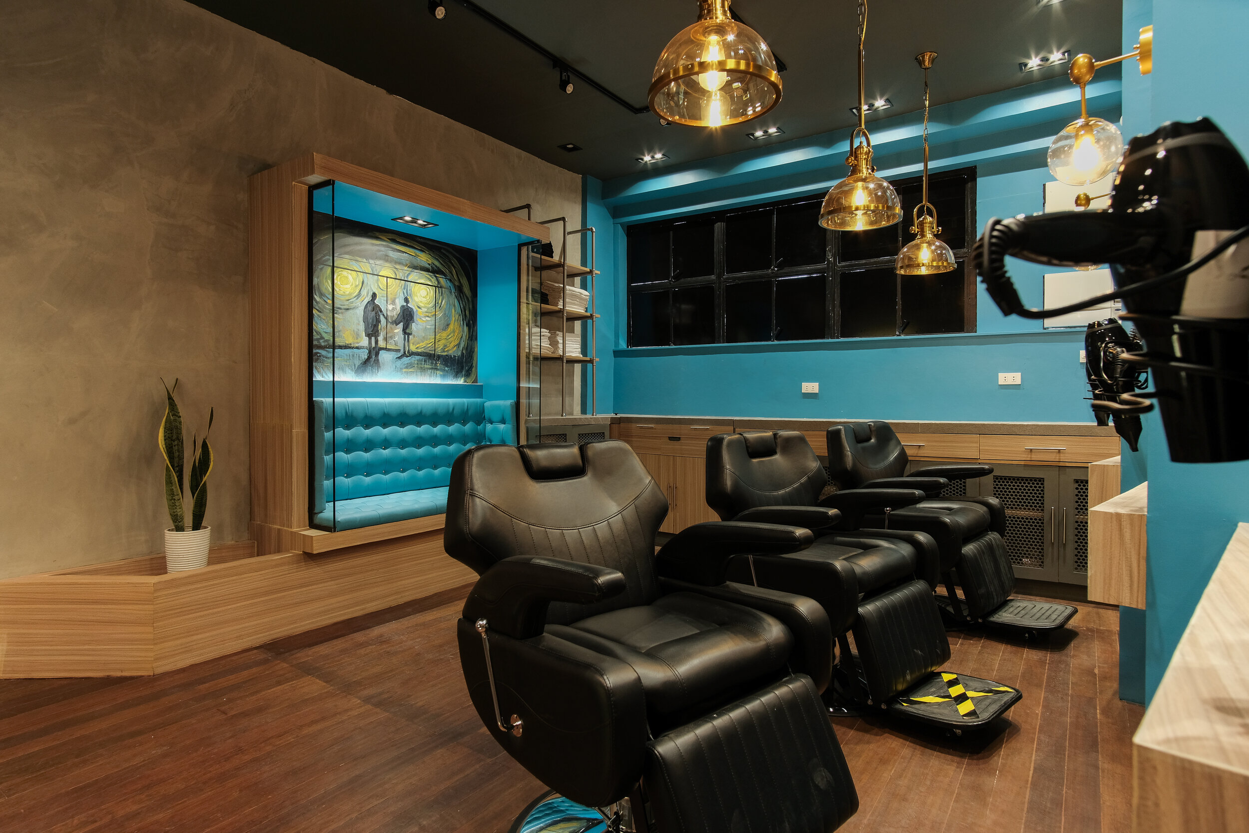
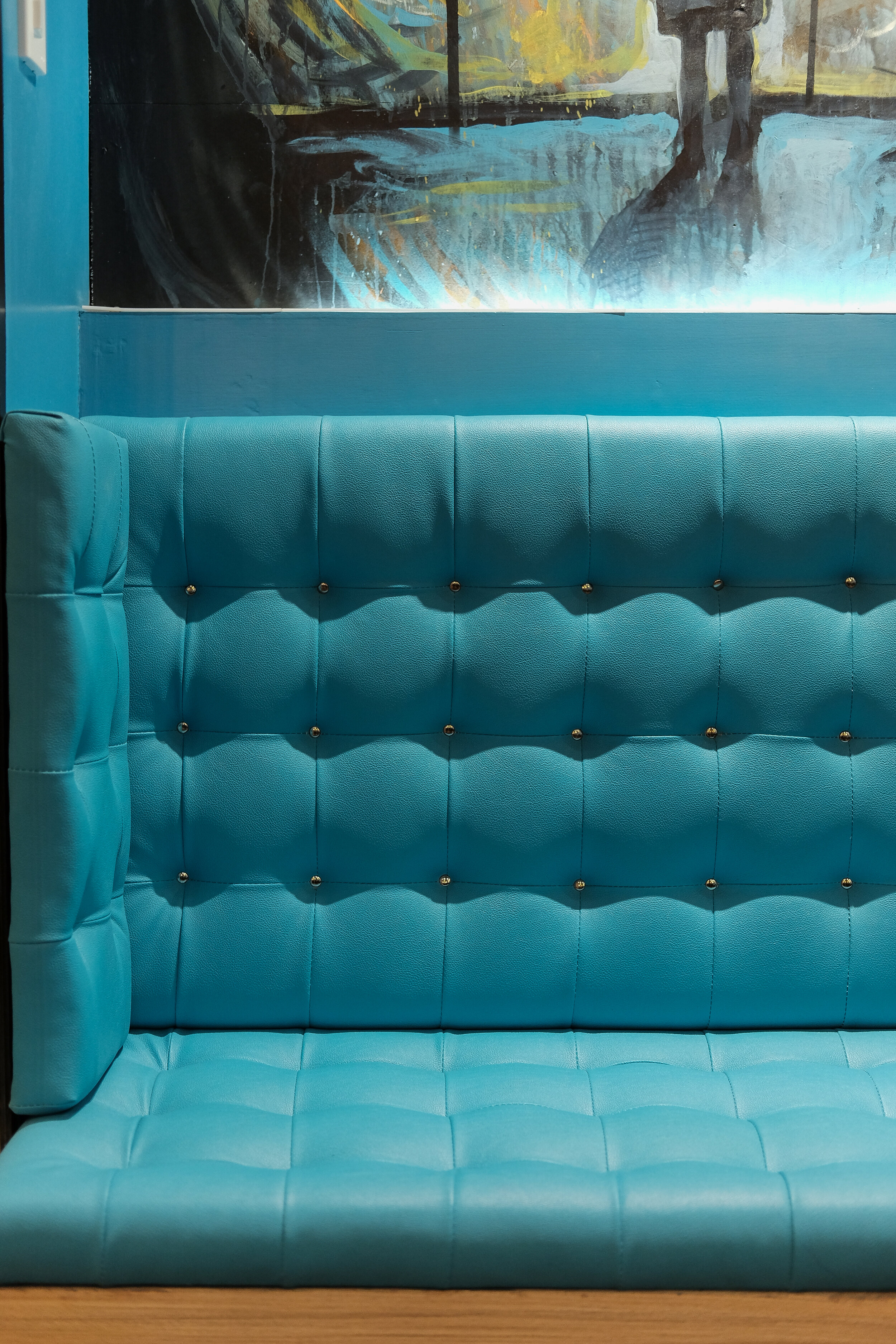
The second floor waiting area is another Photo op space one can enjoy. The artwork featured above the booth is another commissioned artwork with a local artist. It is an homage to the final scene of Fight Club which the clients are fans of.

Most Memorable Experience
The most memorable part of the process was when we were able to test out the lighting in the whole space. The different lighting gave us different moods to work with which was part of the whole concept from the beginning, to be able to control the ambiance of the space. Each design element in the barbershop is an art piece on its own but when you look at it as a whole, everything ties in together. The best part of the design phase was when the clients trusted the vision for the whole space. This gave us a chance to see the transformation from rendered perspective to reality.
Contact the Interior Designer
IDr. Lesly Yiu
E-mail: idrleslyyiu@gmail.com
Mobile No.: 09175520331
Instagram: @IDrLeslyYiu_Interiors | @lesyiu
Facebook: LYIU Interiors

