The Contemporary Scandi
Design and Words by Imperial Architects + Design
Project location: Sandstone at Portico, Pasig City, Philippines
Floor Area: 80 square meters
Inspiration
The style of the home is Contemporary-Scandinavian Luxe style design.
We envision their unit to reflect who they are, to create as well a sense of luxury without being too overpowering but still has an element of Scandinavian that is beautiful, functional, refined, warm, and subtle in character.
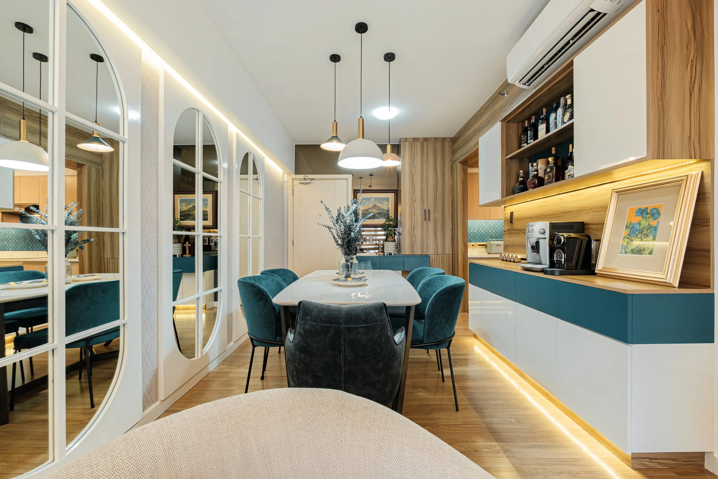
Leaning toward’s client’s favourite hue, We combined with it the use of natural wood, soft hues, textures, clean lines, and simple curves. We also chose contemporary furnishings, marble tops and added shine from mirrors and gold accessories for that luxe vibe. Greens and abundance of natural and artificial light also played a major role in brightening and opening up their space, completing the Contemporary-Scandinavian Luxe feel.
Client is a young newly wed couple & both lawyers and they wanted their first home to be maximised to the fullest extent possible. They specifically mentioned additional storage space for every area, coffee nook & alcohol cupboard, working area, book shelves, paintings, toy & art figure collections, vinyl set, & lounging area while watching TV or playing PS5.
Ceiling
We just maintained the ceiling height and chose statement lighting pieces that will accentuate each area. Plus client has allergies so we try to avoid dust collecting structures like cove ceiling.


Lighting ( Dining & Living Area)
Aside from the natural light we get from the full size windows during the day, we incorporated hidden lights in our built-ins and on the wall side to infuse mood and ambiance especially during the night.
Laminate for built-in cabinets in all areas
Easy to clean & maintain (low maintenance) compared to just paint. Gives a superior & cleaner look and long term wise is much practical.


Blue-green Laminate (Code: Casa Pearl)
This is the client’s happy hue. We sourced the perfect shade and used it as the accent color for the main areas. We balanced it out with greens, wood and neutral colors.

Mini Foyer
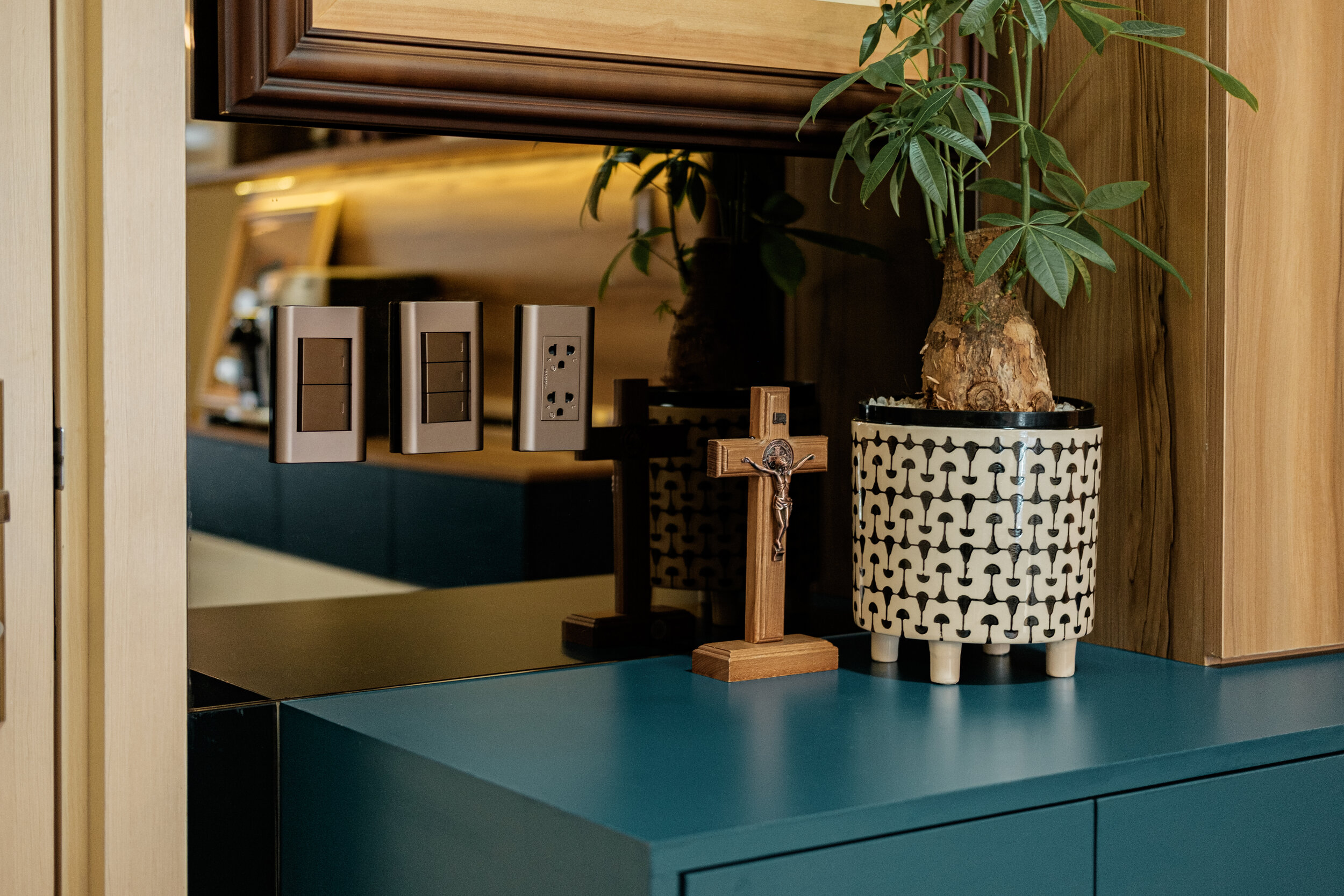
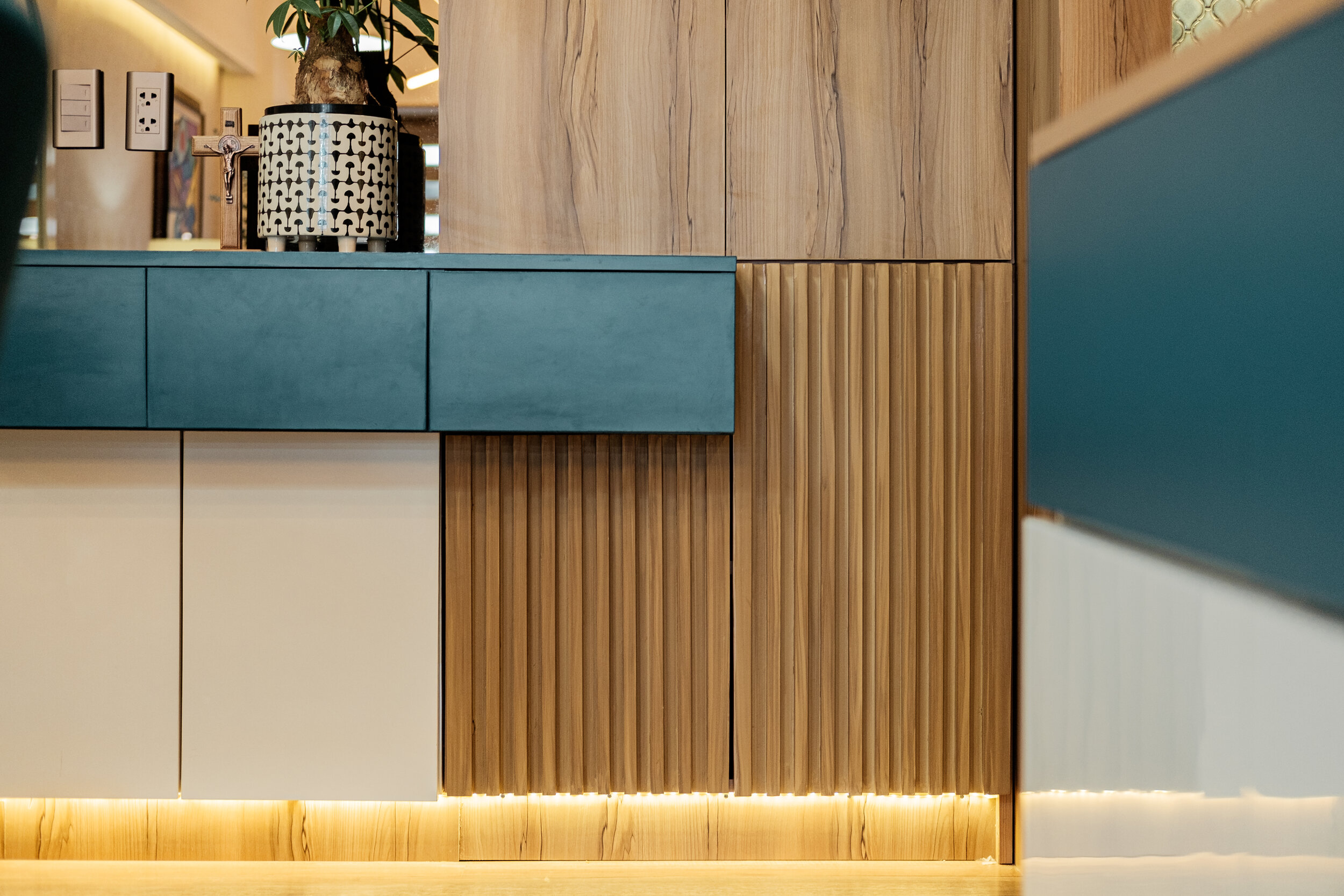
With the situation we are in right now and upon seeing the entrance area, we developed the space as their mini foyer maximising it as a discreet storage for there shoes & small items like keys, bills, notes, etc. as well as sanitizing paraphernalia. We then added a small partition between the full height shoe cabinet and the kitchen to create division.
As this is the entrance area, we also wanted to enhance this part with their art piece collection of Mayon Volcano by using Bronze mirror because it reflects a luxe kind of warmth & light. This priceless piece has more to it than just an old painting because it has a sentimental value that was passed on by his late great-grandfather.
Kitchen
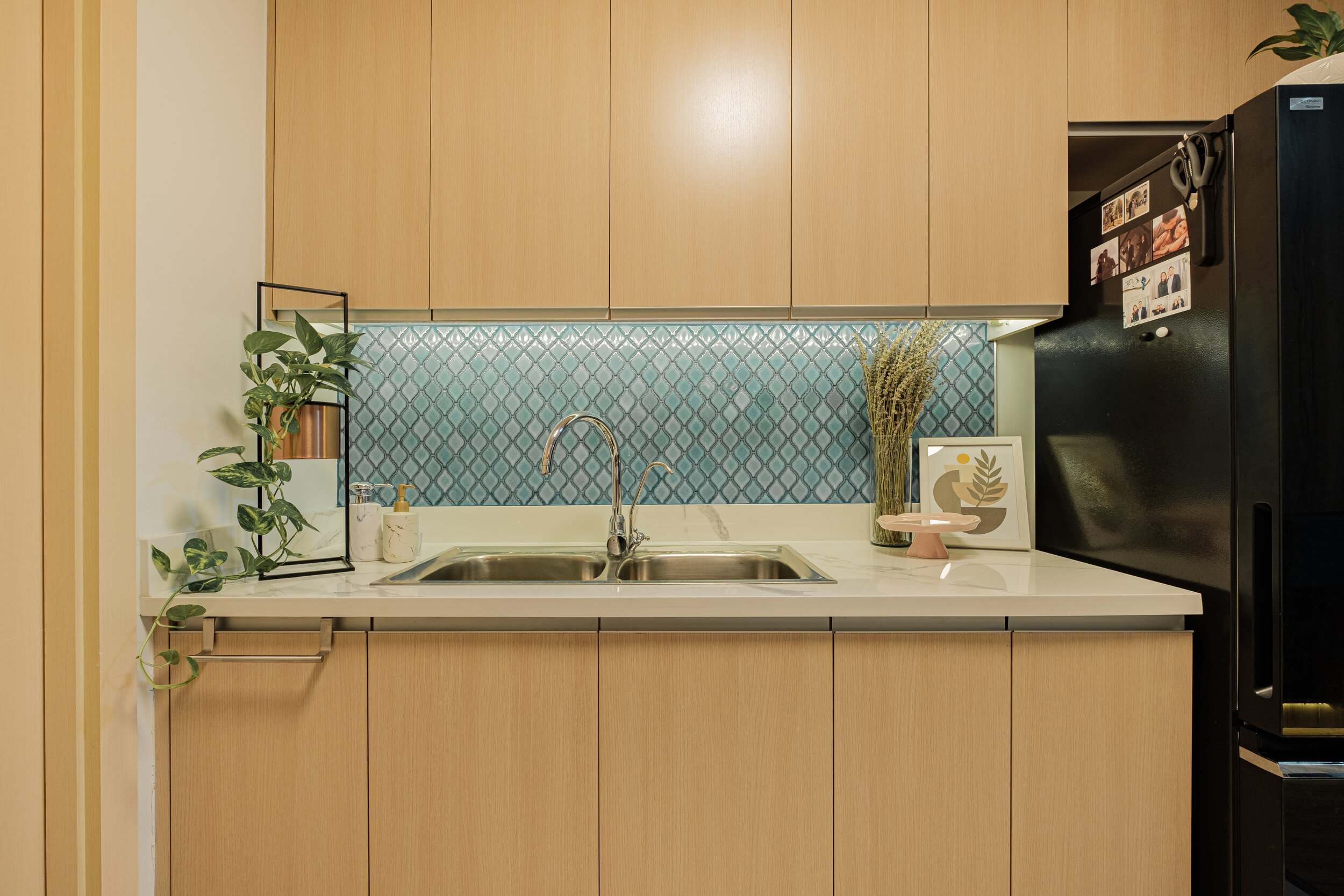
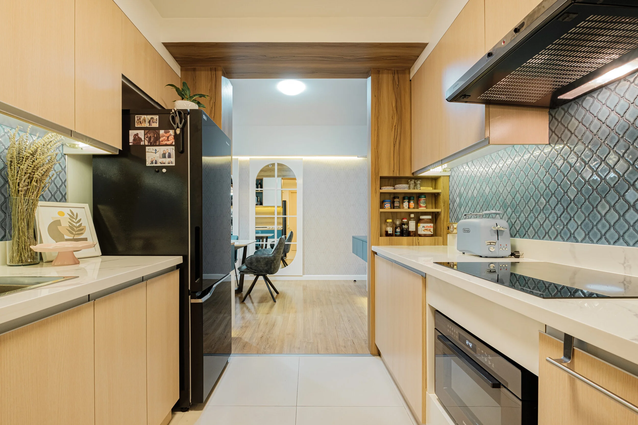
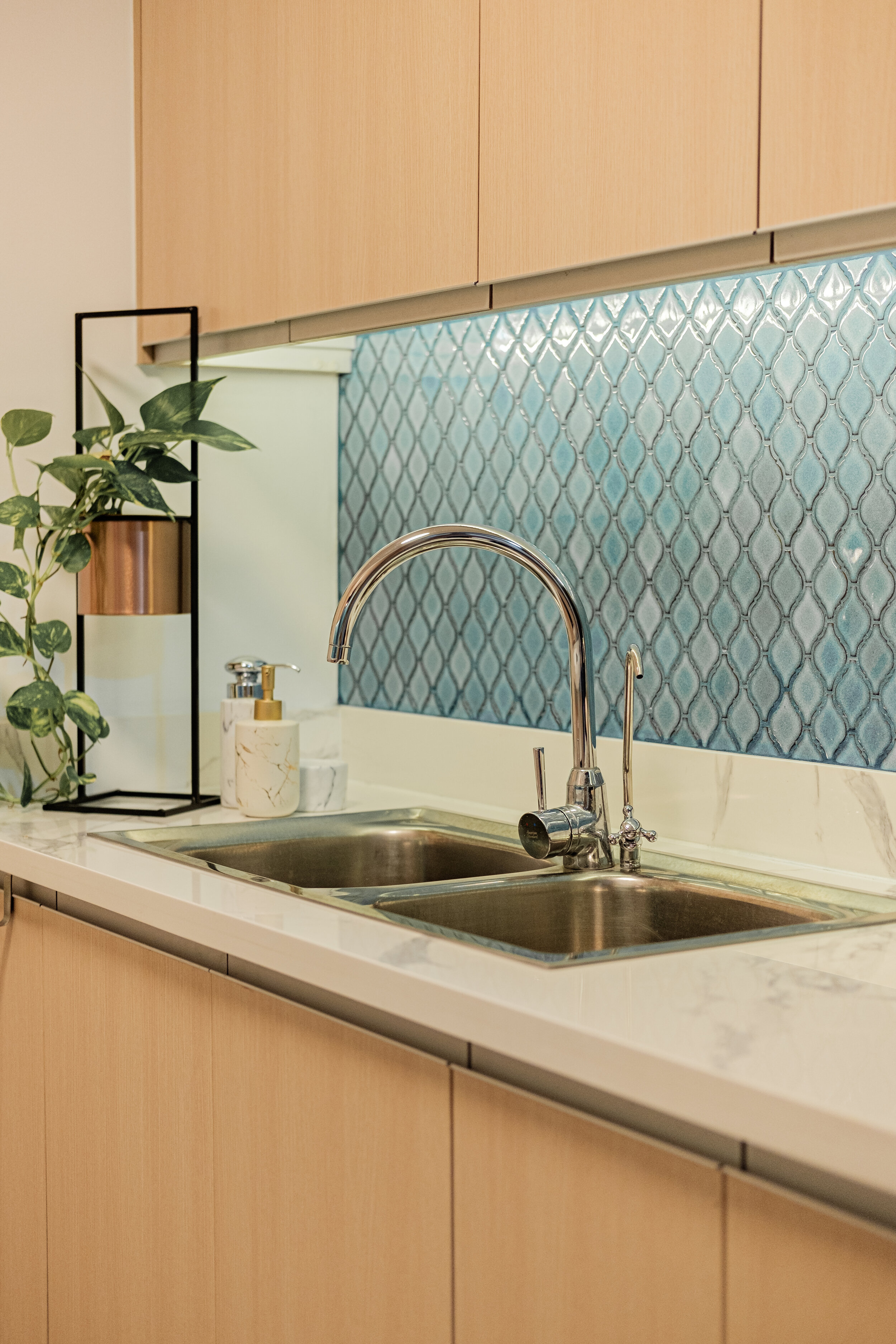
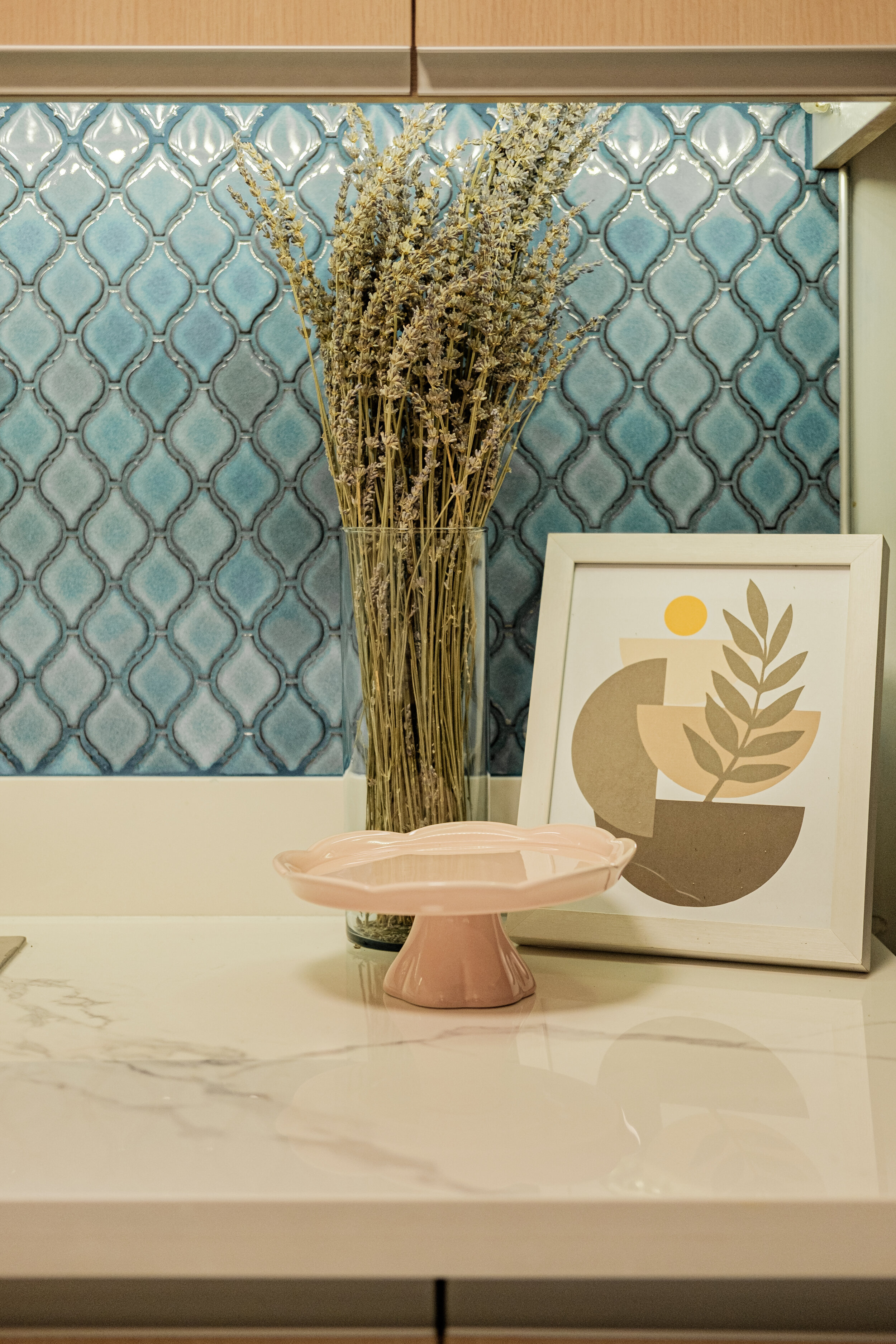
We replaced the existing black countertop to a white carrara marble to achieve a luxe sense of a cleaner, brighter & spacious look. We maintained the existing laminate color of the cabinets and with client’s favourite hue in mind, we chose this nice blue-ish mosaic pattern to compliment the white countertop & cabinet. The combination creates the character it needs, not too heavy but very refreshing to look at.
We also maximised the partition between the mini foyer and kitchen thus creating a small nook for spreads and condiments.


Dining Area
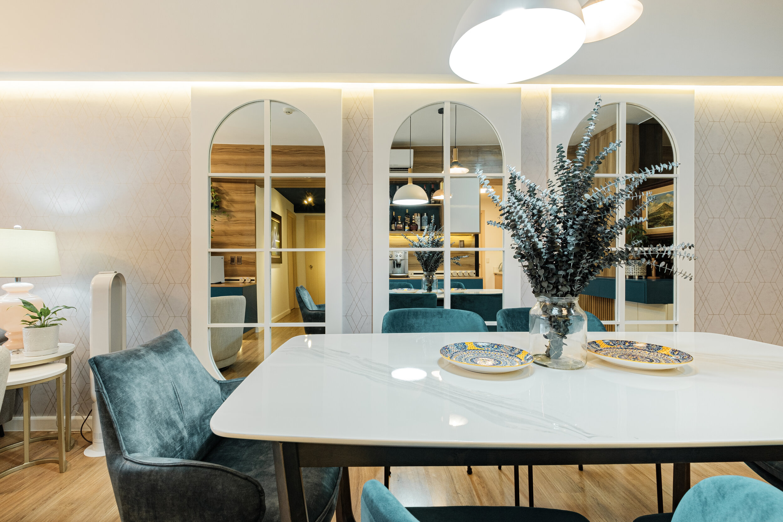
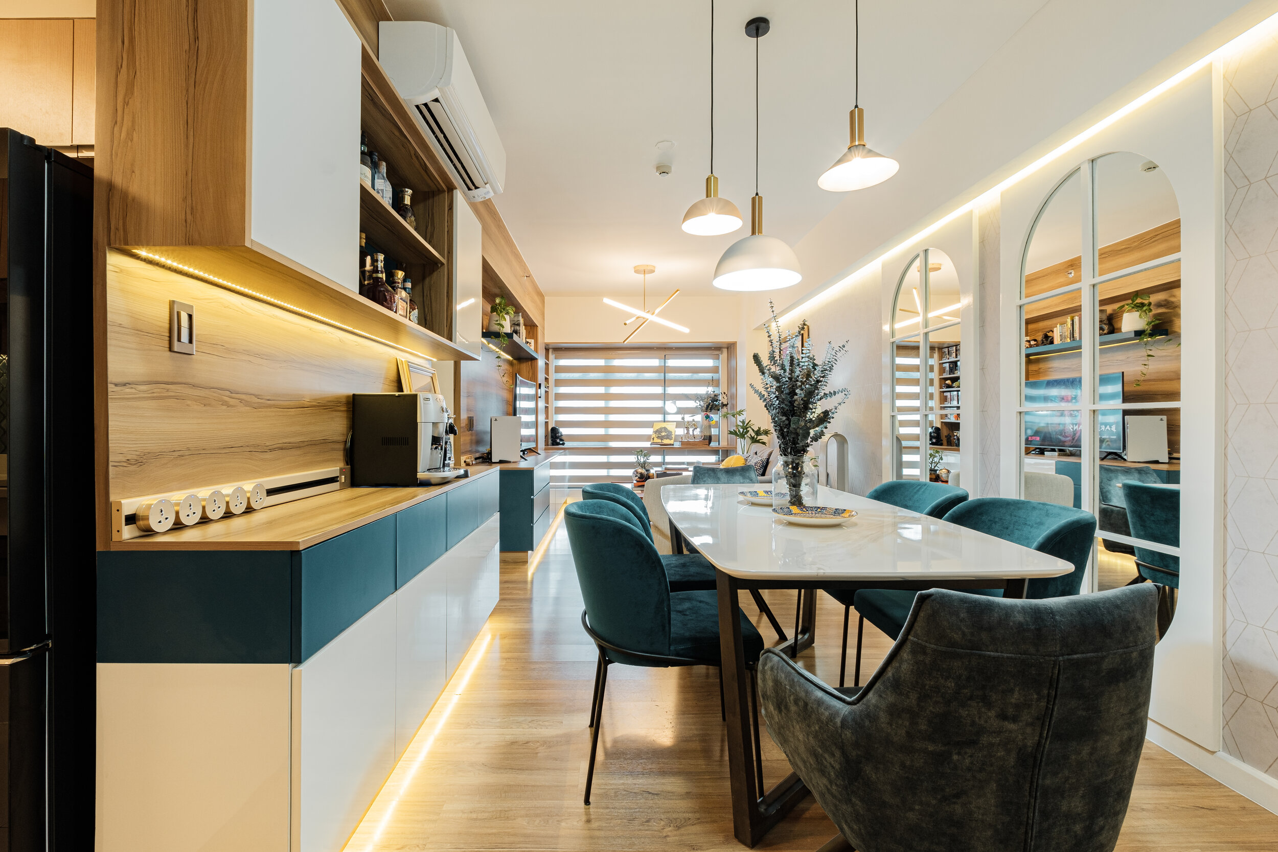
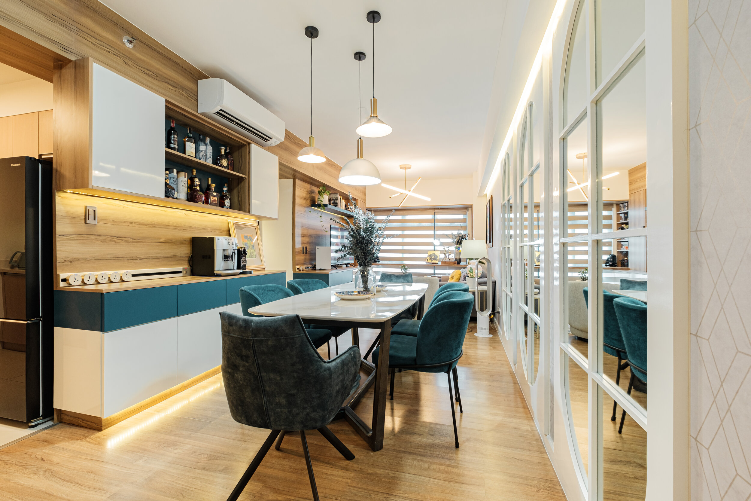
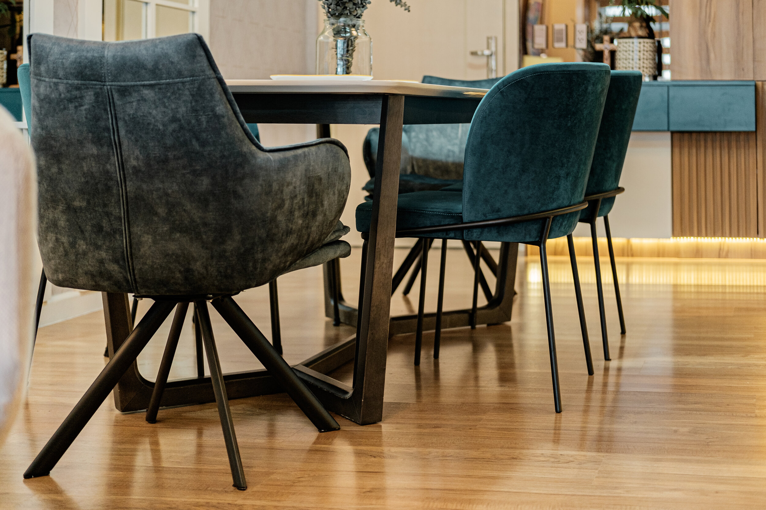
The first thing you’ll see upon entering. We wanted to visually trick the eye of a wider space by adding window looking mirrors. Mirrors are aesthetically pleasing and it amplifies the light coming from the center and sides making their dining area much brighter and grander.
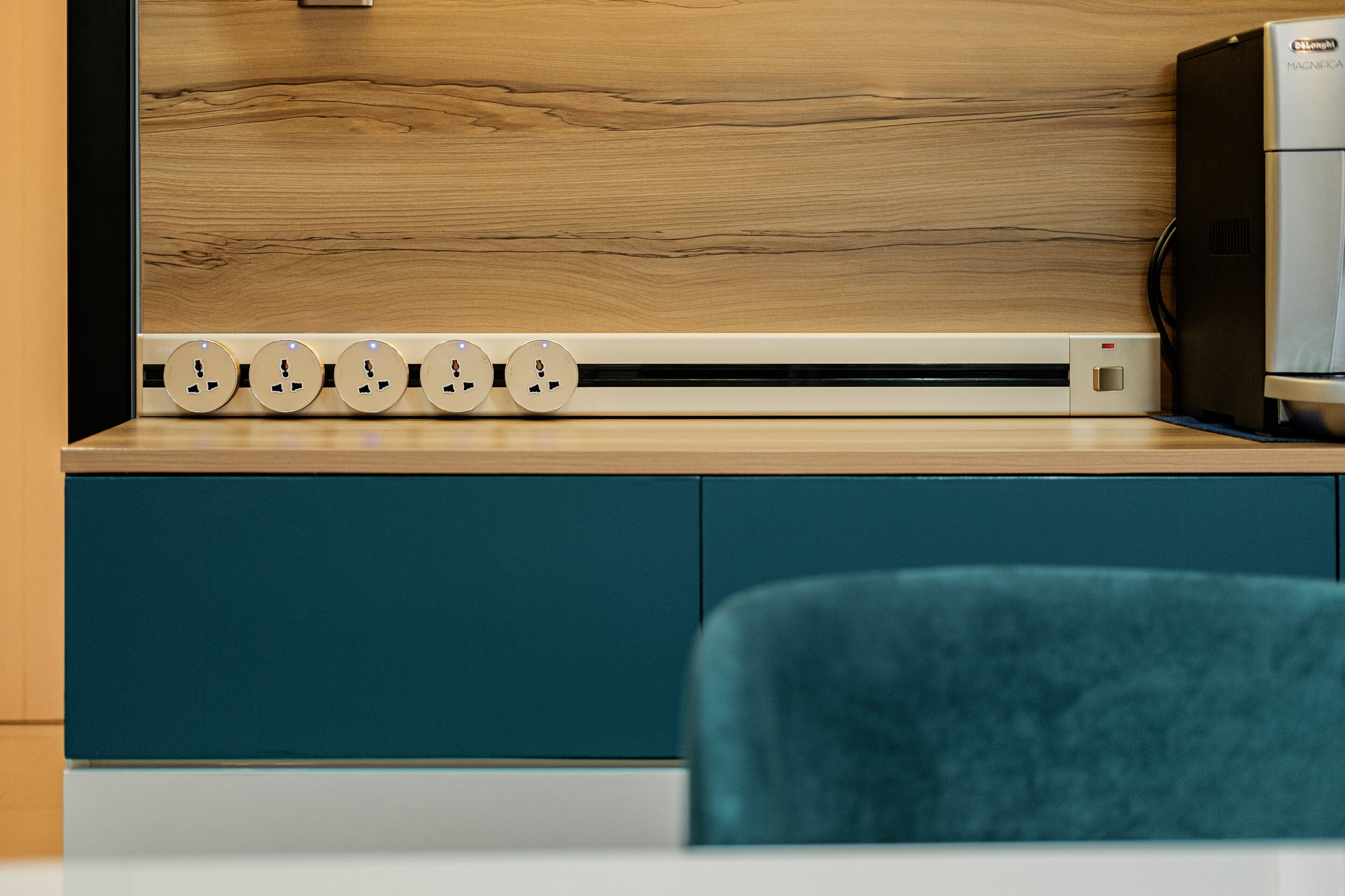
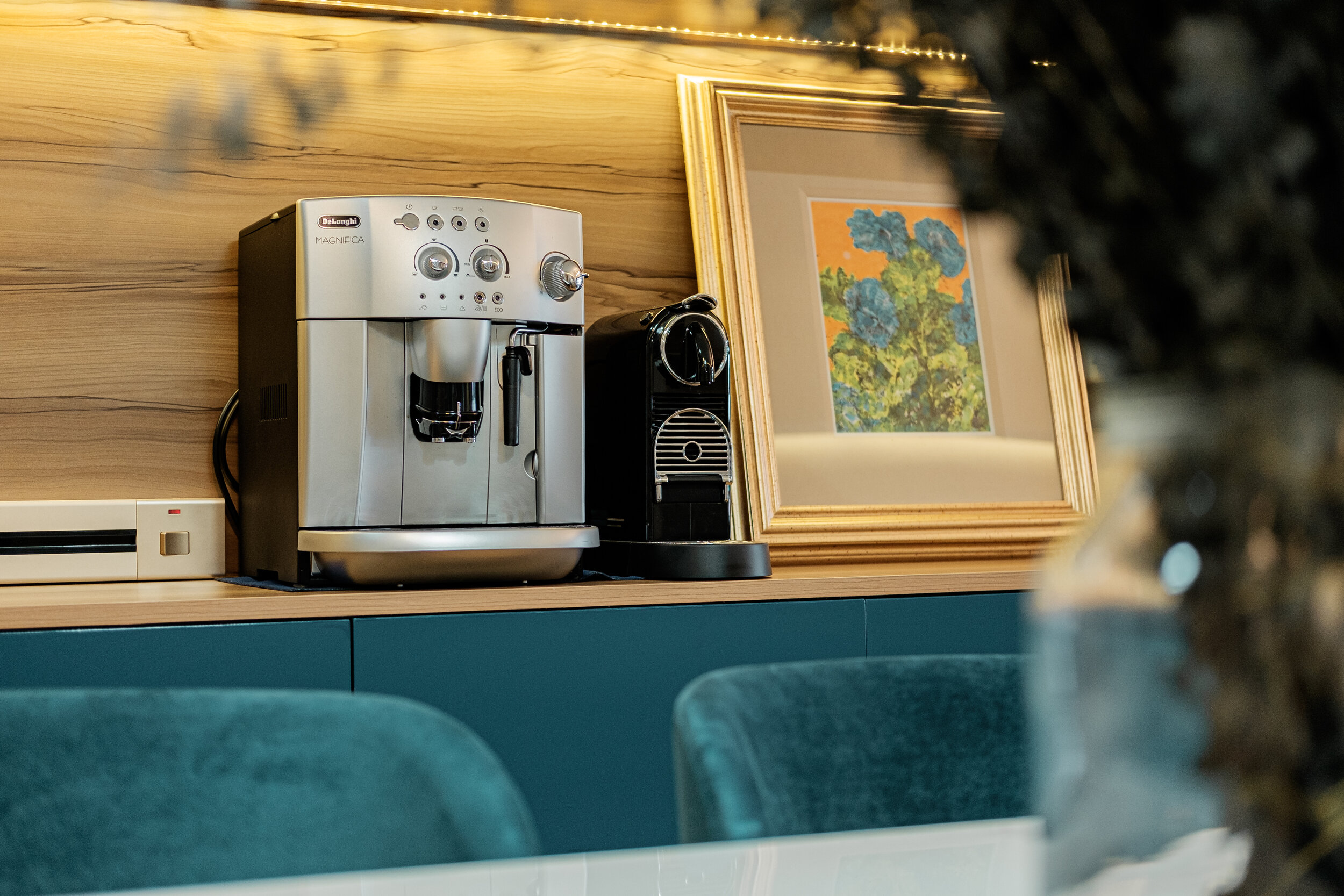
We also wanted to showcase their liquor collection by creating an opening in the overhead cabinet with the accent hue as the background. We also placed here their 2 coffee machines, closer to the dining area and so as to free up the space in the kitchen counter.




Living Area
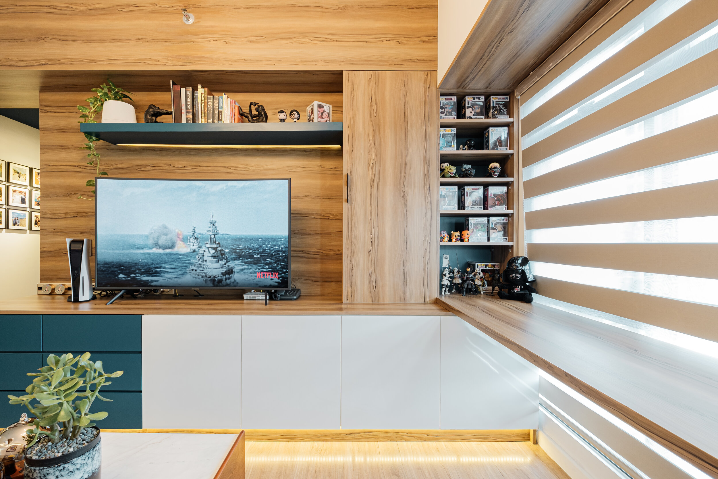
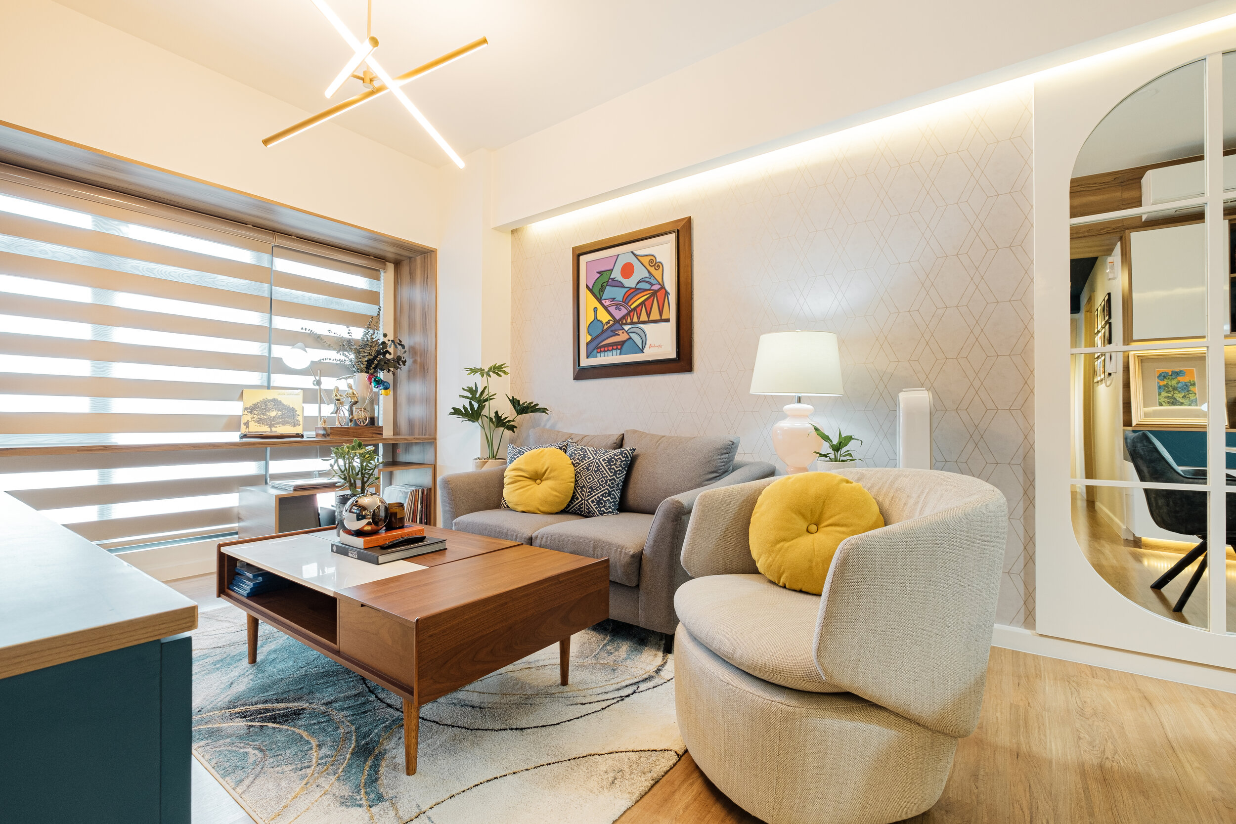
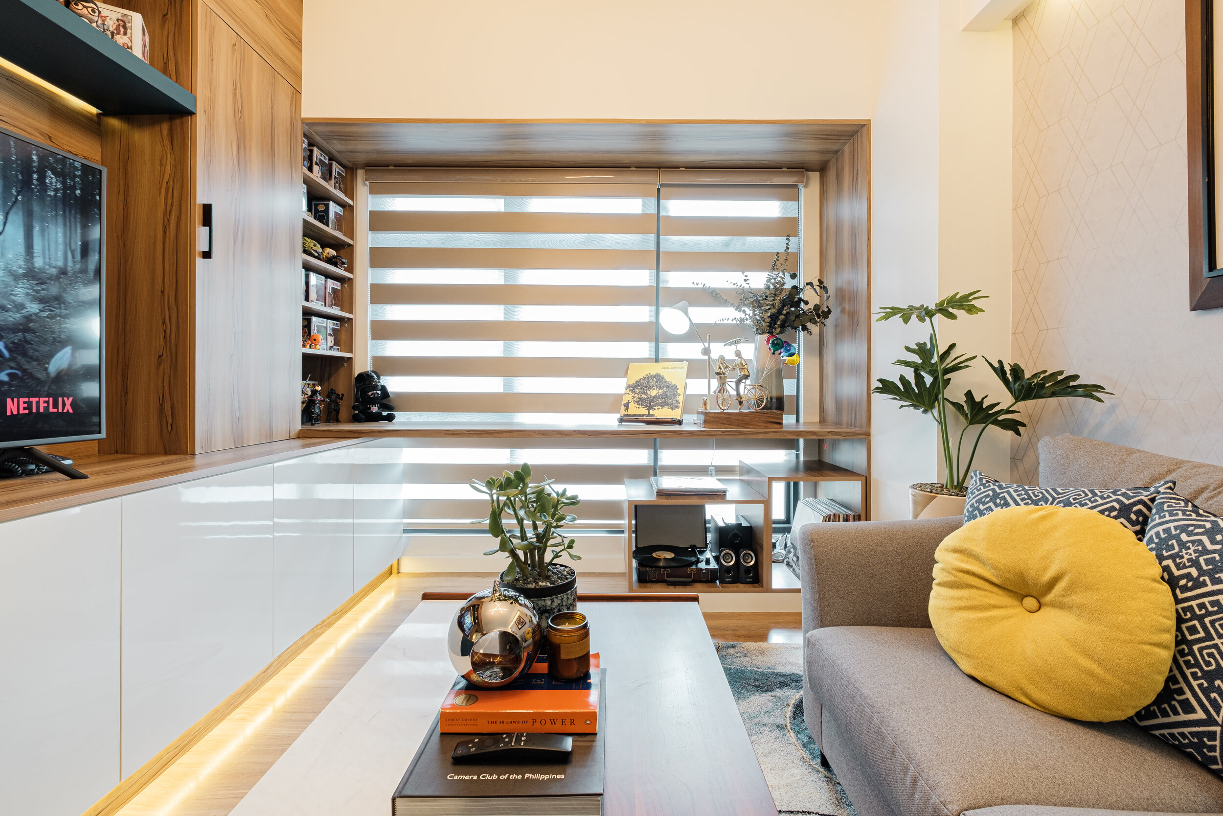
The design goal is that we maximise this area not just for lounging, relaxation & display but also as working area for days that client has to work from home. To do that, we designed a full stretch window ledge that extends to the TV cabinet and also supported with an open cabinet on the other side to accommodate their vinyl collection set.
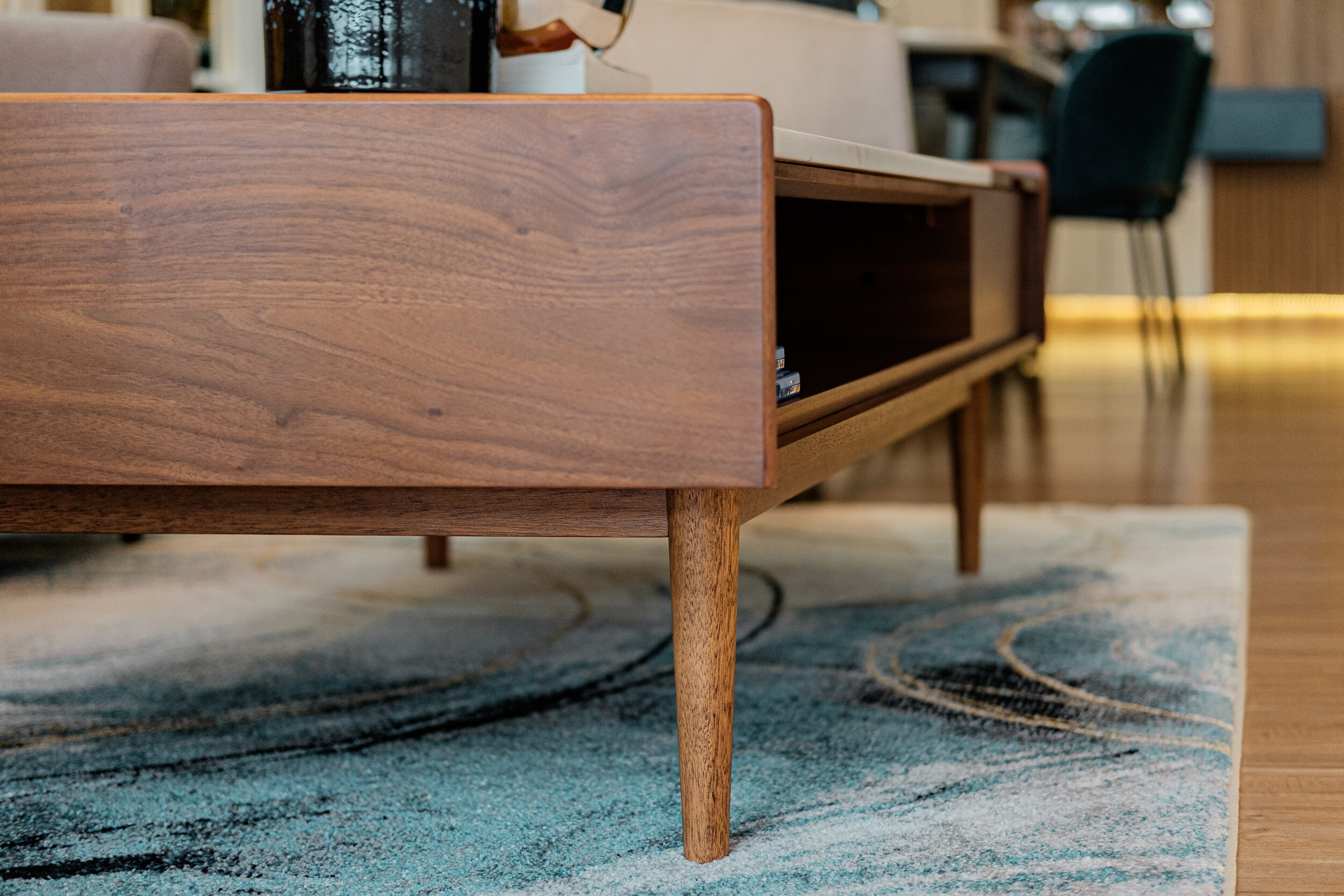
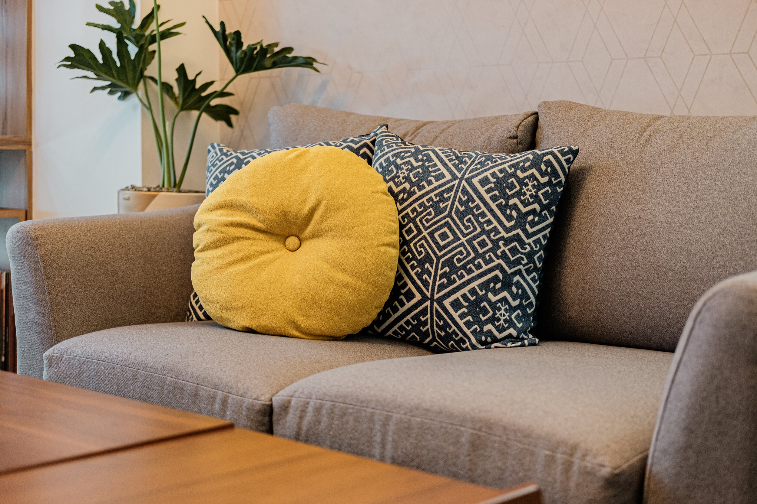
We also made sure to design the TV cabinet with enough storage underneath as well as an open and concealed book shelf and a corner for their toy collection. We also chose a center table with double purpose that has a lift top mechanism making it ideal to use as a desk and to keep small items inside. We also love the swivel chair we got as it is not restricted to face one area plus very relaxing to sit on.
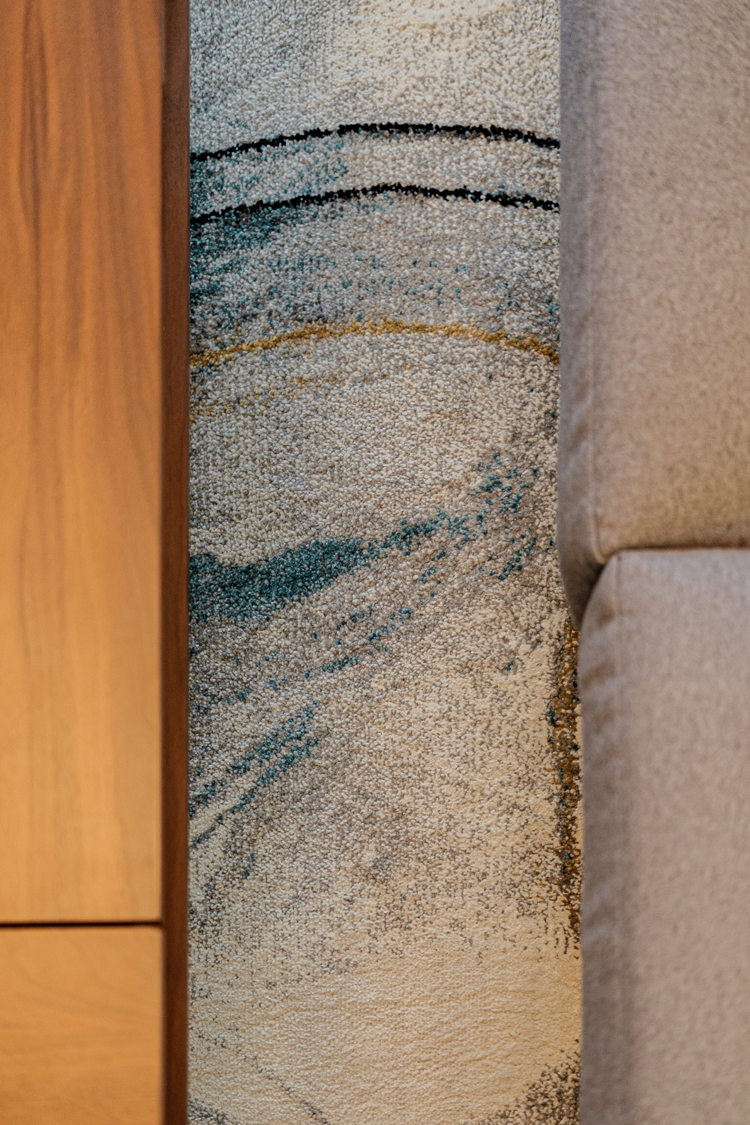
The painting by Imao also speaks charm in their living area as the colors stand out from the rest. We also added a sleek geometric wallpaper pattern on the whole wall to highlight this side. And to complete the look, we added a chic stylish area rug to bring life, texture and softness.



Mirrors
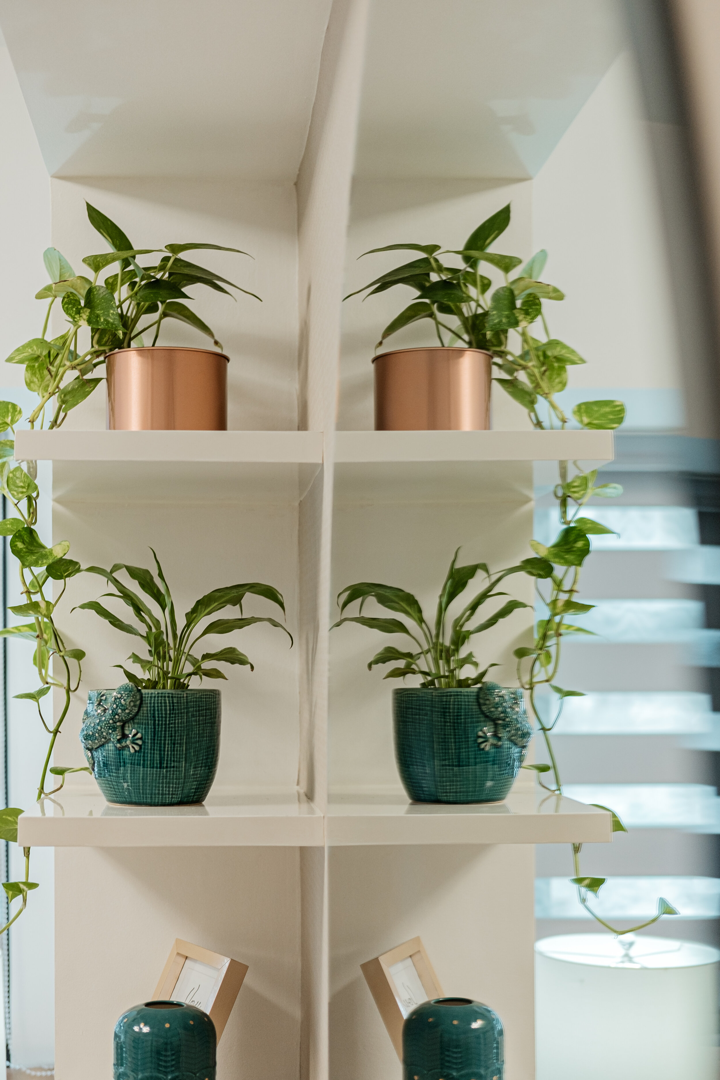
We wanted to create the illusion of a bigger space by using mirrors particularly in their mini foyer, dining area, bedrooms & bathrooms with different approach to match the intent of each area.

Fabric Upholstered Furniture
Breaks the stiffness of laminate. The use of texture adds warmth to every area

Kid’s Bedroom
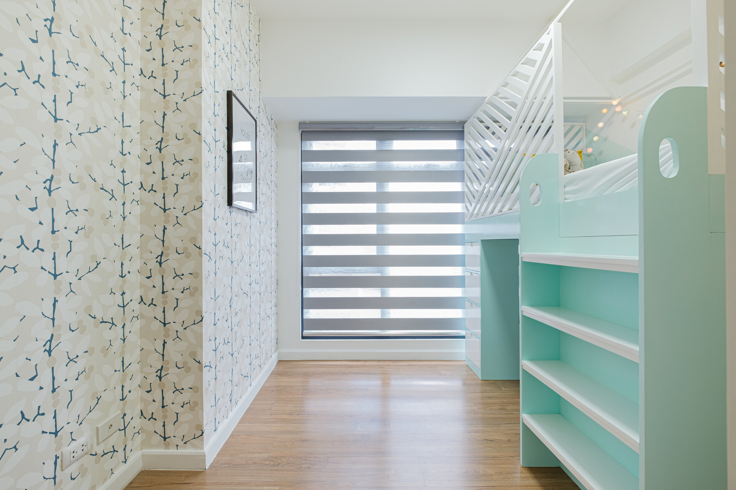
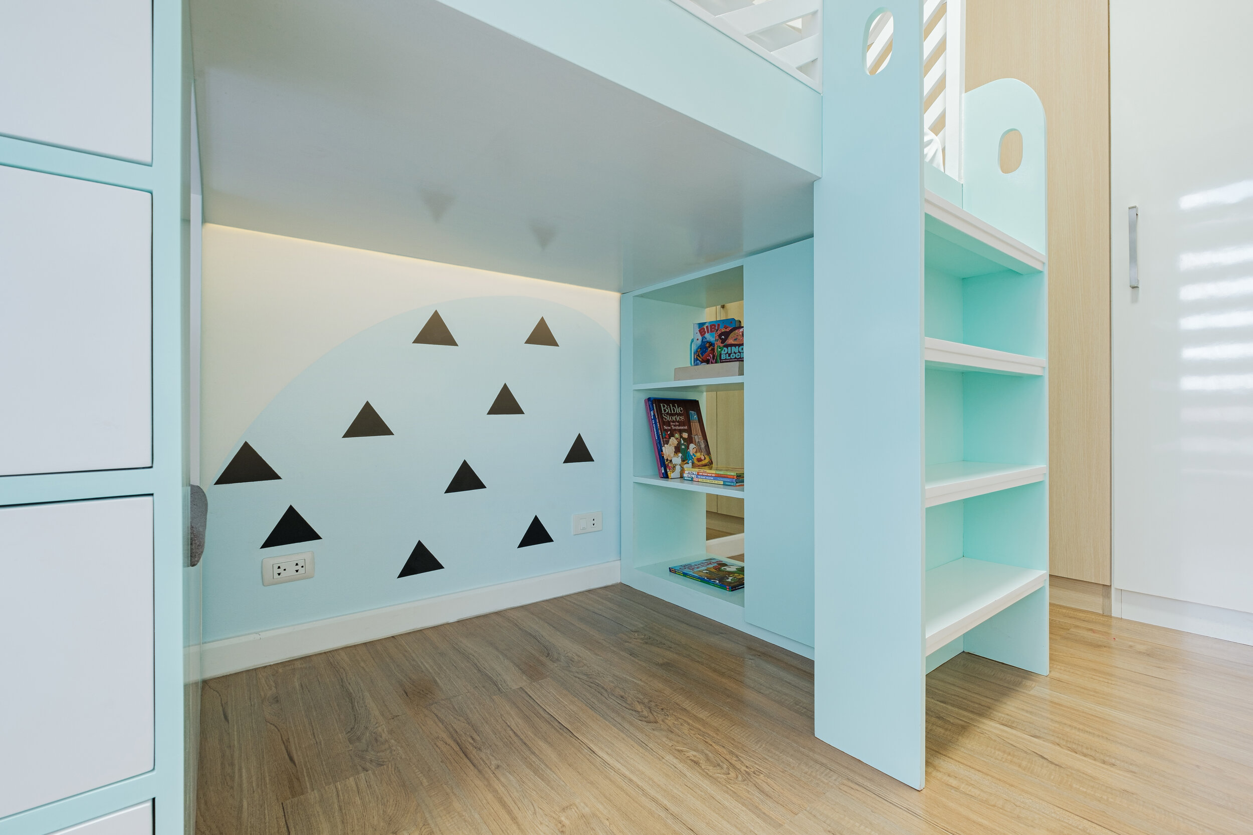
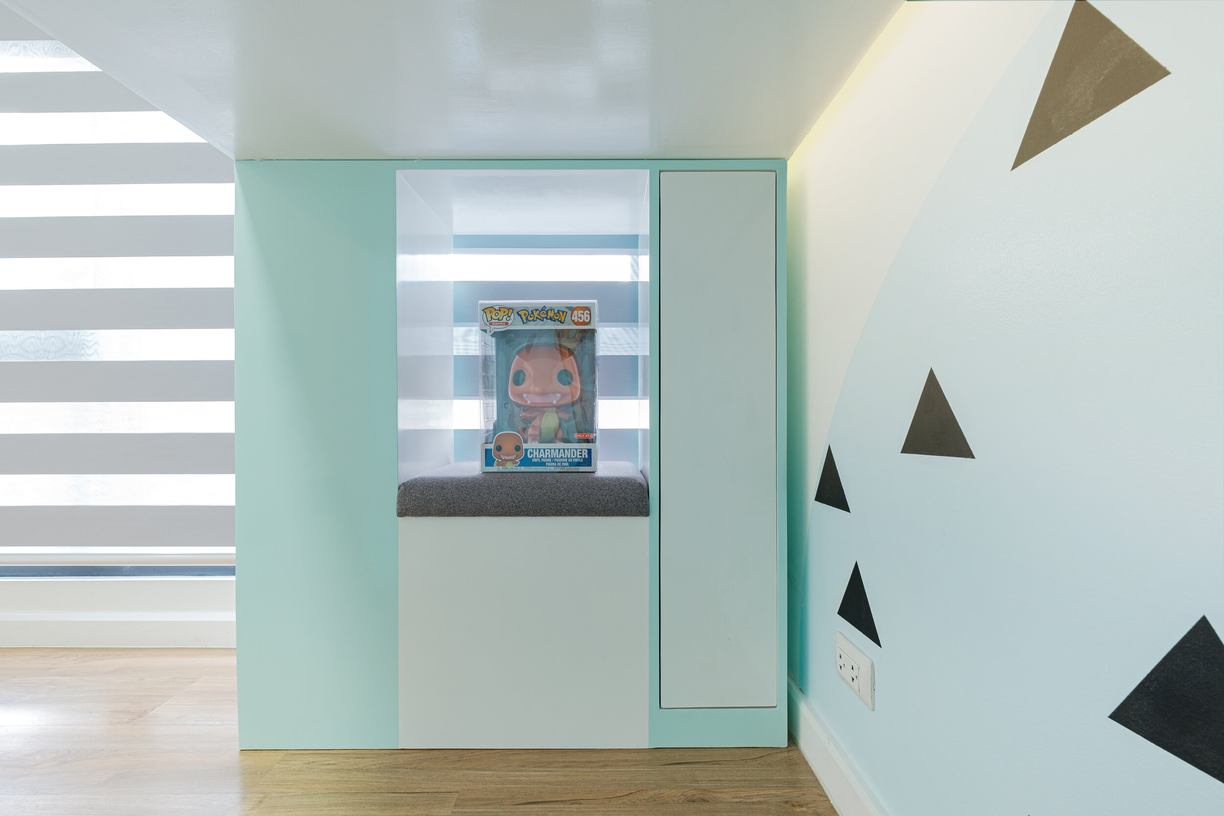
The client wanted something fun, playful, more storage yet spacious enough for their future child from infant to toddler years. They specifically wanted a bunk bed as it reminds them of their childhood days. It is sturdy enough to carry even adults at heart. Bed perimeter is designed in such a way that air and light flows through yet anyone sleeping is safe and secured from falling off. Bottom area has enough space for playing and keeping toys & books too.
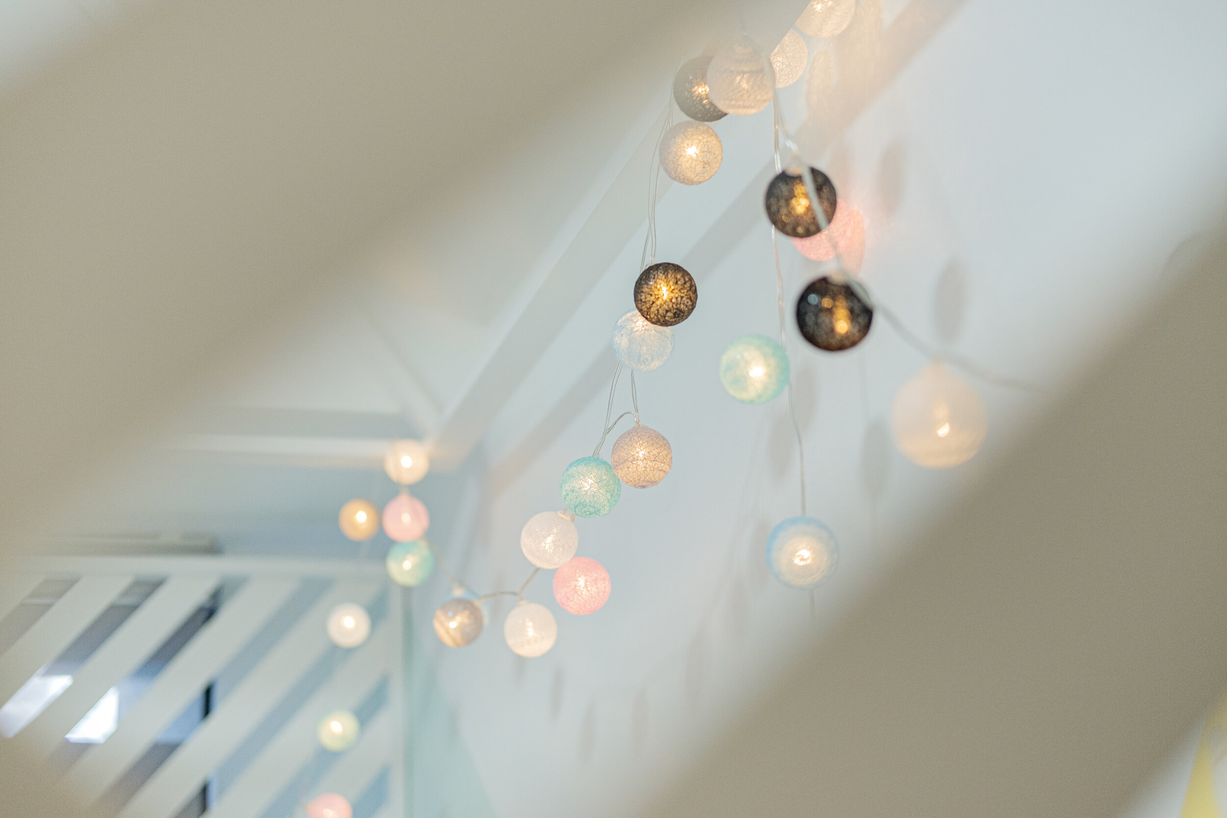
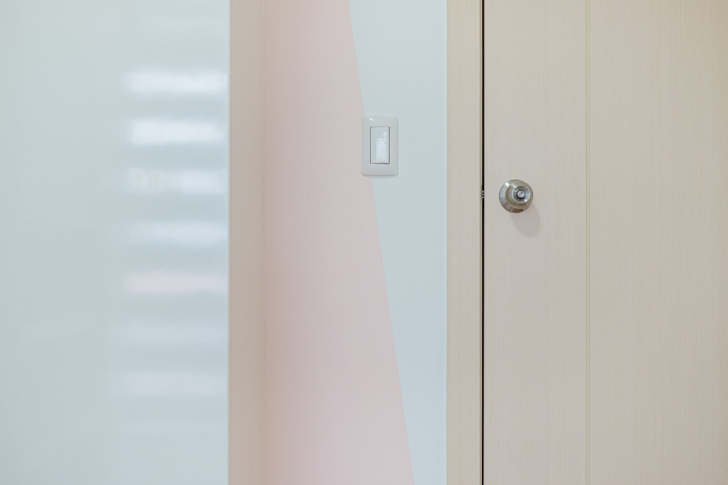
We also extended the existing closet to cater to more things. We installed full length mirror between the closet and bed so it will not look too tight. One corner can soon be a space for bassinet or crib or a rocking chair. We also chose pastel colors as it brings a happy vibe, pleasing to the eyes and the color combination is very gender neutral. A wallpaper on the other side adds personality to the room.



Hallway
We don’t want to keep it blank so we incorporated their favourite hue to the ceiling & added a nice gold track light to draw attention creating a cosier vibe. The blank walls we made into a mini gallery of family pictures and a painting made by a national artist.
Master Bedroom
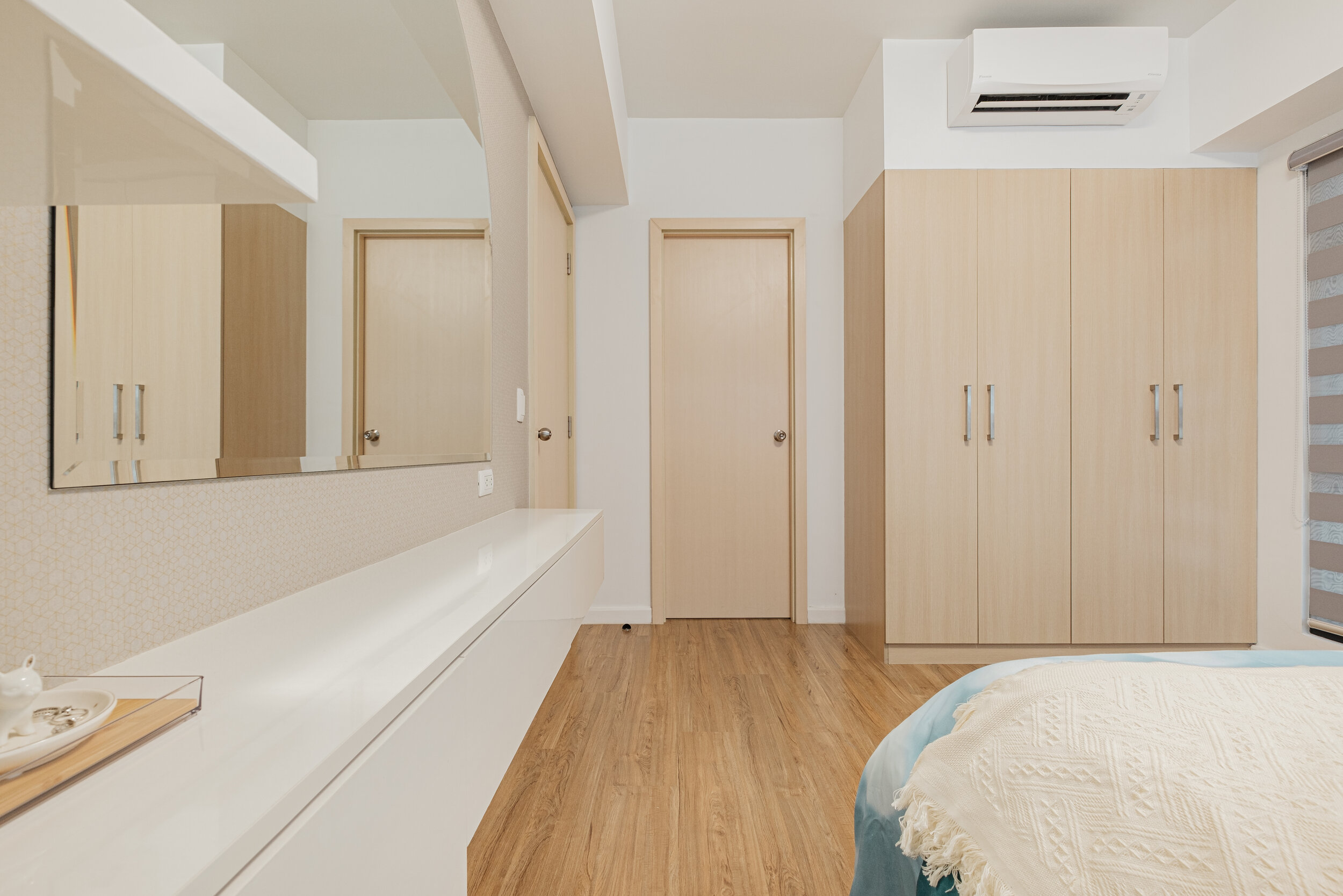
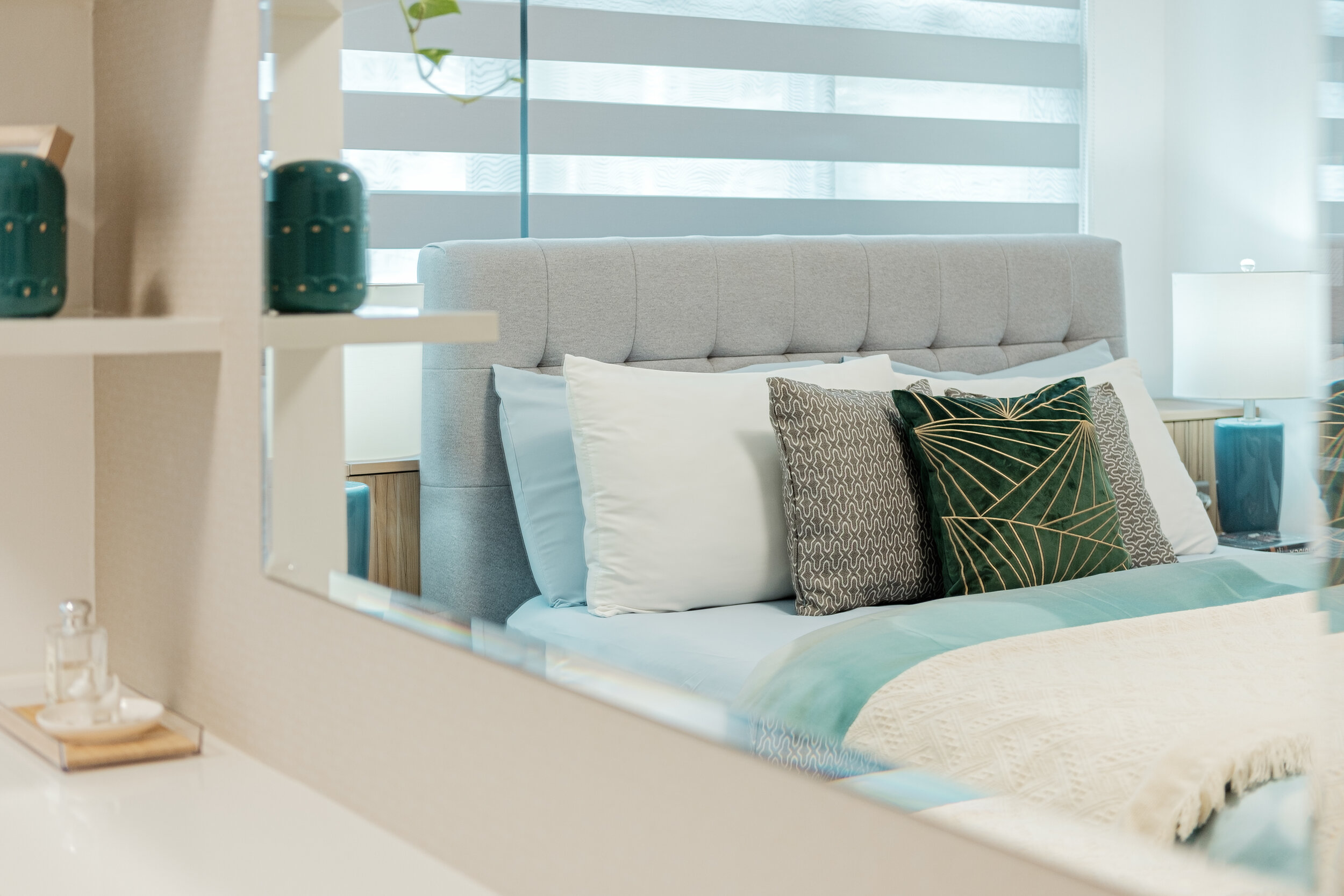
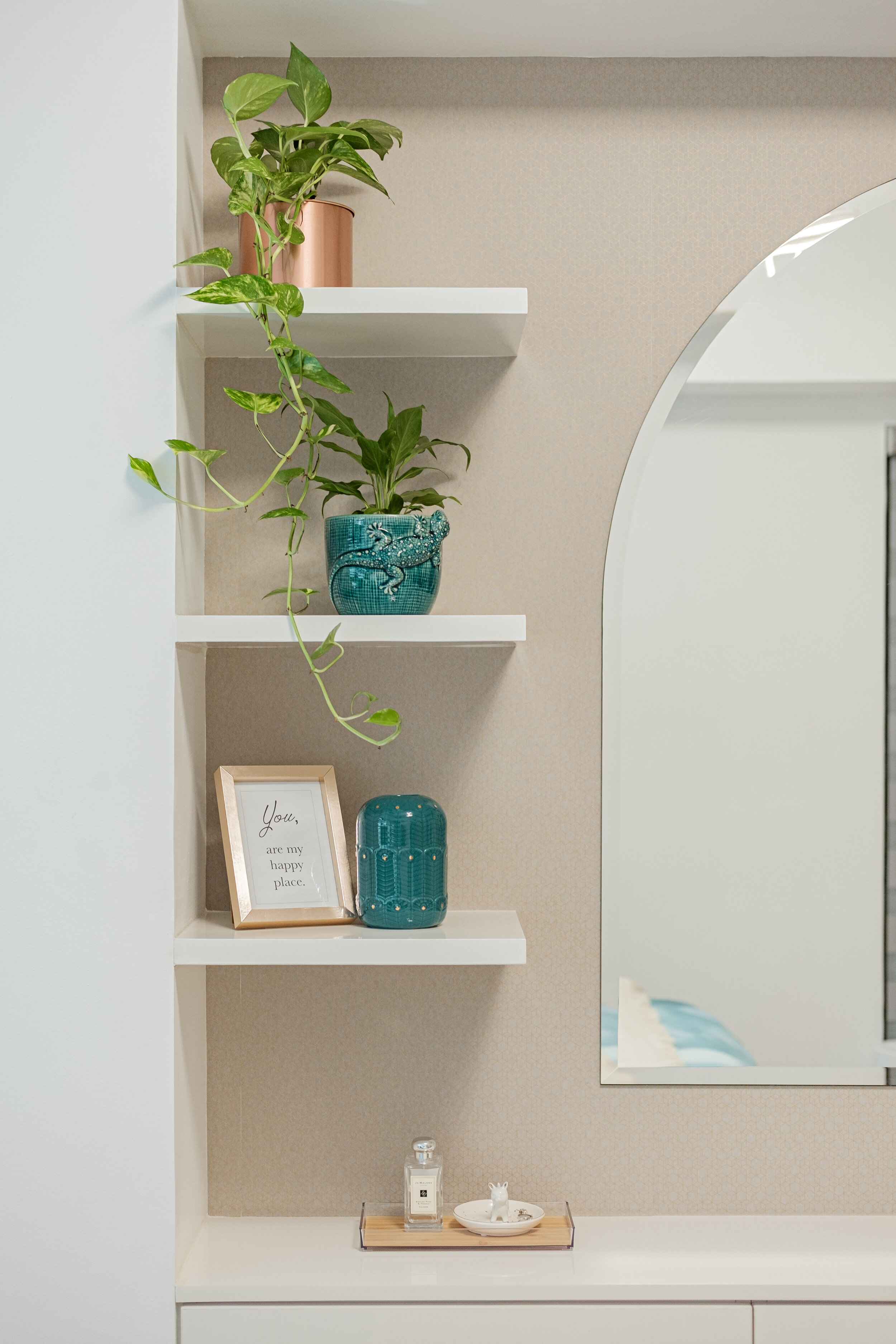
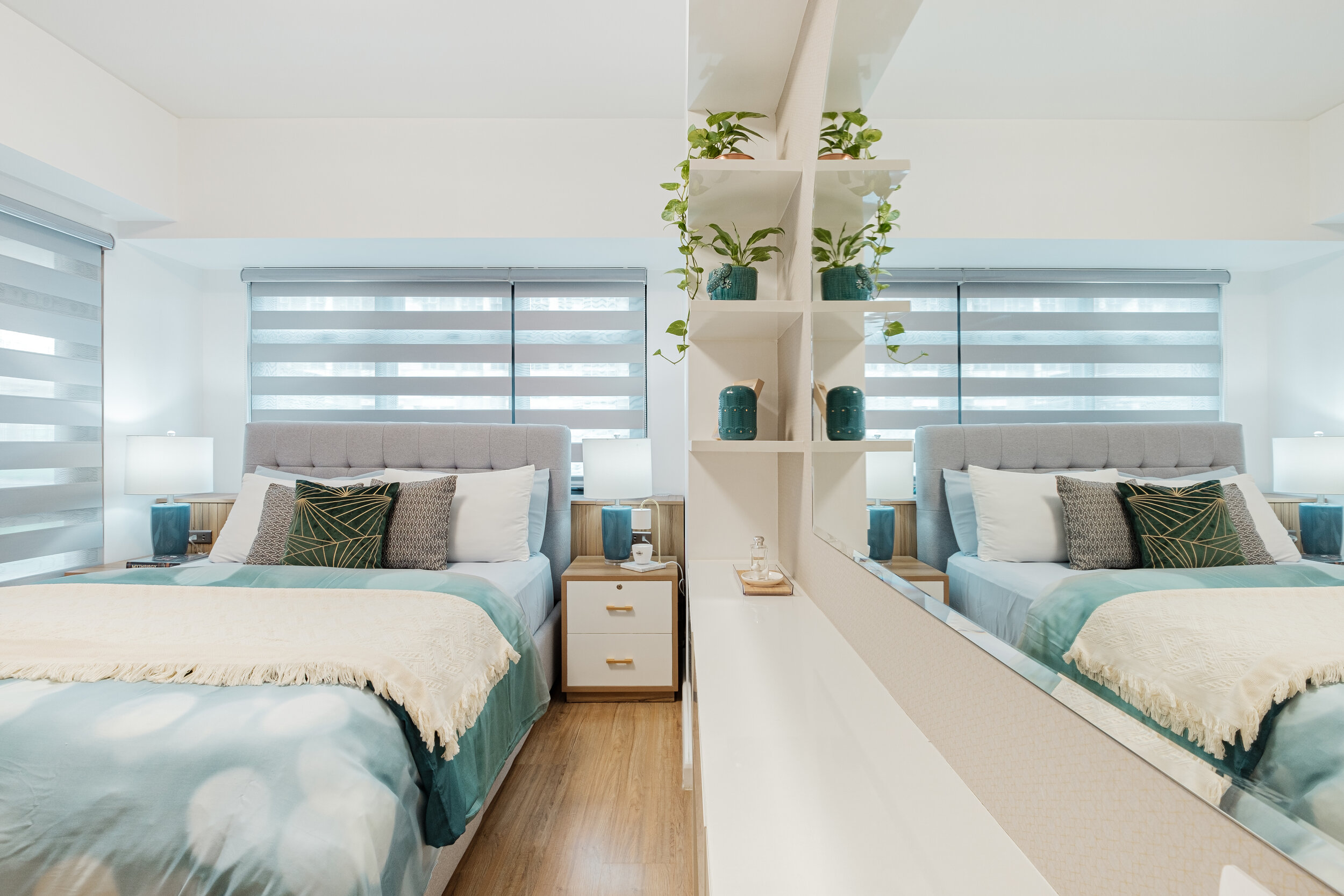
We kept it simple, refined and functional. The closet is the only existing storage as well in the bedroom. Bed frame has drawers on the side & front. There's also additional storage on the side table and discreetly at the back of the bed where we custom built a cabinet with lift-up cover for easy reach. We maximised as well the door side to accommodate a narrow & floating vanity area with shelves, a big arch mirror, drawers & side cabinet. We also chose a ceiling light that has mood levels from daylight to warm light.




Bathrooms
We just maintained the existing tiles in the bathroom and added overhead & wide vanity mirror cabinet with strip light to address their storage concern and break the tight atmosphere.


Roller Blackout Blinds
We chose this because we wanted to continue the idea of sleek clean lines in all rooms. Plus it offers excellent light control, privacy options and is easy to maintain.
Most Memorable Experience
The most memorable experience is discovering new ideas for every design problem while engaging with the client, knowing their likes and dislikes, their interests and from that creating solutions that will work best for them.
But what we love the most about this project are the people behind it. This won’t come out best if not for the cooperation, hard work and willingness of all parties involved especially the owners.
Contact the Designer
Imperial Architects + Design
E-mail: info.imperialarchitect.design@gmail.com
Instagram: @imperial_architects_design
Facebook: Imperial Architects + Design


